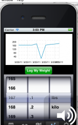
hey guys i just put the core data plot into my app so the user can make a custom graph based on user information.. it is tracking someones weight..
but when the user clicks the button to log the weight, the numbers on the y axis are too far apart from each other, so like if someone logs the weight 150 pounds, the x axis automatically starts around 140 then to 160 then 180 and 200, im looking for it to be something starting around 5 pound intervals from the original weight logged.. has anyone else had this problem? does anyone know how to fix it?
but when the user clicks the button to log the weight, the numbers on the y axis are too far apart from each other, so like if someone logs the weight 150 pounds, the x axis automatically starts around 140 then to 160 then 180 and 200, im looking for it to be something starting around 5 pound intervals from the original weight logged.. has anyone else had this problem? does anyone know how to fix it?