Become a MacRumors Supporter for $50/year with no ads, ability to filter front page stories, and private forums.

SrWebDeveloper

macrumors 68000
Original poster
Dec 7, 2007
1,871
3
Alexandria, VA, USA
http://www.goldtechpro.com

Please note I developed this site using Drupal 7. I'd like some critique on the layout, functionality and general content. Did you find anything confusing, difficult to use, or overly complex? I went for a clean corporate look and feel, but interjected some of my personality into it, I hope. I started with a theme called Bowtie and essentially changed its default layout, adding in the search box, more simplified slider, event calendar and a few other cosmetic changes so it's not too recognizable. I like the liquid layout themes, my personal choice. I know some of you prefer the static 960. I also modified views and modules to output things the way I want, i.e. random ordering, limits and links.

I have not yet optimized for SEO, that is in the works.

Thank you for visiting the site and offering your constructive feedback.

;)

Cheers.

-jim
 

SrWebDeveloper

macrumors 68000
Original poster
Dec 7, 2007
1,871
3
Alexandria, VA, USA
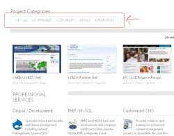
Why is the "x" in "eXperience" capitalized? I also find the "Project Categories" much too small and hard to see. Maybe display them more prominently somewhere.

That's commonly capitalized as a means of promoting rich web 2.0 interface design. It's a minor detail even if you don't buy that, I'm going to keep it so it draws some attention, which is a benefit.

As to the project area on the HOME page, those are 4 randomly selected projects in a highlighted/teaser format, each with scaled snapshot pics which link to a details page showing the full sized pic and text. Please note there is text on the top right of that area noting the 4 random selections with a convenient text link to explore the portfolio (in its entirety). I am not an advocate of cluttering the home page, long loading pages due to large pics, etc. (not saying you do, either) but these are reasons for the layout and scaling choices. Hope this made sense to ya!

Thank you for your opinion, of course.
 

miles01110

macrumors Core
Jul 24, 2006
19,260
36
The Ivory Tower (I'm not coming down)
As to the project area on the HOME page, those are 4 randomly selected projects in a highlighted/teaser format, each with scaled snapshot pics which link to a details page showing the full sized pic and text. Please note there is text on the top right of that area noting the 4 random selections with a convenient text link to explore the portfolio (in its entirety). I am not an advocate of cluttering the home page, long loading pages due to large pics, etc. (not saying you do, either) but these are reasons for the layout and scaling choices. Hope this made sense to ya!
Ok, but that wasn't what I was talking about. The element I was asking about is highlighted in the attached image. It seems out of place to me.
 

Attachments

  • goldtechpro.JPG
    goldtechpro.JPG
    61.2 KB · Views: 149

McGiord

macrumors 601
Oct 5, 2003
4,558
290
Dark Castle
Remove the "You are here" text/link, it doesn't help at all, it is confusing, for example, when you click on Portfolio it says " You are here: Home"

The Logo at the top left corner doesn't match very well with the rest of the layout, it seems "disproportionate".

What is Drupal? Does all your clients know about it? Current and potential new ones?
First time I cross with it, the site doesn't define it at first glance, or with an easy way to get to its definition, nor develops interest on investigating what is it?

Resume' = What do you mean by the apostrophe ? Instead of Resume, maybe call it something else, like Experience or Technical Capabilities.
There is a difference, in trying to sell you company or yourself.
Tailor it as to what is better for your target audience.
Many of the "recommendations" highlight that it is only one person running the show.

Focus on the 3 main things, and the grow with them, trying to cover too many things makes it look like one more of many, or desperate.

The image with the two golden droids is awful.

For the Blog, you have to give it a unique name. No Twitter?
 

SrWebDeveloper

macrumors 68000
Original poster
Dec 7, 2007
1,871
3
Alexandria, VA, USA
Ok, but that wasn't what I was talking about. The element I was asking about is highlighted in the attached image. It seems out of place to me.

Projects are assigned categories, so that's a filter to view all or specific categories of projects. I like the feature so I'm not going to remove it, but I might tweak its colors a bit. Thanks for pointing that out.
 

SrWebDeveloper

macrumors 68000
Original poster
Dec 7, 2007
1,871
3
Alexandria, VA, USA
Remove the "You are here" text/link, it doesn't help at all, it is confusing, for example, when you click on Portfolio it says " You are here: Home"

The Logo at the top left corner doesn't match very well with the rest of the layout, it seems "disproportionate".

What is Drupal? Does all your clients know about it? Current and potential new ones?
First time I cross with it, the site doesn't define it at first glance, or with an easy way to get to its definition, nor develops interest on investigating what is it?

Resume' = What do you mean by the apostrophe ? Instead of Resume, maybe call it something else, like Experience or Technical Capabilities.
There is a difference, in trying to sell you company or yourself.
Tailor it as to what is better for your target audience.
Many of the "recommendations" highlight that it is only one person running the show.

Focus on the 3 main things, and the grow with them, trying to cover too many things makes it look like one more of many, or desperate.

The image with the two golden droids is awful.

For the Blog, you have to give it a unique name. No Twitter?

Breadcrumbs need work, yes.

I disagree on the logo not "matching" the layout, it doesn't have to mirror it, and that logo is branded on other marketing and promotional items offline. Also, it never hurts to add a little color.

As to "What is Drupal" - sorry, kind sir, but you missed an ENTIRE section on that linked below, which is also linked from numerous other pages.

Resume' is the correct syntax - the difference between "I stop at a red light and resume motion when it turns green" vs. "This is my professional work resume'".

I happen to be seeking full time perm, so the site does (for the moment) promote me individually and also B2B contract work through the corporate name. Thanks for noticing the dilemna, it's kind of intentional right now to ensure I get both audiences, and actually I've gotten feedback from company reps asking for clarification which opens up a channel of communication. So it's not really a bad thing, but it is temporary. I agree with you, of course.

The image with the two droids is in your opinion awful, it's actually received compliments from others via feedback and showing it to peers. I am always open to suggestions for alternatives.

Twitter/Facebook coming soon using the corporate name and not mine, which is temporary. Good eye to detail.

As to the blog, I do not "have" to give it a unique name when I'm the only blogger on the site. :)

-jim
 

lucidmedia

macrumors 6502a
Oct 13, 2008
702
37
Wellington, New Zealand
Hi Jim,

I don't usually reply to these sort of "critique my site" posts, but you have been a long and valued member of these forums -- who has dispensed lots and lots of free dev advice to others -- and I wanted to give you some props.

Most of my comments deal with content strategy. I am reading the site as someone who has hired contractors and agencies for large scale design and development jobs.

First: I agree with the poster above regarding whether the site is for a person or a company, and am concerned that this makes the site read as inauthentic. Companies are companies and contractors are contractors. I would prefer the site focus on you as a developer and consultant. Add some employees and you can then consider whether you need to broaden the name.

Second: I feel there are some inconsistencies in your IA. The "about" section is mostly about technology, but also has an overview of you. The resume section has testimonials, but no formal timeline of accomplishments. It would be clearer to have one section focus on who you are (bio, cv, accolades, testimonials) and the other on the technologies you work with. The "Events" section is confusing as you have not made a clear story in other parts of the site about the training you do...

Third: I think you would benefit greatly from hiring a copyrighter to give the text a once-over for consistency and tone. At times the text reads as too personal. In others it is repetitive. A few hours with a freelance editor will make the copy read as much more professional.

Best of luck!
 

SrWebDeveloper

macrumors 68000
Original poster
Dec 7, 2007
1,871
3
Alexandria, VA, USA
Companies are companies and contractors are contractors. I would prefer the site focus on you as a developer and consultant.

As I said to the other user, I don't disagree as to the mixed message and I offered an explanation. However, a single member LLC (a corporation of one individual) allows for a certain amount of protection of personal assets as I might sell software apps through the same site in the future. So that aspect won't change. But you're right, I really am a contractor right now who happens to be seeking full time perm, and I should emphasize only the former in terms of content, masthead, About, etc. to avoid confusion and accurately reflect the company size - me, myself and I.

So it looks like I need to re-think my approach from a perspective of content strategy and afterwards do some basic editing.

As for technologies, I chose to use project categories for describing high elevation views of the basic technologies I use, then include a more detailed explanation in the project info text once a project is selected.

The "Events" section is confusing as you have not made a clear story in other parts of the site about the training you do...

Yep, that needs work. I plan on reducing the calendar size and including content on that page detailing what I do. I can then add an upcoming events block on the right sidebar. That's in the works.

Thank you very much for your extremely helpful feedback. Thanks also for remembering me, it's been awhile since I've posted help on here - a combination of being very busy and escaping a bit to refresh the void which used to be my brain. :p

Cheers.

-jim
 

McGiord

macrumors 601
Oct 5, 2003
4,558
290
Dark Castle
Jim:
You asked for feedback, and that is what I am trying to give you.

About the logo, I meant disproportionate, not that it is not matching. I mean that maybe relocating it, or re-distributing the other things around it will make the website less convoluted.

Resume' ≠ Résumé

The apostrophe is a different character than a vowel with an accent.

To improve it, for each position or project, list 3 major accomplishments. Your potential customer or future employer would like to know what you had done, and how that translates into what you can do for them.

For your website, like for your Résumé, anyone looking into it will have a very short amount time looking into it, if they don't find something interesting they will move on to any other website, or candidate.

Therefore the key thing is to grab their attention quickly.

For anyone working as service provider, consultant, or dealing with customers, this is a good read:
http://www.cultofthecustomer.com/
 

SrWebDeveloper

macrumors 68000
Original poster
Dec 7, 2007
1,871
3
Alexandria, VA, USA
McGiord, thanks for your followup and link.

"Relocating" the logo from its prime position is in my opinion not sensible advice for any web site, much less mine, and I already commented on the branding so we'll agree to disagree on that one, respectfully.

The site now correctly uses "Résumé", the French noun stemming from Latin, matching the North American pronunciation of the word as that's where I reside. [source]

Other advice taken under advisement, thanks.

-jim
 

Apple Key

macrumors 6502a
Jan 4, 2012
561
0
There are a lot of things I would change, but here's a start.

Homepage animation is a slight bit too fast.

Make circles below homepage animation show cursor when hovering over them.

Contact page - Key Clients - make this more prominent. I think you could even place this on it's own page (or show them on the homepage - scrolling or something). Also, show the logos if you are able to, and not just the names.

Events - Calendar previous and Next buttons are overlapping.

Move Login button to make it more prominent - probably place it on the homepage, possibly at the top of the page.

Search box seems to be haphazardly placed - work on placement.

The logo itself is not very strong and could use a redesign. If you decide to do this, it should guide help to guide the design of the rest of the site, once it is completed.

Testimonials on homepage - flashing to white on hover - change this, or make it done gradually on hover of the entire div and not just the text so it doesn't flash.

From a design perspective, the main thing that needs work is white space. Especially the homepage, which is very crowded right now.
 

Ap0ks

macrumors 6502
Aug 12, 2008
316
93
Cambridge, UK
Just to add what others have pointed out, the slider on the homepage doesn't currently serve much of a purpose except wasting space. If you had company images in there fine, but images with text I'd expect to link to a page related to the image e.g. the Drupal image should link to your Drupal page.

Also resumé (my preferred choice) can be spelt resume, resumé, or résumé they are all perfectly acceptable ;)
 

SrWebDeveloper

macrumors 68000
Original poster
Dec 7, 2007
1,871
3
Alexandria, VA, USA
To Apple Key:

Please note I am following a minimalist concept for my logo and overall page design, it's a personal choice. I know it's not your taste, but I am not asking for feedback on the company logo - to each their own. If you had noted the graphic was blurry or a format issue, sure. On a side note, the graphic is kind of like a CD disk integrated with a circuit board-ish kind of thing, with some gold in it which has to do with my last name and company name. Very minimalist. So there is a method to my madness.

Please note the slider timer is an interesting thing to mention, I know I can't stand long delays between those random ordered frames, and the user can always hover mouse to pause. I don't have tons of text in those images, so it's not really critical to slow it down. So I am keeping the delay. Also, circles are below the slider - just minimalist in nature. If you prefer more "action" during hover events, that's your personal taste. I think the look I got now is elegant, not clumsy with controls/hover effects, and that's a good thing. I appreciate what you said and thought it over, just happen to like this look better.

I disagree on the white space/crowded thing, especially considering the liquid layout, even vertical gaps between evenly rowed features and hidden content in unexpanded area at the bottom. I don't know about you but longer home pages (due to inches upon inches of vertical white space) looks amateurish and users rarely scroll down that far. I'm not going to reduce the slider size or pager controls, either as it's a design choice and intentional to evoke a slightly more professional look.

I do not allow registration on the site, the login button is only for me so it's intentionally not too visible. Actually there is a shortcut hotkey sequence for login I can use from any page.

As to key clients, the focus is not on "name dropping" companies which everyone else does and irks me to no end, it's about the work - the web sites and technologies used, so the portfolio is project driven - by choice. Not client driven. Did you notice on the right sidebar of 90% of the pages is the Key Clients tab, which allows direct links to the client home pages? Also, hovering over any of the 4 randomly selected project screen snapshots on the home page reveals the client name in a less overt manner, I think that's pretty cool. The clients aren't hidden, just not the primary focus. I am not asking you to agree with this, consider this an FYI that is was a conscious choice, and more tastefully executed, I think.

To Ap0ks:

The slider is intended to highlight the major technology stacks involved, and can also be used to promote events in the future. So for me, it has purpose in design and adds elegance to the site. As to the linking each frame to a content page, I'm all for that and will introduce that in the next phase. It's my fault for not mentioning this in the outset, it's kind of obvious.

As to the resume' word, it's mentioned in the source link I added that any of the forms discussed is fine. My final comment on the matter is the format I chose looks more professional, in my opinion, and hope to see more people use it. End of story.

To All:

Okay, folks, I got a good sense of what to do. I'll work on the site when time permits and follow many of the suggestions. Thank you, all, for your excellent in-depth feedback. I defended a few things I did, like or it leave it, as I have principles I follow in both coding and design - but I am always, always willing to listen and adapt when the advice is backed by sound logic and will benefit me. Something to remember for all site designers and code hackers out there -- stick to your principles.

Hope you enjoyed this thread, so far.

I'll followup here after I make changes in the sandbox and publish (TBD).

-jim
 

Apple Key

macrumors 6502a
Jan 4, 2012
561
0
To Apple Key:

Please note I am following a minimalist concept for my logo and overall page design, it's a personal choice. I know it's not your taste, but I am not asking for feedback on the company logo - to each their own. If you had noted the graphic was blurry or a format issue, sure. On a side note, the graphic is kind of like a CD disk integrated with a circuit board-ish kind of thing, with some gold in it which has to do with my last name and company name. Very minimalist. So there is a method to my madness.

Please note the slider timer is an interesting thing to mention, I know I can't stand long delays between those random ordered frames, and the user can always hover mouse to pause. I don't have tons of text in those images, so it's not really critical to slow it down. So I am keeping the delay. Also, circles are below the slider - just minimalist in nature. If you prefer more "action" during hover events, that's your personal taste. I think the look I got now is elegant, not clumsy with controls/hover effects, and that's a good thing. I appreciate what you said and thought it over, just happen to like this look better.

I disagree on the white space/crowded thing, especially considering the liquid layout, even vertical gaps between evenly rowed features and hidden content in unexpanded area at the bottom. I don't know about you but longer home pages (due to inches upon inches of vertical white space) looks amateurish and users rarely scroll down that far. I'm not going to reduce the slider size or pager controls, either as it's a design choice and intentional to evoke a slightly more professional look.

I do not allow registration on the site, the login button is only for me so it's intentionally not too visible. Actually there is a shortcut hotkey sequence for login I can use from any page.

As to key clients, the focus is not on "name dropping" companies which everyone else does and irks me to no end, it's about the work - the web sites and technologies used, so the portfolio is project driven - by choice. Not client driven. Did you notice on the right sidebar of 90% of the pages is the Key Clients tab, which allows direct links to the client home pages? Also, hovering over any of the 4 randomly selected project screen snapshots on the home page reveals the client name in a less overt manner, I think that's pretty cool. The clients aren't hidden, just not the primary focus. I am not asking you to agree with this, consider this an FYI that is was a conscious choice, and more tastefully executed, I think.

I was not presenting my personal taste regarding the logo. Minimalist is great, but the logo is a bit weak and could still use some work and refinement.

I like the circles below the slider, I was just saying you should add css - cursor: pointer to them so when you mouse over it shows the pointer and not just the arrow. It's a small thing, but I think it makes sense from a usability standpoint.

If the login button is solely for you, I would remove it entirely, so it doesn't distract the site users.

Remember, I'm just giving you my opinions and suggestions here. You seem to disagree with all of my suggestions though, which leaves me to think you are not open to feedback.

You seem to primarily be a developer who dabbles in design, I am the opposite and am trying to offer you advice as such.
 

SrWebDeveloper

macrumors 68000
Original poster
Dec 7, 2007
1,871
3
Alexandria, VA, USA
Ah, the old cop out:

You seem to disagree with all of my suggestions though, which leaves me to think you are not open to feedback.

Your insecurities aside, for the record I took the time to explain in detail and sometimes in paragraphs *why* I opted not to take your advice on certain things. At times I even noted I did not expect you to agree with me, I was following a philosophy in design contrary to your advice. I took time to go over your comments carefully, demonstrating I really was listening and making consideration, hence the time I gave back to you in response with my replies. Nor was I keeping score on "accepted" vs. "ignored" advice, because this isn't a game. How nice could I have been, and fair?

Yet, you still have to say THAT.

This is why I likely won't post a topic of this nature on here again.

Good day to you, sir.
 

GoCubsGo

macrumors Nehalem
Feb 19, 2005
35,741
153
There has been a lot of good feedback that hopefully is taken. I will say that where you wrote:
FYI:
Jim is also a proud member of the Apple "cult" in the sense he keeps his life and businesses organized with his iPhone, Mac Book Pro, iMac, iPad3 (coming soon), Airport Exrtreme with his own restricted WiFi hotspot, and Apple TV device. Of course he also owned many PC's through the years and knows Windows 7 and Office, etc., via his professional experience. Let's just say he shed a tear or two when Steve Jobs died and leave it at that.
The font is horrid, hard to read, too small and too light. What is the purpose of putting it there if you don't want people to see it? Also, I think it's uber cheesy to list your inventory of products and with some respect, are people going to care that you cried when the CEO of a company died? It doesn't leave me with a compelling reason to hire you. I would focus other content.
 

Apple Key

macrumors 6502a
Jan 4, 2012
561
0
Ah, the old cop out:


Your insecurities aside, for the record I took the time to explain in detail and sometimes in paragraphs *why* I opted not to take your advice on certain things. At times I even noted I did not expect you to agree with me, I was following a philosophy in design contrary to your advice. I took time to go over your comments carefully, demonstrating I really was listening and making consideration, hence the time I gave back to you in response with my replies. Nor was I keeping score on "accepted" vs. "ignored" advice, because this isn't a game. How nice could I have been, and fair?

Yet, you still have to say THAT.

This is why I likely won't post a topic of this nature on here again.

Good day to you, sir.

There is no reason for personal insults. Although I'm sure that post made you feel better.

Just stop trying to be something that you're not. You're a developer, not a designer. The sooner you accept this the better.
 

SrWebDeveloper

macrumors 68000
Original poster
Dec 7, 2007
1,871
3
Alexandria, VA, USA
Ugh. Such negativity, so combative and authoritarian -- what a downer this has become. Lighten up, man.

:D

Guess what? I already implemented several key issues raised. My apologies to you if they didn't happen to be related to your requests, I explained that already, but I'm doing my best, one page and graphic at a time. BTW, I never claimed to be a designer, I just said I had a certain philosophy on the design - minimalism and elegance, and never claimed the original site pulled that off either! It's my goal, its just that I have other ideas than you on certain elements. Can you possibly live with that and shake hands and let bygones be bygones?

Smile!
 
Register on MacRumors! This sidebar will go away, and you'll see fewer ads.