I'm having a bit of a problem with the way Safari on iOS displays graphics on retina displays (iPhone 4+, iPod touch 4th generation and probably also the iPad 3).
Before I begin, let me say that these screen captures are viewed at 100% zoom since I use the meta-tag "viewport" set to 320px and disabled the zoom entirely.
It seems that instead of simply resizing the image to fit the high-resolution display, someone in the Safari or Webkit development team actually thought that resampling (thus blurring) the image would be better. 😡
Attached are screen captures from Safari on Mac OS X, Safari on a first-generation iPod touch and Safari on an iPhone 4. Note that I have doubled the size of the screen captures of Mac OS X and the iPod touch (with the "nearest neighbor" method so it's a pixel-perfect doubling) so you can clearly compare with the iPhone 4 screen capture.
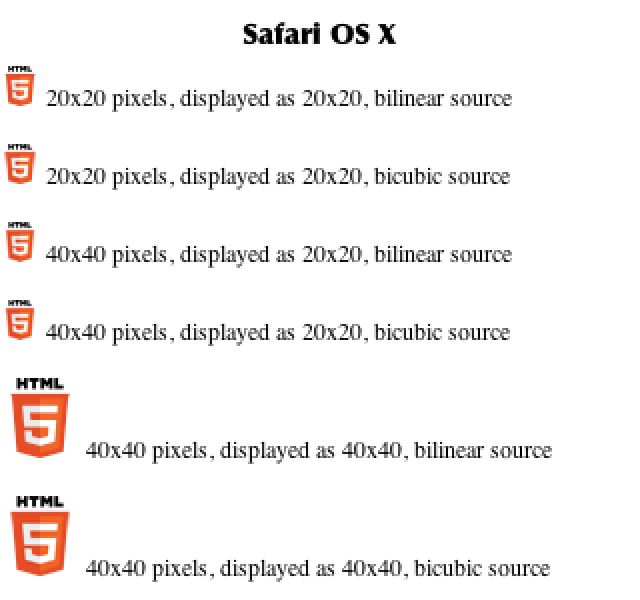
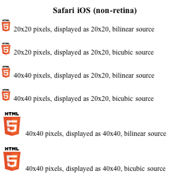
As you can see, there's nothing blurry on either the OS X or iPod touch screen captures. Blocky yes, but otherwise not blurred.

On the iPhone 4 screen capture, however, while we do get our "retina" images displayed with a much better result the smaller and bigger images appear blurry. That's because of the method used by Safari to double their size for the retina display. This is the problem to which I can't seem to find a solution. Using resampling to make an image smaller is the right choice, but using resampling to make them bigger, especially if they're exactly 200% bigger, is far from the right choice as you can see for yourself.
So my question is: does anyone know if there is a way, via an HTML meta, CSS parameters or other method, to force Safari/Webkit to NOT use resampling when doubling the size of the non-retina images?
Before I begin, let me say that these screen captures are viewed at 100% zoom since I use the meta-tag "viewport" set to 320px and disabled the zoom entirely.
It seems that instead of simply resizing the image to fit the high-resolution display, someone in the Safari or Webkit development team actually thought that resampling (thus blurring) the image would be better. 😡
Attached are screen captures from Safari on Mac OS X, Safari on a first-generation iPod touch and Safari on an iPhone 4. Note that I have doubled the size of the screen captures of Mac OS X and the iPod touch (with the "nearest neighbor" method so it's a pixel-perfect doubling) so you can clearly compare with the iPhone 4 screen capture.
As you can see, there's nothing blurry on either the OS X or iPod touch screen captures. Blocky yes, but otherwise not blurred.
On the iPhone 4 screen capture, however, while we do get our "retina" images displayed with a much better result the smaller and bigger images appear blurry. That's because of the method used by Safari to double their size for the retina display. This is the problem to which I can't seem to find a solution. Using resampling to make an image smaller is the right choice, but using resampling to make them bigger, especially if they're exactly 200% bigger, is far from the right choice as you can see for yourself.
So my question is: does anyone know if there is a way, via an HTML meta, CSS parameters or other method, to force Safari/Webkit to NOT use resampling when doubling the size of the non-retina images?
Attachments


Last edited: