Okay, I'm back with a refined website.
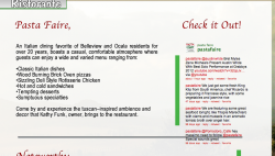
I removed rollover "buttons" (Not the ones in that shape of a wine bottle, cafe logo, and menu) but the ones suggested in the reviews page. Also, there's a completely new look and feel to the site.
I think this is my best work yet, lot more refined, and just in time for my big day today (I am presenting!!!) hopefully all goes well and I can start implementing this. Even if it's not worth a lot (Which I have a hard time believing its not, considering the 6+ months that went into it, all the refining, and changes made in coding -not through design view because it always comes out wrong!!) I'll be happy if it's bought for a reasonable price, this is just the addition to my portfolio I need to get a scholarship into Full Sail") .
.
I removed rollover "buttons" (Not the ones in that shape of a wine bottle, cafe logo, and menu) but the ones suggested in the reviews page. Also, there's a completely new look and feel to the site.
I think this is my best work yet, lot more refined, and just in time for my big day today (I am presenting!!!) hopefully all goes well and I can start implementing this. Even if it's not worth a lot (Which I have a hard time believing its not, considering the 6+ months that went into it, all the refining, and changes made in coding -not through design view because it always comes out wrong!!) I'll be happy if it's bought for a reasonable price, this is just the addition to my portfolio I need to get a scholarship into Full Sail
.
Last edited: