Hi folks,
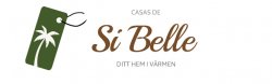
A client & friend is setting up a (swedish) business renting and selling apartments mainly on Canary Islands.
Based on the following keywords I've made this logo.
- trustworthy
- warm
- welcoming
- semi-luxurious
- relaxed (but still serious and trustworthy, which is somewhat of a conflict)
What are your opinions? Does it communicate what kind of company it is, will it scale well, and so on?
Thanks
")