The
winner is
AlexH and "Roll it".
There's a lot to like about this picture. I think the simplicity of its design-- the focus on lone dice with three sides visible, everything else out of focus-- spoke to me. The theme was given form as a small cube that was the very embodiment of "numbers". But what really sealed the deal was the lighting
especially the shadow of the die that was produced. It gave the photo a unique atmosphere. Furthermore, the contrast between the dark background and the white board extended the theme of the die, as did the choice to go with a B&W picture at all (which allowed the lighting to really shine). Without the lighting, the photo would have fallen flat. So kudos!
Second place is
iJohn.8.80 and "Numbers".
This is another one that has an elegantly straightforward design but what I love about this shot is that, not only do you have fifteen numbers all front and center, but you have the various colors of the balls making the photo pop. The use of depth of field also gave the triangle/rack of balls a direction that would have been completely absent had the focus been on one of the center balls. Great job!
Finally, in third place is
Bartlindon.
I like this shot because, while the focus is on the "1" (and those mouthwatering cherries), the
attention is on the child who is experiencing what will be the first of many. So you not only have the literal 1 in the picture, but the promise of more numbers (birthdays) to follow. It's the optimism of an unwritten future wrapped up with literal cherries! Had the adults been lit up, you would have had competing faces drawing away from the child and it would have detracted from the shot
but the fact is they weren't. It's a really nice shot and I think it was a wonderful move to keep the attention solely on the child and the import of the birthday. Nice job!
A few thoughts on the runners-up (in order of posting)
Melizard and "Black Flies 2": I liked this picture and thought it had good use of depth of field. It always makes me suddenly itch, like I can feel them swarming around me.
cambookpro: Love the colors here! I think birthdays are a fertile ground for number themed pics, but I think an actual number to anchor the concept would have helped.
Sideonecincy: That's a great clock face and reminds me of some of the stained glass deals my grandparents used to own. I go back and forth on the sliver of night sky in the upper-left corner-- on the one hand it anchors the time-of-day as evening and contributes to the atmosphere of the shot. On the other, though, it's a distracting burst of color that competes with the clock face for my attention. Either more sky to make it a bigger part of the composition or less so that the attention is entirely on the clock face. I don't know, like I said, I go back and forth on it. But I do love the subject and the angle!
NZed and Homework: great use of the theme to not only focus on the numbers on a calculator, but throw that scary calculus book into the mix, as well! I like the angle a lot.
Keleko: I really like the subjects here and the omnipresence of numbers. Old, worn down machines like this are always fun to see and photograph. The only thing that would make the shot better, IMHO, is more dynamic framing of the shot ala NZed. They're both just kind of there and the shot feels like it's missing something in the upper right corner. Getting in closer to the keys or just slightly angling the shot I think would have helped. Still a nice picture, though!
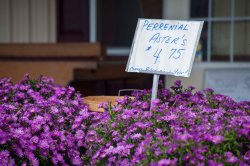
georgeinnj: Great splash of color and framing for the price sign.
jodelli: Nice shot! I would love to get up close to those tigers. I like the nested use of numbers-- the crowds, seats, scoreboard, ads
Ultimately, though, the ads compete with each other for your attention and I find myself unsure of where my attention should be drawn.
milbournosphere: This is a really nice shot, great atmosphere! Would have been better (for the contest, anyway) if the odometers were in focus rather than the steering wheel, but still a great shot.
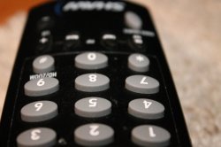
greenkitty2000: I like how your attention is drawn to the numbers on the remote, I would only suggest a more dynamic angle to help.
Great job all around! But,
AlexH is the winner and now has 48 hours to select the new theme!


