Become a MacRumors Supporter for $50/year with no ads, ability to filter front page stories, and private forums.

Does the logo look professional?

  • Yes, completely

    Votes: 1 6.7%
  • Somewhat

    Votes: 12 80.0%
  • Hints intensely of amateurship

    Votes: 2 13.3%
  • Very. Like a pro at sucking made it.

    Votes: 0 0.0%

  • Total voters
    15

schimmel

macrumors member
Original poster
Oct 31, 2009
41
0
Sweden
Yo folks.

After considerable – but self-inconsiderate – amounts of time, I feel that I've come a bit with branding for my own company Pixelengine.

I do visual branding, and help with finding more efficient/neat ways to work digitally, i.e developing workflows for accomplishing different tasks.
I've tried to condense this into "Marketing & usability".

First off: are these two concepts too separate for anyone to believe I could be good at both you think? Is it a bit “Paddys woodchopping & websites”-ish ?
Actually, what I love is (finding workflows for) information management, but that feels a bit specific, plus it's unmanageably long.

Second, what do you think of the logo? Does it represent what I do? Does it look good? Or are things bad?
 

Attachments

  • pixelengine-logo-box5.jpg
    pixelengine-logo-box5.jpg
    56.8 KB · Views: 145

R1PPER

macrumors 6502
Oct 1, 2008
360
62
I think its a really good start. I dont like the M&U typeface or the Pixel Engine typeface. Needs to be slightly slicker with maybe a pixel intergrated into the I too help link them. The grey line is abit dated also. But as a stage 1 its good. Id like to see how the logo works out of a dark colour also.
 

citizenzen

macrumors 68000
Mar 22, 2010
1,543
11,786
I think its a really good start. I dont like the M&U typeface or the Pixel Engine typeface. Needs to be slightly slicker with maybe a pixel intergrated into the I too help link them. The grey line is abit dated also. But as a stage 1 its good. Id like to see how the logo works out of a dark colour also.

Completely agree. the M&U and PE components look like they come from different brands. I too would look at integrating a pixel into the PE. I'd also consider caps/lowercase and varying the color in PE.
 

fig

macrumors 6502a
Jun 13, 2012
916
84
Austin, TX
Agreed that the two typefaces really aren't working together, but as a whole I feel like this is taking a bit of the easy way out.

The concept of "pixel engine" gives you SO many cool metaphors and ideas to play with. Gears, mechanical diagrams, steampunk, etc., there's some great opportunities to do something really interesting.

Your logo as is isn't terrible but it isn't memorable either, it's something I feel like I've seen a dozen times before. If you were to combine it with a really well executed type treatment that would be one thing, but as is it's just sort of there.

Hope that helps.
 

schimmel

macrumors member
Original poster
Oct 31, 2009
41
0
Sweden
Agreed that the two typefaces really aren't working together, but as a whole I feel like this is taking a bit of the easy way out.

The concept of "pixel engine" gives you SO many cool metaphors and ideas to play with. Gears, mechanical diagrams, steampunk, etc., there's some great opportunities to do something really interesting.

Your logo as is isn't terrible but it isn't memorable either, it's something I feel like I've seen a dozen times before. If you were to combine it with a really well executed type treatment that would be one thing, but as is it's just sort of there.

Many thanks for the input people.

The three pixels in the > formation is supposed to make the following plays on the concept of pixelengine:
- represent forward moving
- resembles a p and and e at the same time; the e inverted (i.e the white pixels that form within the symbol), and the p, well, with some good will, it's there.
- looks like the front of an electrical motor
- is obviously pixelated as hommage to the brand

I guess I do know what you're saying about the typefaces, although I may not wanna admit it. I really love the Playfair Display typeface which makes up the grey text above, so I really want to incorporate it. Maybe only with an ampersand, but it's really extraordinary so yeah... check out http://www.forthehearts.net/tag/typeface-design/ to appreciate it's full blown sexiness.

Could anyone elaborate on why you think they don't work together? Studying typography last semester I learned that contrast rather than resemblance is the way to go when selecting type, and these two contrast a lot obviously. But maybe it doesn't really ring true in logo design and is really only for setting longer texts or as a general rule..

Anyhow. I guess it's a battle between simplicity (which may or may not be a quality in itself), and building meaning/memorability. I have a lot more variants actually but I don't feel chockingly pleased with them so I think I'll try and experiment with what ya'll been saying, and get back with that, if you're still awake then.
 
Last edited:

supabooma

macrumors newbie
Feb 19, 2006
27
0
To me, marketing and usability seem like 2 concepts too far apart from each other. I understood it after reading your description of what you do, but someone coming across your logo for the first might not understand how those two relate to each other, if at all. In fact, it may pigeonhole you into 2 very specific skillsets, neither of which really speak to your design capabilities.

Have you considered removing M&U altogether? It will allow greater creative freedom with PixelEngine, and Pixel Engine by itself lends to a broader meaning (ie. anything digital).

Logo is a good start though. Cheers-
 

fig

macrumors 6502a
Jun 13, 2012
916
84
Austin, TX
Many thanks for the input people.

The three pixels in the > formation is supposed to make the following plays on the concept of pixelengine:
- represent forward moving
- resembles a p and and e at the same time; the e inverted (i.e the white pixels that form within the symbol), and the p, well, with some good will, it's there.
- looks like the front of an electrical motor
- is obviously pixelated as hommage to the brand

Honestly, I don't catch any of that aside from maybe the arrow. I can see some of it after you explained it to me but it still comes off as rather bland IMO, sorry. There's nothing wrong with going simple if it has some really great execution or typography, I'm just not getting that here.


I guess I do know what you're saying about the typefaces, although I may not wanna admit it. I really love the Playfair Display typeface which makes up the grey text above, so I really want to incorporate it. Maybe only with an ampersand, but it's really extraordinary so yeah... check out http://www.forthehearts.net/tag/typeface-design/ to appreciate it's full blown sexiness.

Could anyone elaborate on why you think they don't work together? Studying typography last semester I learned that contrast rather than resemblance is the way to go when selecting type, and these two contrast a lot obviously. But maybe it doesn't really ring true in logo design and is really only for setting longer texts or as a general rule..

Anyhow. I guess it's a battle between simplicity (which may or may not be a quality in itself), and building meaning/memorability. I have a lot more variants actually but I don't feel chockingly pleased with them so I think I'll try and experiment with what ya'll been saying, and get back with that, if you're still awake then.

Unfortunately combining typefaces is much more art than science so it can be tough to explain, it's often just the feel that a certain combination has.

In this case you've got a bold, solid typeface and a dainty, swirly, detailed one. For me there's just too much contrast between the two faces for them to have any relation.

I think the "tagline" placement also hurts, I don't visually connect "marketing & usability" to the name and logo, they look like two distinctly different elements that happen to occupy the same space.

I understand falling in love with a certain character or idea but sometimes you have to kill your babies, so to speak. One thing you might try is using just the ampersand and combining it with a typeface that's more similar to your logo, or even the same face in a thinner weight. Using less of that detailed element might make for a more palatable combination.
 

kevinfulton.ca

macrumors 6502
Aug 29, 2011
284
1
Yo folks.

After considerable – but self-inconsiderate – amounts of time, I feel that I've come a bit with branding for my own company Pixelengine.

I do visual branding, and help with finding more efficient/neat ways to work digitally, i.e developing workflows for accomplishing different tasks.
I've tried to condense this into "Marketing & usability".

First off: are these two concepts too separate for anyone to believe I could be good at both you think? Is it a bit “Paddys woodchopping & websites”-ish ?
Actually, what I love is (finding workflows for) information management, but that feels a bit specific, plus it's unmanageably long.

Second, what do you think of the logo? Does it represent what I do? Does it look good? Or are things bad?

I should start by saying it LOOKS good, but as a logo it may not work. I agree others that the M&U type face is too far a departure from what's used in the main logo. If this is a tech company then keep it looking that way. Differing too much will have the negative effect of confusing the viewer. Also, having that at the top doesn't really work. If anything it should be below the main logo/company name or removed all together. Order should always be: 1) Who we are 2) What we do. Ideally your logo should make what they do obvious or at least allow the viewer to put it in the correct industry without much thought.

The use of color with the pixels is also a concern. Turn all the colors to black and see if the message still gets through. These different shades will work fine when printing CYMK or for web, but what about spot color printing or textile? This logo NEEDS to work with every form of media.

One suggestion would be that brown, at least to me, doesn't say tech. Reds, greens, blues, and different shades of grays would be a closer match, but I'd try and avoid red since it means "stop" or "danger" subconsciously to most people. You may not have that option, but that's just my opinion.

As I mentioned before though, it looks very nice, but what looks good doesn't always cut it when it comes to logos. The MESSAGE to the viewer is, far and away, the most important aspect of any logo. Good luck!
 
Last edited:

kevinfulton.ca

macrumors 6502
Aug 29, 2011
284
1
Yo folks.

After considerable – but self-inconsiderate – amounts of time, I feel that I've come a bit with branding for my own company Pixelengine.

I do visual branding, and help with finding more efficient/neat ways to work digitally, i.e developing workflows for accomplishing different tasks.
I've tried to condense this into "Marketing & usability".

First off: are these two concepts too separate for anyone to believe I could be good at both you think? Is it a bit “Paddys woodchopping & websites”-ish ?
Actually, what I love is (finding workflows for) information management, but that feels a bit specific, plus it's unmanageably long.

Second, what do you think of the logo? Does it represent what I do? Does it look good? Or are things bad?
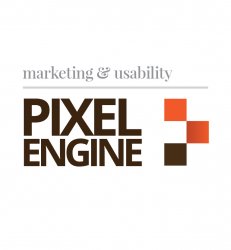
One last point would be that the name "Pixel Engine" combined with those pixel graphics leads me to believe that it's a display company and not a marketing or development company. Perhaps including some stylized coding references may give the viewer a better idea of what the company does?
 

madmaxmedia

macrumors 68030
Dec 17, 2003
2,932
42
Los Angeles, CA
A couple of suggestions-

1. I'm curious how the main logo would look if 'PIXEL' and 'ENGINE' were the same size.
2. Try putting the 'marketability and usability' below the main logo, and underneath the gray divider line.
3. I get your point about contrast in typeface, although I haven't made up my mind yet. Could you try an '&' symbol that is not so frilly?
 

lucidmedia

macrumors 6502a
Oct 13, 2008
702
37
Wellington, New Zealand
I agree that "marketing and usability" feel a bit far apart conceptually...

"marketing" is old school... Bill Lee at the Harvard Business Review claims that traditional marketing — including advertising, public relations, branding and corporate communications — is dead. You can agree or disagree with him, but I have personally seen a lot of the change he talks about in his article, and my own work has shifted accordingly.

"Usability" is new school, a subset of user experience, and reflects a shift from designing objects to designing services and systems.

First off: are these two concepts too separate for anyone to believe I could be good at both you think?

I don't think that you have to worry about "can people be good at both" (they certainly can) but its more that they are very different philosophies of design and, in practice, can sometimes be incompatible with each other. This can put a designer trying to do both for the same company in a difficult situation. Fights between the marketing department and the UX people are common, and lots of fun to watch.

So, I am not sure you want to lump them together.

But lets back up for a second: Can you more clearly define what you mean by marketing? Are you a visual designer? a copywriter? a strategist? a PR or CC person? all of the above?

I think being specific is better if you can.

Also, is your view of usability a designer-centric view, or one from HCI or Cognitive Psychology? Are you focused on the evaluation of usability, or do you use the term to imply you design usable interfaces? Those are two very different jobs in my office.

what I love is (finding workflows for) information management, but that feels a bit specific, plus it's unmanageably long.

This is why I responded to your post. This specificity is good. In my experience, it is far easier to find someone who can design a decent logo than to find someone who uses design thinking to approach business/workflow problems. I need the latter.

So, I think you have a terminology problem. How do companies that do similar work to you describe themselves? Look at some of the "Strategy and Innovation / Service Design" companies (most are in Europe and Australia) and see how they describe themselves.

TL;DR version: If you're having branding problems, I feel bad for you son / You got 99 problems but a logo ain't one :D (sorry)

I think you need to find better terms to describe what you really do (or want to do). Once that concept is clear, the form of your logo will fall into place. As long as the concept is not clear, the logo will, by default, have to be generic.

finally, as someone who hires designers in the interaction design / user experience space, I could care less if you have a personal logo... thats a marketing/branding problem :) not the kind of problem I would be asking you to solve in studio.
 

twietee

macrumors 603
Jan 24, 2012
5,300
1,675
Maybe I overlooked it, but can you please explain the use of colours too? They didn't strike me as self-explanatory either. Orange and Brown + light Grey - makes it look somehwhat antique.

re your pixelated arrow: because of the use of a darkish brown at the bottom and a much lighter orange at the top + gradient in betwenn it gives you a rather static impression of 'from bottom to top' instead of left to right movement. I didn't notice this idea until you explained it and think it just doesn't work that way.
 

PortableLover

macrumors 6502a
Apr 14, 2012
734
663
england
It looks good, it just needs a little bit more work.

Perhaps you could remove the marketing and usability bit.., to just make it look more streamlined and 'cleaner' The Pixel Engine text, needs to be changed somewhat, maybe to a different font, or a different color.
 

Parkin Pig

macrumors 6502a
Oct 23, 2009
670
141
Yorkshire-by-Gum
I do visual branding, and help with finding more efficient/neat ways to work digitally, i.e developing workflows for accomplishing different tasks.
I've tried to condense this into "Marketing & usability".

Got to be stern here. If you 'do visual branding' then surely you should be telling us, not asking us what works.
As for more efficient workflows: running your quality control via a MacRumors thread 'After considerable – but self-inconsiderate – amounts of time' is not what I would call a legitimately 'more efficient/neat way to work digitally'.
It seems like you're asking for help in a field that you're marketing yourself as an expert.
 
Last edited:

schimmel

macrumors member
Original poster
Oct 31, 2009
41
0
Sweden
Got to be stern here. If you 'do visual branding' then surely you should be telling us, not asking us what works.
As for more efficient workflows: running your quality control via a MacRumors thread 'After considerable – but self-inconsiderate – amounts of time' is not what I would call a legitimately 'more efficient/neat way to work digitally'.
It seems like you're asking for help in a field that you're marketing yourself as an expert.

Well, first of all, branding etc. are surely more of an art than a science. Right? And I do find Macrumors to be a good place for a pretty lively and engaging discussion regardless of time of day. The amount of input on here is quite impressive. Granted, not everyone who replies is a professional, but it seems quite a few are.

If nothing else, a little discussion doesn't hurt. People who do not ask other people for advice, opinions, or just a casual discussion even if the topic is their job, need to get off their high horses, imo.
 
Register on MacRumors! This sidebar will go away, and you'll see fewer ads.