Become a MacRumors Supporter for $50/year with no ads, ability to filter front page stories, and private forums.

Is it ugly?

  • Yes

    Votes: 35 44.3%
  • No

    Votes: 44 55.7%

  • Total voters
    79

RealMadrid15

macrumors member
Original poster
Jun 19, 2012
33
0
Come on guys...what were you thinking?

This looks like something Samsung would have designed. Plus you even used the exact same design process of Samsung - copy (Lumia), and then make it look worse.

2012-ipodnano-product-yellow
 

dkersten

macrumors 6502a
Nov 5, 2010
589
2
The Lumia line is Nokia. Plus I think that Samsung designs a few pretty nice products.

On to the iPod, while I'm pretty bummed that Apple abandoned the Nano watch concept (for now), I kinda like the design of the new Nano. Don't get me wrong I think most the colors are hideous except the black and silver, I like the design. It gets back to music, in a simple way. Oh well thats my opinion of it at least.


On a side note I wish Apple would update the classic, make is skinner, SSD, update the screen, and keep the scroll wheel. Man do I miss the iPod scroll wheel
 

mrsir2009

macrumors 604
Sep 17, 2009
7,505
156
Melbourne, Australia
Is anyone else wondering why Apple decided to change the icons to make the UI look totally different from iOS? In my opinion it makes it look more like another manufacture's work...
 

Oohara

macrumors 68040
Jun 28, 2012
3,050
2,423
Plus you even used the exact same design process of Samsung - copy (Lumia), and then make it look worse.
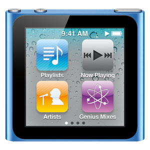
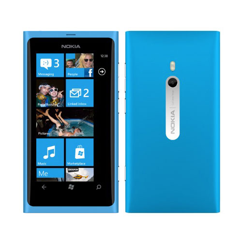
This is ridiculous. Just stretch the Nano 6th gen - that's your Lumia right there. Apple didn't copy Nokia, they built on their own design.

hB9Re.jpg

iPod Nano 6th gen (2010)

Y1amp.jpg

Nokia Lumia 900 (2011)

I think the new Nano looks OK, but the last version with the wristband possibility made more sense and the round icons don't look very Apple at all.
 

Wolfpup

macrumors 68030
Sep 7, 2006
2,927
105
Is anyone else wondering why Apple decided to change the icons to make the UI look totally different from iOS? In my opinion it makes it look more like another manufacture's work...

You know, I hadn't thought about that! I was wondering why I thought it looked different...

My guess is they want you to be able to see that it's not iOS at a glance. Like they don't want people to think it's iOS and then go "why is this so limited"?

Since the 6th gen came out I've been wondering if they'd actually start having these run iOS... Was kind of excited by that until...just now when they trashed podcast support on iOS! Now I'm glad to have a regular iPod available...
 

iEvolution

macrumors 65816
Jul 11, 2008
1,432
2
I'm not too excited, silver and 'slate'/black look great but as a music player touch screens blow.

Though I am not sure how good the rocker switch on the side is, I suppose this is Apple's solution to the lack of the click wheel?

Anyway with no capacity updates, touch screen interface I upgraded to a new 5th gen I just ordered a few days ago.

Sorry the click wheel is superior for music playback this all touch screen crap is..well crap. Sure its good for apps and other things but apps aren't supported so who cares?

OP I love how you picked the worst color to try to prove a point, the device looks better IRL than it does with Apple's silly digital pictures.
 

MonkeySee....

macrumors 68040
Sep 24, 2010
3,858
437
UK
Is anyone else wondering why Apple decided to change the icons to make the UI look totally different from iOS? In my opinion it makes it look more like another manufacture's work...

Just to differentiate it. It looks weird because we're not used to it.
 

decafjava

macrumors 603
Feb 7, 2011
5,159
7,248
Geneva
Hmm I like it and prefer touchscreens for music players-that's what playlists and the remoter controls are for. Some of the colours are pretty bad though.
 

Wolfpup

macrumors 68030
Sep 7, 2006
2,927
105
I'm not too excited, silver and 'slate'/black look great but as a music player touch screens blow.

Though I am not sure how good the rocker switch on the side is, I suppose this is Apple's solution to the lack of the click wheel?

Yeah, I always prefer physical buttons where possible.

I thought the things on the side were the volume controls? It DOES have hardware volume controls at least, right? :eek:
 

Wolfpup

macrumors 68030
Sep 7, 2006
2,927
105
Well... to your disappointment, they are not going to change the round icons since they would have to make a different home button.

Why?

At any rate, I'm thinking this is just an iOS differentiator. Maybe round buttons make more sense for this anyway, easier to hit?
 

Jessica Lares

macrumors G3
Oct 31, 2009
9,612
1,056
Near Dallas, Texas, USA
When you finally get it in your hands, you'll understand that the round buttons are definitely easier to touch. Not only that, but the DPI is smaller.

I hope someone figures out how to open the firmware to customize the look/icons, that would be interesting and would mean we could get the iOS icons back. Used to love doing that with my old iPods.
 

Wolfpup

macrumors 68030
Sep 7, 2006
2,927
105
Because it symbolises the shape of the icon in the main menu. As you might have noticed on the iPhone.

I'm still confused...the home button is round on this and the iOS devices, but the software buttons are squarish in iOS, round here?
 

Wolfpup

macrumors 68030
Sep 7, 2006
2,927
105
Yeah, but the icon on the home button is a square on the iPhone.

Ooooooooh! I see what you mean. Yeah, I forgot there was that icon.

Well still, I don't think it's an issue one way or the other, but yeah it does match then.

Although shouldn't this be a rectangular button with a circle icon, to be consistent? :-D
 

Ddyracer

macrumors 68000
Nov 24, 2009
1,786
31
No, all the colors look beautiful except for slate (looks horrible across the whole mobile lineup) and maybe yellow but i don't care for yellow, don't think it looks yuck though.

As for slate why have a very dark gray? Black looks sleeker and less monotonous, dull and depressing.
 

FlatlinerG

Cancelled
Dec 21, 2011
711
5
I simply cannot stand the new look. It doesn't feel Apple-esque to me. Bring back the scroll wheel and lose the rounded shape of those apps (gross) and you have something just like the 4th and 5th gen Nano which were awesome.

Better yet, bring back the first gen Nano, just fix the whole spontaneous combustion thing..:p
 

thenightwatch

macrumors newbie
Sep 18, 2011
17
0
What about THE WATCH?

The whole "raison d'être" for the 5th gen Nano was to use it like a watch. That's the main reason people were buying it, and it was catching on BIG TIME. What the heck was Apple thinking? If they would have made some improvements in that form factor it would have been a cult hit that took off like the Apple TV. The coolest yet least expensive watch ever, but with a bunch of features. Like the iPhone was for the phone, the 5th gen Nano could have been for watches.

I've been supporting Apple since the 80s. I worked there (at the mothership, not a store) in the 90s when Jobs came back. But now, disappointment after disappointment. If they don't make a SERIOUS MacPro or a pro level Mini, well, their lost.
 

MH01

Suspended
Feb 11, 2008
12,107
9,297
This is ridiculous. Just stretch the Nano 6th gen - that's your Lumia right there. Apple didn't copy Nokia, they built on their own design.

Image
iPod Nano 6th gen (2010)

Image
Nokia Lumia 900 (2011)

I think the new Nano looks OK, but the last version with the wristband possibility made more sense and the round icons don't look very Apple at all.

2x 6th gen is not the current nano. Remove the home button and u have a point. Lumina did not copy the nano, that image is total bs, you cannot confidently forget the user experience and functionality that has been introduced into the new nano with the home button.

Now go take a black nano and black lumina, they look damn similar no?? If you like stack two 6gen, it will still not look like the new nano.
 

Oohara

macrumors 68040
Jun 28, 2012
3,050
2,423
2x 6th gen is not the current nano. Remove the home button and u have a point. Lumina did not copy the nano, that image is total bs, you cannot confidently forget the user experience and functionality that has been introduced into the new nano with the home button.

Now go take a black nano and black lumina, they look damn similar no?? If you like stack two 6gen, it will still not look like the new nano.
I'm not saying 2 x 6th gen is the current Nano. I'm saying 2 x 6th gen = basic shape of the Lumia.

However I'm not saying that to claim that Nokia copied Apple. I'm saying it to refute the OP's claim that Apple copied Nokia for the new Nano - the basic elements in the outer design of the Nano is present in the Lumia, but was present already in Apple's own 6th gen.

The button + functionality of course has nothing to do with either 6th gen or Lumia.
 
Register on MacRumors! This sidebar will go away, and you'll see fewer ads.