Hi all ")
I got my new iPhone 5 a week ago and have been loving it and iOS 6!
There are a couple little details that I am not fond of however that I just thought I'd share for kicks:
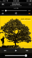
1) The Chameleon status bar! I'm sorry but I hate this and have no idea why Apple even introduced this. It looks so weird that it makes your eyes freak out and looks like the menu bars below it are washed out or something. Is it black? Is it blue? Is it white? Looks like all of them vomited together lol!
Before iOS 6 was released and in beta I would see screen shots and wonder what was wrong and even hypothesized that the white flash from screen shots was off by a frame or something and making the status bar look washed out lol. Point is it is weird and looks BAD and needs to go!
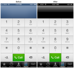
2) The new phone UI. Overall it is ok, but they are doing the ugly Chameleon thing again in the entry field on the top, and I don't like how the call button at the bottom is smaller than every other button.
I went to the effort of mocking up my simple solution to the phone UI design and how it could be improved as you can see below.
So with that, please chime in and share your likes or dislikes with iOS 6 and what you might tweak or change and how etc.
Have fun and thanks to all
(Shameless plug) I also wanted to let you all know about new videos touring Silicon Valley guided by TechChip (Steve Jobs' chipmunk best friend) hehe
http://www.youtube.com/user/TechnologyChip?feature=mhee
I got my new iPhone 5 a week ago and have been loving it and iOS 6!
There are a couple little details that I am not fond of however that I just thought I'd share for kicks:
1) The Chameleon status bar! I'm sorry but I hate this and have no idea why Apple even introduced this. It looks so weird that it makes your eyes freak out and looks like the menu bars below it are washed out or something. Is it black? Is it blue? Is it white? Looks like all of them vomited together lol!
Before iOS 6 was released and in beta I would see screen shots and wonder what was wrong and even hypothesized that the white flash from screen shots was off by a frame or something and making the status bar look washed out lol. Point is it is weird and looks BAD and needs to go!
2) The new phone UI. Overall it is ok, but they are doing the ugly Chameleon thing again in the entry field on the top, and I don't like how the call button at the bottom is smaller than every other button.
I went to the effort of mocking up my simple solution to the phone UI design and how it could be improved as you can see below.
So with that, please chime in and share your likes or dislikes with iOS 6 and what you might tweak or change and how etc.
Have fun and thanks to all
(Shameless plug) I also wanted to let you all know about new videos touring Silicon Valley guided by TechChip (Steve Jobs' chipmunk best friend) hehe
http://www.youtube.com/user/TechnologyChip?feature=mhee
Attachments
Last edited: