Become a MacRumors Supporter for $50/year with no ads, ability to filter front page stories, and private forums.
Take a look at this people
- Thread starter ionjohn
- Start date
- Sort by reaction score
You are using an out of date browser. It may not display this or other websites correctly.
You should upgrade or use an alternative browser.
You should upgrade or use an alternative browser.
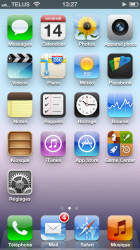
Now that's what i call iOS!
Add the ML dock, modify some icons and it's a deal!
That Gamecenter icon is awful, looks lie a 4-in-1 game pack.
It's also really inconsistent. Some have circles with zoom lines behind them, one is a phot of a flower, the weather icon gives an icorrect tempreture, some have slanted green lines and the other one is just aboring flat orange. And what's the deal with not all of them having that glare overlay?
They need to rework a lot of them.
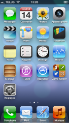
That Gamecenter icon is awful, looks lie a 4-in-1 game pack.
The one in iOS 7 isn't exactly good either.
That Gamecenter icon is awful, looks lie a 4-in-1 game pack.
It's still better than the one on ios 7

It's still better than the one on ios 7
It matches the interface and intent of the app; which is a social app, not a chess/dart/space/sports 4-in-1 app. Its pretty spot on except for the 3D effect on them.
Yeah gotta say I much prefer the icons and drop shadows on iOS 6. Flat barebones icons are not pleasing to the eye or brain. I think that if Apple is really set on this "simplicity" trend, they can still show some artisanship by creating more intricate, finely detailed icons.
Register on MacRumors! This sidebar will go away, and you'll see fewer ads.