Become a MacRumors Supporter for $50/year with no ads, ability to filter front page stories, and private forums.
IOS Beta 2 and Mail Settings
- Thread starter robwilson
- Start date
- Sort by reaction score
You are using an out of date browser. It may not display this or other websites correctly.
You should upgrade or use an alternative browser.
You should upgrade or use an alternative browser.
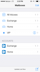
Anyone notice the Microsoft look???
Total honesty... The MS Icon on my phone for mail looks better than the iCloud icon...
Uh oh.

Well, Exchange and Outlook accounts are technically Microsoft based accounts, so it would make sense to use the latest Microsoft icons for those (just as the latest Yahoo! icon is used for Yahoo! Mail, and Gmail icon is used for Gmail, etc.).
Well, Exchange and Outlook accounts are technically Microsoft based accounts, so it would make sense to use the latest Microsoft icons for those (just as the latest Yahoo! icon is used for Yahoo! Mail, and Gmail icon is used for Gmail, etc.).
I think he's referring to the overall look of the screen. Not exactly the MS specific icons
But that's not really new/different in beta 2 though since it had that type of look in beta 1 already.I think he's referring to the overall look of the screen. Not exactly the MS specific icons
Last edited:
But that's not really new/different in beta 2 though since it had that type look in beta 1 already.
Maybe he's just noticing it now? xD
I think he's referring to the overall look of the screen. Not exactly the MS specific icons
If he is talking about the icons then they're not only MS specific.
The specific Yahoo and Gmail icons also show up.

Looks nifty! View attachment 419518
I didnt really notice it in the first beta. But it caught my eye in this one. It looks pretty clean.....
So, are we talking about the mail account icons? If so, those have always been there, they just get updated to their latest ones with some iOS updates.I didnt really notice it in the first beta. But it caught my eye in this one. It looks pretty clean.....
Register on MacRumors! This sidebar will go away, and you'll see fewer ads.