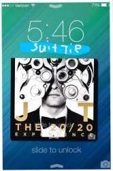
I don't like the new iOS 7 lock screen when music is playing. The black background and all the controls makes it look cluttered. Why have controls on the lock screen all the time when Control Center is just a swipe away and it has the same skip, previous, scrub and volume controls. Currently if your playing something and you want to go to your normal lock screen you have to pause the music in the control center anyways, if you pause it on the lock screen it just shows the controls and album artwork.
Here's my mockup (I made it on my iPhone, don't laugh)
The date disappears and shows the song title, slide up to control center and play, scrub etc. hit pause cover art disappears.
If people turned off control center on the lock screen when you slide up on lock screen it would just show the music controls not any quick settings or quick apps.
And on the iPhone 4 the slide to unlock text won't be covered anymore due to no controls.
Feel free to redo it on more professional software
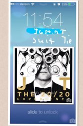
Attachments
Last edited:


")