Become a MacRumors Supporter for $50/year with no ads, ability to filter front page stories, and private forums.

dxyovak

macrumors newbie
Original poster
Jun 13, 2013
25
1
One thing I hate about the current iOS is those dumb dials they use to set the Alarm time and Calendar dates. It is so much more efficient to just be able to type the time instead of having to rotate those dials and stop it on the time you want.

Anyone trying out iOS 7, has Apple finally done away with this idiotic feature?
 
  • Like
Reactions: Sarah M

dxyovak

macrumors newbie
Original poster
Jun 13, 2013
25
1
Thanx Frederico Luna :)

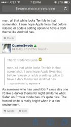
man, all that white looks Terrible in that screenshot. I sure hope Apple fixes that before release or adds a setting option to have a dark theme like Android has.
 

QuarterSwede

macrumors G3
Oct 1, 2005
9,781
2,031
Colorado Springs, CO
Thanx Frederico Luna :)

man, all that white looks Terrible in that screenshot. I sure hope Apple fixes that before release or adds a setting option to have a dark theme like Android has.
As someone who has used iOS 7 since day one I'd like a darker theme for night similar to what Safari on Private mode has. It's quite nice, minus the blue icons (I image they're turn them white before release). The frosted white is really bright when in a dim environment.
 

Attachments

  • image.jpg
    image.jpg
    156.3 KB · Views: 288

occollegeboi420

macrumors regular
Mar 2, 2013
180
0
Couldn't you just use the white on black accessibility feature and toggle it for times when you want it on?
 

dxyovak

macrumors newbie
Original poster
Jun 13, 2013
25
1
Couldn't you just use the white on black accessibility feature and toggle it for times when you want it on?

No, this doesn't work. The accessiblity feature distorts all the colors and makes everything look wierd. A dark theme is coordinated and uses colors that compliment eachother. The accessibility feature is a totally different experience and pretty much looks just as bad as the All White but in a different way. I think the accessibility feature is intended for users with visual impairment--so they don't see things all that great and need the accessibility affects. But it looks bad to normal users who have good vision.
 

aimee.elizabeth

Cancelled
Sep 28, 2012
369
0
I don't mind the dials tbh, and they've been a part of ios as long as I can remember. And I'm sure a lot of people would complain if Apple changed it to manual entering :p
 

PNutts

macrumors 601
Jul 24, 2008
4,874
357
Pacific Northwest, US
Sorry to admit it in this thread, but I think the dials are cool. With that said, I assume there is going to be more in the final release of iOS 7 instead of just the few black lines and numbers they have now. But who knows...
 

typeface

macrumors regular
Jul 6, 2013
137
0
Those "stupid dials" are called the "UIPickerView" in iOS, and are simple yet functional way of attributing data. Why would anyone want to type the time or date, when you can just whizz through many fields in just a few seconds with the flick of a finger?

If I gave you a mechanical egg timer, would you complain that you couldn't type in the desired time?
 

Gogurt48

macrumors 6502a
Jun 17, 2013
663
1
To me, the numbers on the dials in iOS 7 look like they're receding into the fog. The old dials at least looked like, well, dials.

Here they've ditched the skeuomorphism, but it's as if they couldn't figure out what to replace it with, so they didn't. They just left the numbers hanging in space as if they're attached to an invisible dial. In a foggy room. Strange indeed.
 

TyPod

macrumors 68000
Nov 2, 2006
1,745
18
Minneapolis, MN
man, all that white looks Terrible in that screenshot. I sure hope Apple fixes that before release or adds a setting option to have a dark theme like Android has.

Highly unlikely, but I would definitely dig it. All the white looks great on my white iPhone, but I don't know how it looks on a black iPhone 5.
 

typeface

macrumors regular
Jul 6, 2013
137
0
To me, the numbers on the dials in iOS 7 look like they're receding into the fog. The old dials at least looked like, well, dials.

Here they've ditched the skeuomorphism, but it's as if they couldn't figure out what to replace it with, so they didn't. They just left the numbers hanging in space as if they're attached to an invisible dial. In a foggy room. Strange indeed.

Do you want a bezel with big arrows around it, and a title saying "ENTER TEXT HERE ---> [______]" when you are editing it in a browser? The data in the new UIPickerView moves in wrapped, cylindrical manner, and behaves as one expects; do you need a big chrome bezel to shout "HEY! I'M A WHEEL, IN CASE YOU HADN'T REALISED - SPIN ME!" - of course not, because as iOS users, everyone is familiar with how this UI component works by now, and so they are refining by removing what is not required - you *know* to flick it, after all.
 

PNutts

macrumors 601
Jul 24, 2008
4,874
357
Pacific Northwest, US
To me, the numbers on the dials in iOS 7 look like they're receding into the fog. The old dials at least looked like, well, dials.

Here they've ditched the skeuomorphism, but it's as if they couldn't figure out what to replace it with, so they didn't. They just left the numbers hanging in space as if they're attached to an invisible dial. In a foggy room. Strange indeed.

Agreed. I hope that's not the final version.

Do you want a bezel with big arrows around it, and a title saying "ENTER TEXT HERE ---> [______]" when you are editing it in a browser? The data in the new UIPickerView moves in wrapped, cylindrical manner, and behaves as one expects; do you need a big chrome bezel to shout "HEY! I'M A WHEEL, IN CASE YOU HADN'T REALISED - SPIN ME!" - of course not, because as iOS users, everyone is familiar with how this UI component works by now, and so they are refining by removing what is not required - you *know* to flick it, after all.

I'm fairly confident that Apple intends to sell iOS devices to people that don't already know how to use them. The first time I saw these particular controls I stopped to look to see what to do. The visual effect is too subtle and will hopefully be "enhanced" by GM. The reason everyone and their dog can pick up and use iOS now is because of those visual cues: "I'm a cylinder, spin me hard."
 

typeface

macrumors regular
Jul 6, 2013
137
0
Agreed. I hope that's not the final version.


I'm fairly confident that Apple intends to sell iOS devices to people that don't already know how to use them. The first time I saw these particular controls I stopped to look to see what to do. The visual effect is too subtle and will hopefully be "enhanced" by GM. The reason everyone and their dog can pick up and use iOS now is because of those visual cues: "I'm a cylinder, spin me hard."

I can't imagine that even a wild chimpanzee would be unable to correlate the visual, wheel-like behaviour and the changing of the data contained therein, when it moved up/down one click...

(monkey thoughts follow - imagine screams and grunts):

"Finger move, wheel move... so... finger move, wheel go go up-down-up?" [beats chest with glee]

You say typing it in is "easier"? How?


Even in the static state, the way the text fades away around a cyclindrical form, kinda makes it obvious - this is called "affordance" in design terminology.
 

Gogurt48

macrumors 6502a
Jun 17, 2013
663
1
Do you want a bezel with big arrows around it, and a title saying "ENTER TEXT HERE ---> [______]" when you are editing it in a browser? The data in the new UIPickerView moves in wrapped, cylindrical manner, and behaves as one expects; do you need a big chrome bezel to shout "HEY! I'M A WHEEL, IN CASE YOU HADN'T REALISED - SPIN ME!" - of course not, because as iOS users, everyone is familiar with how this UI component works by now, and so they are refining by removing what is not required - you *know* to flick it, after all.

Oh yes, I know how to use it. I just think it looks strange. It's a skeuomorphic interface that's trying not to look like one. Personally, I think if it's going to behave like a dial, it should look like one, even if it's just a simple white dial. This is a place where a little skeuomorphism would enhance the interface. But because that's currently a no-no, we end up with disembodied numbers rotating around an invisible cylinder.

And referring to the screen capture that was posted above, let's be honest, it really would be quicker and easier to just type "21" and "34" on a numeric keypad than to spin the first wheel until you get to 21, invariably overshoot and back up, then do the same with the second wheel until you get to "34."
 
  • Like
Reactions: Sarah M

typeface

macrumors regular
Jul 6, 2013
137
0
Oh yes, I know how to use it. I just think it looks strange. It's a skeuomorphic interface that's trying not to look like one. Personally, I think if it's going to behave like a dial, it should look like one, even if it's just a simple white dial. This is a place where a little skeuomorphism would enhance the interface. But because that's currently a no-no, we end up with disembodied numbers rotating around an invisible cylinder.

Use once, learn once. Not so hard :)
 

Night Spring

macrumors G5
Jul 17, 2008
14,612
7,791
And referring to the screen capture that was posted above, let's be honest, it really would be quicker and easier to just type "21" and "34" on a numeric keypad than to spin the first wheel until you get to 21, invariably overshoot and back up, then do the same with the second wheel until you get to "34."

Exactly. My birthday is the 31st of a month. Whenever I come upon an online form that makes me scroll through a list of numbers to input my birthday instead of letting me type in the date, I want to scream. I can type 31 faster than I can scroll to 5, and having to scroll to 31... I really should have waited another 12 hours or so, and I would have been born on the first, so I don't have to scrol at all.
 
  • Like
Reactions: Sarah M

swingerofbirch

macrumors 68040
I can be critical, but I like the current dial in iOS 6 a lot. It's one of those things where the sound effects and animation are actually very practical and feel very natural. I like the clicking sound and how it slows down as the wheel is slowing down. I'm not sure if I would intuitively understand what the new dial was in iOS 7. Does it still click and move the same way?
 

8a22a

macrumors 6502a
Mar 9, 2012
990
4
Yorkshire, UK
I can be critical, but I like the current dial in iOS 6 a lot. It's one of those things where the sound effects and animation are actually very practical and feel very natural. I like the clicking sound and how it slows down as the wheel is slowing down. I'm not sure if I would intuitively understand what the new dial was in iOS 7. Does it still click and move the same way?

Yes, it has the same sound effects if you have keyboard clicks turned on. Personally I prefer a silent keyboard.
 

Tiptizzle

macrumors 6502
Apr 22, 2011
382
2
Those "stupid dials" are called the "UIPickerView" in iOS, and are simple yet functional way of attributing data. Why would anyone want to type the time or date, when you can just whizz through many fields in just a few seconds with the flick of a finger?

If I gave you a mechanical egg timer, would you complain that you couldn't type in the desired time?

If I gave you a telephone, would you complain that you can't scroll a wheel to input the numbers? Typing is faster. I don't have to scroll and wait for each number to stop before inputting the next number.
 
  • Like
Reactions: Sarah M

Gogurt48

macrumors 6502a
Jun 17, 2013
663
1
If I gave you a telephone, would you complain that you can't scroll a wheel to input the numbers? Typing is faster. I don't have to scroll and wait for each number to stop before inputting the next number.

I agree with you, as I mentioned above. However, there are a very few situations in which a wheel is actually faster. For example, an app that records your weight. If the dial defaults to your last weight reading, it's very fast and easy to move the dial one or two spaces to record your next reading:
 

Attachments

  • 2013-07-07 08.48.29.png
    2013-07-07 08.48.29.png
    87 KB · Views: 202
Register on MacRumors! This sidebar will go away, and you'll see fewer ads.