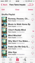
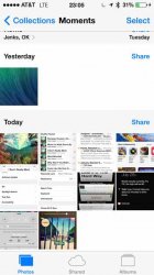
In the first image the centering of the words at the bottom annoys me.
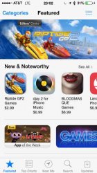
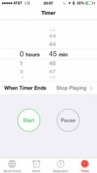
In the second there are just too many words at the top. Why is there "Back" text with an arrow. Sometimes there is just an arrow.
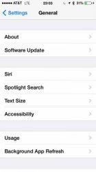
In the third image "Categories" and "Featured" just seems to close together. I don't like these larger words next to each other, might be ok for smaller words.
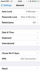
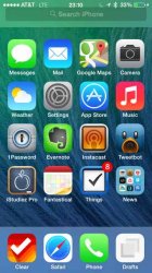
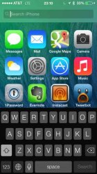
The last two images are under General Settings. Can anyone tell me the rationale for the grouping? I think it was similar in iOS 6.
I've got a lot more images I might upload as well. I also have some that I like that I will sure to post. I like some of added functionality in iOS 7, and don't mind all the "flatness" and whitespace, but some design choices are not consistent and I believe use incorrect placement of text.
Let me know your thoughts.
In the second there are just too many words at the top. Why is there "Back" text with an arrow. Sometimes there is just an arrow.
In the third image "Categories" and "Featured" just seems to close together. I don't like these larger words next to each other, might be ok for smaller words.
The last two images are under General Settings. Can anyone tell me the rationale for the grouping? I think it was similar in iOS 6.
I've got a lot more images I might upload as well. I also have some that I like that I will sure to post. I like some of added functionality in iOS 7, and don't mind all the "flatness" and whitespace, but some design choices are not consistent and I believe use incorrect placement of text.
Let me know your thoughts.