Become a MacRumors Supporter for $50/year with no ads, ability to filter front page stories, and private forums.
New Find My iPhone icon looks nice
- Thread starter Gogurt48
- Start date
- Sort by reaction score
You are using an out of date browser. It may not display this or other websites correctly.
You should upgrade or use an alternative browser.
You should upgrade or use an alternative browser.
you could have posted this in the same thread on the front page...this is just my honest opinion...
you could have posted this in the same thread on the front page...this is just my honest opinion...
Sorry, I don't read the front page, so I don't know what's there. This is the only forum in which I hang out, so if it's not here, I don't know about it.
Also, its not iOS 7 related.
Sure it is. The icon has been "flattened" and simplified to be consistent with the iOS 7 style.
Sure it is. The icon has been "flattened" and simplified to be consistent with the iOS 7 style.
Not to be a jerk, but if I created an iOS 6 app and made it a "flat" designed icon, it suddenly is iOS 7 related?
Not to be a jerk, but if I created an iOS 6 app and made it a "flat" designed icon, it suddenly is iOS 7 related?
No, but if you previously had a glossy, skeuomorphic iOS 6 icon and you flattened it, removed the gloss and simplified it in order to make it fit in better with iOS 7, then, yes, it would be iOS 7 related.
You realize they are just deconstructing the iOS 6 icons and removing the superfluous, but tasteful details? It really doesn't take much skill to take a design and strip it down. What was wrong with the map and bevel? Made it look more obvious and tactile. Flat is often a dumb trend.
You realize they are just deconstructing the iOS 6 icons and removing the superfluous, but tasteful details? It really doesn't take much skill to take a design and strip it down. What was wrong with the map and bevel? Made it look more obvious and tactile. Flat is often a dumb trend.
We'll, you wouldn't think so, but considering how badly the marketing department botched some of the other ones (Safari, Settings, etc.) I don't know. My point is that if you're going to simplify the Find My iPhone icon, this is about what it should look like. I wish the people who did this one would take a crack at some of the others.
Funny how most of the threads on this forum now consist of a million and 1 posts saying:
- It's a beta
- Wrong place to post
- Another thread, why not just put it in the other
- This isn't iOS 7 related
YAWN. . . . . . . .
- It's a beta
- Wrong place to post
- Another thread, why not just put it in the other
- This isn't iOS 7 related
YAWN. . . . . . . .
Was the Find My iPhone beta icon (for the beta that was released when iOS 7 beta 1 was released) the same?
Nope, it was still the old icon.
Was the Find My iPhone beta icon (for the beta that was released when iOS 7 beta 1 was released) the same?
It doesn't come with iOS, so I think it would be the same app everyone else downloaded.
Funny how most of the threads on this forum now consist of a million and 1 posts saying:
- It's a beta
- Wrong place to post
- Another thread, why not just put it in the other
- This isn't iOS 7 related
YAWN. . . . . . . .
You forgot:
- Haters gonna hate*
- Safari is snappier
* I despise that one... You sometimes get that from an insecure nerds when you are being objective and do not blindly like everything Apple does.
It doesn't come with iOS, so I think it would be the same app everyone else downloaded.
The app that could be downloaded wasn't working, so you had to install a beta version of Find My iPhone from the dev center to use it.
The icon for Find My iPhone beta was the same as the old Find My iPhone icon.
i like the icon however the design inside the app is still horrendously iOS 6. its awful!
No app at this time is allowed to show off their new design for iOS 7. They must be saved for after the release of iOS 7.
If any apps have shown their iOS 7 design, well, thats up to them - but you'll definitely see all of Apple's apps get an internal redesign between the GM and final public release of iOS 7.
I know that but I just don't understand why they didn't wait til iOS 7 had been released before updating it. Just shows inconsistency.
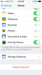
We have known what the icon looked like since beta 1 in the iCloud settings.
I think you'll find that that is still the old icon, not the new one. Notice how the new boarder is white, and the previous border is grey. The icon you posted there in iCloud Settings has a grey border, still.
Register on MacRumors! This sidebar will go away, and you'll see fewer ads.


