Become a MacRumors Supporter for $50/year with no ads, ability to filter front page stories, and private forums.
Am I Crazy, what does this symbol mean?
- Thread starter jayinla
- Start date
- Sort by reaction score
You are using an out of date browser. It may not display this or other websites correctly.
You should upgrade or use an alternative browser.
You should upgrade or use an alternative browser.
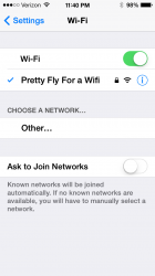
What is the blue circled i next to my wifi signal strength?
Touch it and it takes you to the settings for that Wi-Fi network. It used to be an arrow.
its a "more info/options" button. you can find it next to phone numbers or recent contacts in the messaging app too.
In OS7 (and many other things) "i" stands for "information". Pretty obvious I would have thought.")
I agree, if threadstarter would have touched the icon, he would have had his answer.
I agree, if threadstarter would have touched the icon, he would have had his answer.
But if he/she had touched the icon and found the answer, then how would he have had a chance to start a new thread???
Last edited:
In OS7 (and many other things) "i" stands for "information". Pretty obvious I would have thought.
Pretty sure it's a universal ISO 7001 symbol for information.
I'd say timid. Experiment and try things out. If you're worried that something catastrophic will happen then back up your device first.Am I Crazy
I'd say timid. Experiment and try things out. If you're worried that something catastrophic will happen then back up your device first.
If the device blows up then what ??
The icon may have been a self-destruct button. It's always best to check before pressing things.
Other than the reset all content and settings, I can't think of another button on an iDevice which would do such a thing.
Other than the reset all content and settings, I can't think of another button on an iDevice which would do such a thing.
According to some reports on the Internet, if you touch the home button on the 5S it scans your fingerprint and sends it to the NSA!
That's the trouble when you have a design that barely distinguishes interactive elements from non-interactive elements.
That is an excellent summation of my one over-arching complaint with the iOS 7 design language. Overall, I like iOS 7. I have a few iPad complaints that largely, I believe, stem from the iPad version being half-baked. And I have issues with the Music app on both the iPad and the iPod Touch/iPhone. But overall iOS 7 is attractive and functional. I kept two test devices on the beta from B3 forward, and I upgraded all the personal family devices as soon as Apple released the GM to developers.
But I've always thought that interactive and non-interactive elements should be clearly distinct. Flat is fine, but removing "touch target" circles and ovals from "buttons" and leaving simple text that is informational AND interactive doesn't strike me as good design.
But I still like iOS 7. (And I thought the circled-i symbol was clear enough.
)But if he/she had touched the icon and found the answer, then how would he have had a chance to start a new thread???
Actually if I didn't start the thread I wouldn't have had an opportunity to read, your smug, unneeded, sarcastic response. Cheers to you.
But if he/she had touched the icon and found the answer, then how would he have had a chance to start a new thread???
Just cause the original poster sees a symbol or icon does not necessarily mean you can touch it, and something will happen. Personally if I see an icon or symbol on ios7, my first instinct would not be to touch it. To me it would mean just to symbolize something.
I agree, if threadstarter would have touched the icon, he would have had his answer.
Who starts threads by trying to figure out things for themselves first? Half of these new threads can be googled in 15 seconds.
These are the same people who post a status update on Facebook for the sake of posting a status update.
Actually if I didn't start the thread I wouldn't have had an opportunity to read, your smug, unneeded, sarcastic response. Cheers to you.
You are indeed welcome. We aim to please.....
----------
Just cause the original poster sees a symbol or icon does not necessarily mean you can touch it, and something will happen. Personally if I see an icon or symbol on ios7, my first instinct would not be to touch it. To me it would mean just to symbolize something.
And what would be your second instinct??? Start a thread????
Register on MacRumors! This sidebar will go away, and you'll see fewer ads.