Become a MacRumors Supporter for $50/year with no ads, ability to filter front page stories, and private forums.

Pndrgnsvc

macrumors 6502
Original poster
Jun 13, 2008
452
26
Georgetown, Texas
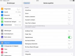
Apparently iOS 7.1 includes a new option to "Display Button Shapes".

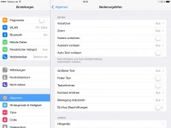
I have toggled the Button Shapes in Settings/Accessibility, but see no difference. Clearly, I am doing something wrong or not looking in the right place.

Might some kindly wizard or wizardess please help these old eyes?

Of course, screen shots will help.
 

petvas

macrumors 603
Jul 20, 2006
5,479
1,807
Munich, Germany
The attached pic shows a button.
 

Attachments

  • image.jpg
    image.jpg
    308.3 KB · Views: 557

Pndrgnsvc

macrumors 6502
Original poster
Jun 13, 2008
452
26
Georgetown, Texas
Petvas,

Many thanks for your prompt response. But alas, I see no difference regardless whether Button Shapes is enabled or not.

Please, might you be able to post a before & after screen shot?
 

andyw715

macrumors 68000
Oct 25, 2013
1,827
1,397
When Button Shapes is off, notice the "< General" button...its just text.
Now turn Button Shapes on, notice it looks more like a traditional button with gray background.
 

Altis

macrumors 68040
Sep 10, 2013
3,165
4,896
Upper left corner. Button. Grey.

It looks as though they put all of 1 minute of thought into it. The buttons used to look integrated... this is quite clearly not something they expect or want people to use.
 

petvas

macrumors 603
Jul 20, 2006
5,479
1,807
Munich, Germany
It looks as though they put all of 1 minute of thought into it. The buttons used to look integrated... this is quite clearly not something they expect or want people to use.

It's an afterthought, a reaction to the critics. Apple wasn't like that some years ago. I wish they stop reacting to people like that.
 

Patrick J

macrumors 65816
Mar 12, 2009
1,434
7
Oporto, Portugal
It's an afterthought, a reaction to the critics. Apple wasn't like that some years ago. I wish they stop reacting to people like that.

As Apple grows exponentially isn't is a natural evolution that eventually "Alienating the User Base" becomes an issue of some weight?

However, I totally agree with you that in iOS7 we are seeing a huge amount of option boxes, many to undo recent changes. Apple didn't use to be about options. They used to get it right.

This isn't getting it right.
 

numlock

macrumors 68000
Mar 13, 2006
1,590
88
It's an afterthought, a reaction to the critics. Apple wasn't like that some years ago. I wish they stop reacting to people like that.

so the hockey puck mouse would be going on 16 years old then

the apple you are thinking about would have released a better product to start with and if they add it on later it would be done better than anyone else (maybe hard to imagine with a button).
 

petvas

macrumors 603
Jul 20, 2006
5,479
1,807
Munich, Germany
so the hockey puck mouse would be going on 16 years old then

the apple you are thinking about would have released a better product to start with and if they add it on later it would be done better than anyone else (maybe hard to imagine with a button).

Apple has done worst in the past, even with Steve. Remember MobileMe?
I just want Apple to be about quality and to stop rushing products to the market.
iOS 7 has some great features, but also lots of challenges and inconsistencies.
 

C DM

macrumors Sandy Bridge
Oct 17, 2011
51,390
19,458
It looks as though they put all of 1 minute of thought into it. The buttons used to look integrated... this is quite clearly not something they expect or want people to use.
It's an afterthought, a reaction to the critics. Apple wasn't like that some years ago. I wish they stop reacting to people like that.
I don't think this is really there for looks or anything like that, like most Accessibility options, it's mainly there for people who have actual issues distinguishing things on the screen and this essentially simple shading would help them notice some things better.
 

Altis

macrumors 68040
Sep 10, 2013
3,165
4,896
I don't think this is really there for looks or anything like that, like most Accessibility options, it's mainly there for people who have actual issues distinguishing things on the screen and this essentially simple shading would help them notice some things better.

That's precisely what I mean. It's a shame that those who benefit from that (my parents likely will) get a bit of an eye sore as penalty for their accessibility needs.
 

C DM

macrumors Sandy Bridge
Oct 17, 2011
51,390
19,458
That's precisely what I mean. It's a shame that those who benefit from that (my parents likely will) get a bit of an eye sore as penalty for their accessibility needs.
I think those who really benefit from it (which are likely those that are beyond just somewhat older people but those who have actual visual impairments/issues) won't even notice or really care how polished it looks as long as it gives them the definition they were hoping to have (in fact, the polish that was there in iOS 6 and before with gloss and 3D effects sometimes could even make things a bit less clearer to people like that compared to just good shading that does the job well for those purposes). There's certainly a middle ground there too for those who want it and a slick looking device/interface, but primarily that's not quite what that option or others are really for in the end.
 

Altis

macrumors 68040
Sep 10, 2013
3,165
4,896
I think those who really benefit from it (which are likely those that are beyond just somewhat older people but those who have actual visual impairments/issues) won't even notice or really care how polished it looks as long as it gives them the definition they were hoping to have (in fact, the polish that was there in iOS 6 and before with gloss and 3D effects sometimes could even make things a bit less clearer to people like that compared to just good shading that does the job well for those purposes). There's certainly a middle ground there too for those who want it and a slick looking device/interface, but primarily that's not quite what that option or others are really for in the end.

I understand your view. I think it may have been deliberately unappealing so that people wouldn't use it.

Apple tends to do things properly if they are going to do them at all. No harm in making the accessibility options look like they were done right. ;)
 

C DM

macrumors Sandy Bridge
Oct 17, 2011
51,390
19,458
I understand your view. I think it may have been deliberately unappealing so that people wouldn't use it.

Apple tends to do things properly if they are going to do them at all. No harm in making the accessibility options look like they were done right. ;)
I understand what you mean as well, but accessibility items are somewhat different, and what's right for them (as far as actually addressing an accessibility need, which is their primary function) might not always or necessarily be something that would be aesthetically pleasing or "nice" to others who are not really affected by some impairment/limitation that the accessibility setting is really there to address. For example, high contrast or inverted colors don't really look right/good to most people, but for those who actually need them they are much better than the more aesthetically pleasing (in general) regular colors/contrast.
 
Register on MacRumors! This sidebar will go away, and you'll see fewer ads.