Become a MacRumors Supporter for $50/year with no ads, ability to filter front page stories, and private forums.
Status
Not open for further replies.

Sean7512

macrumors 6502a
Original poster
Jun 8, 2005
854
37
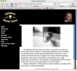
Well, I have finally finished my first real website for a client. We made it in my web design class as a group. I was one of the three programmers, and there were other graphic artists.

http://home.comcast.net/~sean7512/

That is the temporary url of the site. Opinions, opinions, Please! The site will be on a real host with a real url, but we haven't bought the webspace or the domain name yet.

Note: To Safari users, unfortunately the Java menu won't work properly in Safari, but no fears...there is an option to switch to a different menu and all is good :D
 

steelphantom

macrumors 6502a
Oct 15, 2005
555
1
It's not too bad, but I would suggest not using that iFrame for the content area. It would probably be best if you made it part of the physical page instead, possibly taking up the entire right side. Right now, the lady in the top right corner (the dentist?) seems randomly placed, and probably doesn't need to be there. The whole black bar on top, including the dentist's picture, could be scrapped. Just fix a few little things like this, and the site should look very nice! Good luck.
 

Peyton

macrumors 68000
Feb 2, 2006
1,615
0
I am biased to websites being CENTERED. It keeps them from looking weird on really large screens, and just in general.

The woman's face (or man's face) in the top left is SCARY. if that is the doctor or whoever, I would be afraid to have her do anything to me. I don't know, give the photo more of a background, heck get a picture of an office, and photoshop her into it.

Put the pictures of the left, or on the right, so that the text is beside them. Dress up the text font so it doesn't look like it was copied and pasted out of 'wordpad'

Just my opinions
 

devilot

Moderator emeritus
May 1, 2005
15,584
1
The picture of the woman's head 'floating' in space sort of freaks me out. :eek: And I'm not sure if it's meant to look like this or not, but I'm not very fond of the slight overlap of the black 'menu' onto that main white area (where the links are on the left hand side).
 

Attachments

  • Picture 1.png
    Picture 1.png
    180.7 KB · Views: 128

Peyton

macrumors 68000
Feb 2, 2006
1,615
0
You came to the right place for unsatisfiable computer critique...for sure.
 

Sean7512

macrumors 6502a
Original poster
Jun 8, 2005
854
37
Thanks for the replies. Yes, we all agree that the pic on the top is HORRIBLE; however, the doctor wants the picture to be there so we can't do much about it.

The other opinions are really good, keep them coming please. Thanks!
 

Sean7512

macrumors 6502a
Original poster
Jun 8, 2005
854
37
devilot said:
The picture of the woman's head 'floating' in space sort of freaks me out. :eek: And I'm not sure if it's meant to look like this or not, but I'm not very fond of the slight overlap of the black 'menu' onto that main white area (where the links are on the left hand side).

hmm...what browser are you using?? That is the first encounter that we have had with that. That is really odd.
 

devilot

Moderator emeritus
May 1, 2005
15,584
1
Sean7512 said:
hmm...what browser are you using?? That is the first encounter that we have had with that. That is really odd.
Camino Mozilla v 1.0. Yeah, I thought that that screen shot might be more effective than my poor attempt to write what I was seeing. :eek:
 

Sean7512

macrumors 6502a
Original poster
Jun 8, 2005
854
37
What happens if you make your browser window wider? Does the side move out with it? That is just a table set by percent. We tried using fixed pixels, but unfortunately IE for windows was having some terrible difficulties.
 

devilot

Moderator emeritus
May 1, 2005
15,584
1
Sean7512 said:
What happens if you make your browser window wider? Does the side move out with it?
Yeah, if I force my browser window to be larger, then it behaves. :D
 

Sean7512

macrumors 6502a
Original poster
Jun 8, 2005
854
37
ChicoWeb said:
Why three programmers??

Because it was a class project, and everyone had to be involved in one way or another. I think the professor wanted us to be able to work as a team and keep communicating even when we weren't in class.
 

desenso

macrumors 6502a
May 25, 2005
797
1
Have you ever bought a black tube of toothpaste?

Considering this is one of your first sites, I think that overall it's quite good. Here are a few suggestions:

1) Why the frame? Go and look at you favorite 5 sites in terms of design and count how many of them use frames / iframes. My guess would be 0.

2) The color choice is perplexing. When was the last time you bought an all-black tube of toothpaste, or a tube of black toothpaste? When I think of dentistry (and all its grinding and painful tools), I don't really want the color black to be assosiacted with it. When combined with dentistry, it makes me thing of pain, death, and rotting teeth. It's also rare to find corporate websites in black, and there's a good reason why.

3) Remove the floating head. As others have pointed out, it's totally inappropriate. I'm sure she has another picture of herself, in her work environment, that looks much more friendly. It just doesn't work, and should be removed asap.

4) Make the forms PDF. You're on the mac forums, so I assume you have a mac, which means this should be quite easy. The way they are at the moment is terrible.. plus as a PDF you could combine both pages.

5) I'm not a fan of hover menus on websites because 99.9% of them don't work well. Sadly, yours fall into that group... dont' be disheartened though, I've only ever seeon one that works properly. If you insist on keeping them because you feel they're impressive, then at least be consistent - why can I click on the Services "hover" link and get a page, but not the 'Care of Your Teeth' links? It's inconsistent and confusing. Navigating the site is a challenge.

6) Did you design the logo? It's a bit strange - not necessarily bad, just strange. I can't tell if those are cannons, snails, or or what. Will they use that logo at their offices? I see on the staff page that they have a sign on their office building - it's kind of quaint and old-school. Perhaps you should consider working that into your webpage. I'm not saying the logo is bad, but I wonder if it's appropriate to redesign a logo for the webpage only?

I hope I don't sound overly critical. There are many things about the site that are good - text-size, consistent use of colors, etc. My biggest concern is not that you've designed a bad site, but that it might be more appropriate for a rock band, not a dentist's office. A website needs to be consistent with the company's profile, and from what I can gather from the pictures, their first choice when it comes to a color scheme probably wouldn't have been black and gold. I could be wrong.

Anyways, keep up the good work. You'll be surprised how quickly you improve your own skills.
 

Sean7512

macrumors 6502a
Original poster
Jun 8, 2005
854
37
desenso said:
1) Why the frame? Go and look at you favorite 5 sites in terms of design and count how many of them use frames / iframes. My guess would be 0.

2) The color choice is perplexing. When was the last time you bought an all-black tube of toothpaste, or a tube of black toothpaste? When I think of dentistry (and all its grinding and painful tools), I don't really want the color black to be assosiacted with it. When combined with dentistry, it makes me thing of pain, death, and rotting teeth. It's also rare to find corporate websites in black, and there's a good reason why.

3) Remove the floating head. As others have pointed out, it's totally inappropriate. I'm sure she has another picture of herself, in her work environment, that looks much more friendly. It just doesn't work, and should be removed asap.

4) Make the forms PDF. You're on the mac forums, so I assume you have a mac, which means this should be quite easy. The way they are at the moment is terrible.. plus as a PDF you could combine both pages.

5) I'm not a fan of hover menus on websites because 99.9% of them don't work well. Sadly, yours fall into that group... dont' be disheartened though, I've only ever seeon one that works properly. If you insist on keeping them because you feel they're impressive, then at least be consistent - why can I click on the Services "hover" link and get a page, but not the 'Care of Your Teeth' links? It's inconsistent and confusing. Navigating the site is a challenge.

6) Did you design the logo? It's a bit strange - not necessarily bad, just strange. I can't tell if those are cannons, snails, or or what. Will they use that logo at their offices? I see on the staff page that they have a sign on their office building - it's kind of quaint and old-school. Perhaps you should consider working that into your webpage. I'm not saying the logo is bad, but I wonder if it's appropriate to redesign a logo for the webpage only?

I hope I don't sound overly critical. There are many things about the site that are good - text-size, consistent use of colors, etc. My biggest concern is not that you've designed a bad site, but that it might be more appropriate for a rock band, not a dentist's office. A website needs to be consistent with the company's profile, and from what I can gather from the pictures, their first choice when it comes to a color scheme probably wouldn't have been black and gold. I could be wrong.

1. I'm not sure exactly why we agreed on the iframe. I think it was just the only way that we knew how to make the site appear in the right side

2. Yes, I agree, black is bad. We had many fights over the color of the site. In the end, the Graphic Artists got their way because they are soo smart :rolleyes:

3. I will look into a more "friendly" head picture.

4. We originally had the forms in PDF, but they weighed in at an insane 11mb :eek: is there anyway to compress them to a more reasonable size?

5. Good points on the menu. I do not remember why we used the hover menu to be honest. Yes, it does not work properly, but at least we didn't render the site useless and did include an alternate navigation system. I absolutely understand what you are saying though

6. No, the logo on the website is their logo 100%. It is on all of their paperwork, business cards, etc.

No, you do not sound overly critical. I asked for opinions and opinions I received, thanks a lot. I am only a freshman in college, so I obviously am not that great at websites yet.

I am working on a new website for our college hockey team as the guy in charge now is graduating. It needs to be done by July, so I will be taking all of these recommendations to make a hopefully better website.

Thanks again, I am loving these opinions.

EDIT:
Of course I am using a Mac :) We are using Dreamweaver for the site. We are not using it as "Drag and Drop" though, but all coding. Another note on the menu, it originally worked with EVERY browser, then when we arranged everything into a table, the menu mysteriously stopped working with Safari and IE for Mac, strange! Unfortunately, we did not have time to step through the Safari build of the .js file.
 

Oryan

macrumors 6502a
Apr 1, 2005
595
0
Lincoln, NE
Sean7512 said:
1. I'm not sure exactly why we agreed on the iframe. I think it was just the only way that we knew how to make the site appear in the right side
Just use a table with two columns. Set a width for each column and you'll be good to go.

Sean7512 said:
3. I will look into a more "friendly" head picture.
She is scary!


Also, try to put the directions in your own words instead of copying Mapquest. They are very difficult to read. A map would be better.
 

desenso

macrumors 6502a
May 25, 2005
797
1
Oryan said:
Just use a table with two columns. Set a width for each column and you'll be good to go.

I hate to disagree but.. please do NOT use a table. This simply perpetuates the lazy design technique of using tables for an unintended purpose. I know that a lot of table bashing goes on and some of the people are just jumping on the bandwagon, but aside from the fact that it doesn't promote the use of good web standards, it's actually significantly easier to modify and work with a CSS layout.

I suggest that anyone looking for more information on how to work with CSS layouts reads this article: http://www.alistapart.com/articles/holygrail
 

x704

macrumors regular
Apr 15, 2006
118
0
I agree with using CSS as much as you can for the layout, but sometimes you can't always use CSS because of IE. In my website http://www.wneary.com (my first website too) I was forced to use a table for the top row of buttons and have the space to the right of them without it looking bad in every browser. It looks like CSS 3 will fix that.

It's kinda sad that so many websites will break once vista comes out (if they implement the standards)

But learn CSS, it's the future of web development.
 

thejadedmonkey

macrumors G3
May 28, 2005
9,180
3,330
Pennsylvania
That's about a zillion times better than my first sites...
Lose the iFrame though. I think if you lost the iFrame the colors might even flow better. Anyway, I'm assuming you have something like this...
Code:
<iframe src="page.html" align="right"></iframe>
Instead try this...
Code:
<div align="right">content of page.htm would go here...</div>
Obviously there's a lot more, but that's the basic.
Also, you can cut down on page size by getting rid of all the OnMouseOver and OnMouseOut and replacing it with CSS (index1.htm). This would go in the head...
Code:
<style type="text/css">
a:link, a:active, a:visited {color:#9c8431;}
a:hover {color:#FFFFFF;}
</style>
P.S. Upon looking at your code, I see you already have some CSS. so throw that into the styles.css file. If you need to, give it a class, and then give the menu a class so it only effects the menu.

And a site map is an excellent idea for apple, ford, or GE, but superfluous for a site that has a link to every page in the menu (IMO).
 

desenso

macrumors 6502a
May 25, 2005
797
1
x704 said:
I agree with using CSS as much as you can for the layout, but sometimes you can't always use CSS because of IE. In my website http://www.wneary.com (my first website too) I was forced to use a table for the top row of buttons and have the space to the right of them without it looking bad in every browser. It looks like CSS 3 will fix that.

It's kinda sad that so many websites will break once vista comes out (if they implement the standards)

But learn CSS, it's the future of web development.

Your navigation bar is easily achieved using CSS in a fashion that would work in IE. Try this link, for starters:
http://www.456bereastreet.com/archive/200501/turning_a_list_into_a_navigation_bar/
 

dogbone

macrumors 68020
I'm sorry to say this but in my opinion this site is a good candidate for http://www.webpagesthatsuck.com/

I can't find any redeeming features at all. If I came across a site like this while looking for a dental service I would immediately go elsewhere. But that's just me I'm very sensitive to bad design and I would extrapolate this to infer that the practitioners are equally cruddy.

White type on a black background: Unpleasant.

Floating Zombie Head®: Wierd

The hotlinks are inconsistent. Some bring up other info (services, care of your teeth) and others don't.: Confusing

The black notch in the white box: Ugly

Site Map: on such a simple site it is a tacit admission of failure. IMO the site map and logo alone would drive off less customers.

Some of the words are being cut off by the strange black bit in the frame.

The photos are really really boring and are not consistent: All the b/w shots have a completely different feel.

I've done a quick bit of something on the toothbrush shot as a sample. It's nothing special but anything is an improvement.
 

Attachments

  • toothbrush.jpg
    toothbrush.jpg
    6.4 KB · Views: 150

desenso

macrumors 6502a
May 25, 2005
797
1
x704 said:
Thanks, I figured there was only one way; the way I used a table. However I don't know of a pure CSS way to do exactly what I want. At any rate thanks for your info.

Are you still unsure of how to achieve it using CSS only? If so, I'd be happy to show you, as it's not very complicated at all..
 
Status
Not open for further replies.
Register on MacRumors! This sidebar will go away, and you'll see fewer ads.