Become a MacRumors Supporter for $50/year with no ads, ability to filter front page stories, and private forums.

bluetooth

macrumors 6502a
Original poster
May 1, 2007
662
1
Toronto
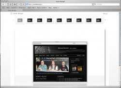
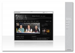
Working on updating my Portfolio. I have two layouts. The first has a side bar with info - there was a portfolio on here with a similiar sidebar that gave me some inspiration for that concept.

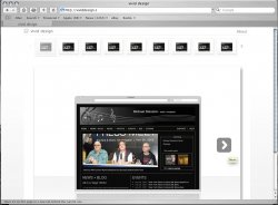
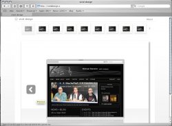
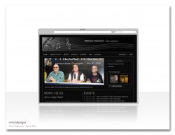
The second is a lot simpler and just has my logo with Client and Media.

I think I am leaning towards the latter as it is nice and clean and simple but wanted some opinions on how it looks or any suggestions.

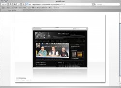
The website was just a piece I pulled from my portfolio - the majority will be print media (flyers/posters/brochures/banners etc.)

Cool.
 

Attachments

  • page18c2.jpg
    page18c2.jpg
    243.8 KB · Views: 195
  • page18c3.jpg
    page18c3.jpg
    233.1 KB · Views: 142

LeviG

macrumors 65816
Nov 6, 2006
1,277
3
Norfolk, UK
personally I like the simplicity of the all white one but I also think its too simple, a user has to be able to figure out how to work the site, ie moving to the next example page, something clearly defined by the two triangles on the grey edged one.
 

oscuh

macrumors 6502
Apr 27, 2007
314
0
Michigan
Initially I was like "what sidebar?" and then I saw it hiding off to the right there. So, therefore, no sidebar gets my vote!
 

bluetooth

macrumors 6502a
Original poster
May 1, 2007
662
1
Toronto
personally I like the simplicity of the all white one but I also think its too simple, a user has to be able to figure out how to work the site, ie moving to the next example page, something clearly defined by the two triangles on the grey edged one.

Yes, good point. I am planning on having a row of thumbs above the page of all work in that category. I am also thinking of having a larger triangle on the right side of the page pop up when you move your mouse over the right side of the page. And a "back" triangle pop up when you move your mouse over the left side of the page.
 

LeviG

macrumors 65816
Nov 6, 2006
1,277
3
Norfolk, UK
Yes, good point. I am planning on having a row of thumbs above the page of all work in that category. I am also thinking of having a larger triangle on the right side of the page pop up when you move your mouse over the right side of the page. And a "back" triangle pop up when you move your mouse over the left side of the page.

think about the user experience, the design can come second, someone who isnt tech savvy will probably just close the window down if they have to go hunting for bits.

Also wouldnt it affect the design having the menu over the top anyways so it might be worth knocking up a quick photoshop of the overall design with the top menu, you might not like the design overall :)
 

bluetooth

macrumors 6502a
Original poster
May 1, 2007
662
1
Toronto
I attached a couple of the layouts to give you a clearer idea...let me know what you think.

thanks.
 

Attachments

  • Picture-1.jpg
    Picture-1.jpg
    214.8 KB · Views: 92
  • Picture-2.jpg
    Picture-2.jpg
    220.3 KB · Views: 86
  • Picture-3.jpg
    Picture-3.jpg
    213.3 KB · Views: 75
  • Picture-4.jpg
    Picture-4.jpg
    195.6 KB · Views: 78

LeviG

macrumors 65816
Nov 6, 2006
1,277
3
Norfolk, UK
Yeah not too bad, maybe consider lightening the top images till you run a mouse over or something, just so they're not so distracting if you have a darker page.

Also in my opinion the arrows are too dark and distract from the rest of the page, maybe look at reversing the colours so the arrow is grey and the surround is white or going for a paler shade, similar to the menu bar design in the first group.
 

chaos86

macrumors 65816
Sep 11, 2003
1,006
7
127.0.0.1
the smallest inner measurments of any browser on any platform at 800x600 is 755x400. I think it was IE5 on windows with all the toolbars and crap on.

If you want to design a website that will fit in everyones browsers (including the less tech-savvy office workers and who have low res screens and the startbar showing and google toolbars etc), then it must fit into those dimensions.

11% still use 800x600 or less. (http://www.thecounter.com/stats/2007/June/browser.php)
 
Register on MacRumors! This sidebar will go away, and you'll see fewer ads.