Become a MacRumors Supporter for $50/year with no ads, ability to filter front page stories, and private forums.

Earendil

macrumors 68000
Original poster
Oct 27, 2003
1,567
25
Washington
But go easy, I'm a Photographer, but my major is computer science ;-)

I'm somewhat set on the image background, as it really applies to the area that I'm working in. I'm shooting entirely none team based sports photos for people (windsurfing, Mt. Biking, etc). Also, this is a really informal "company", and my first card. I'm making the card mostly because every so often I've had to write my info on a piece of paper for someone, and would love to just hand them a card.

However, as far as design goes, I don't know how the set up "feels", or how to make it feel any better. Thoughts on font/spacing contrast/fading of background image, and drop shadows would be greatly appreciated. Or on anything else that comes to mind.

Sometimes when you work with an image long enough your brain can fill in the details that others can not see. So I'm looking for a fresh perspective :)

Thanks everyone!

~Tyler

ps
even now I'm thinking I need to pull the info away from the edges a bit...
 

puckhead193

macrumors G3
May 25, 2004
9,570
852
NY
If i saw your card, i wouldn't think of the sports you mentioned b/c of the background... but that's just me. :eek:
 

mariahlullaby

macrumors 6502a
Jan 19, 2005
852
3
NYC
1) I hope that isn't your real cell on the card, otherwise take it off to protect yourself.
2) I'd add your full name somewhere on that card, as well as perhaps some of the specialized services you offer
3) Design-wise, a simple B&W approach can be great, but I feel like yours looks more just monochromatic. I'd make the contrast on the photo a lot sharper/bolder colors. Then write the text in white with a little drop shadow to stand out.

Good luck!
 

tyr2

macrumors 6502a
May 6, 2006
826
217
Leeds, UK
I'd ease up on the drop shadows a bit, especially on the text at the bottom.

Perhaps a non-italic font for the text at the bottom.
 

LeviG

macrumors 65816
Nov 6, 2006
1,277
3
Norfolk, UK
same as everyone else really in that, wouldn't associate the imagery with the work.

colour scheme and text is difficult to read in some areas.

personally speaking as well, I would loose the smugmug address and buy a domain name, worst case scenario just do a hidden redirect to the smugmug address but the smugmug would put me off using you.
needs your name too
 

flowagner

macrumors member
Jun 1, 2007
80
0
Vienna, Austria
no offense dude but this card looks really amateurish. not professional at all. but yeah you asked for constructive critics to make your card somewhat better, so here are my tips for you:

- drop the bg photo
because it is much too distracting to have two focus points. it's either data or image but seldomy both. that is why business exectuves have these boring business cards with plain text only ... you just see the plain data without any distractions.

- use other fonts
arial looks so boring in print. it really does ... everybody is using it and you certainly do not want to give the impression that you are nobody special. you are an artist, someone who has to see the subtileness in fonts and how they fit. if you want to try something more conservative, try the frutiger font. if you feel like retro take helvetica and play around a bit with character spacing etc... it just gives the whole thing a better identity.

- design it
you just have to figure out how the business card will affect people. perhaps somebody will just stick it in their briefcase and pull it out two months later and has absolutely no clue what it's all about. with a unique, professional design you definetly can make a big impression. people will like looking at your business card ... it kinda works like advertising - at best, ask a communication student about how to get the best effect out of it. they usually got (at least over here) better knowledge about how to market images than media designers.

- design a logo
this goes hand in hand with the point i just tried to explain. the purpose of a business card is that people remember you. but yeah, it's even better when people remember you in a positive way when looking at your card. a good logo should be created carefully ... perhaps with a good designer at hand.

- and last but not least
the card just does not say anything about you. if i would see this card i would (honestly) throw it away because there is simply no information on it. no name, no address and even the whole purpose of your business is missing. data you should include:
* your name - as a reference. because people need a personal reference to a company / photo dude whatever. it just gives a better impression of yourself. additionally they just need to know whom to call.
* your address - because people will perhaps send over stuff and won't want to take notes when they ask you about your address. give it to them beforehand. it's very important that your customer knows you welcome him.
* email and website - this should be obvious but please if you are planning on doing this professionally, get a unique url. no subdomain. like http://www.tylerzuck.com or something like this. looks more professional and gives a good impression.
* mobile number (obvious aswell)

you see, there's a little more to consider :) anyways, i wish you all the best, keep your head up ... it's not that hard.

greets.
 

Leareth

macrumors 68000
Nov 11, 2004
1,569
6
Vancouver
Different Font

No drop shadows

No italics - unless the font deserves, this one does not.

contrast the image more , or fade it out a little so it does not clash with the text.

get a better website name. anything free or subdomain not related to your field , I just toss out - if you cant spend $20 to carve out a niche and show you are serious I don't want to deal with you for what ever service.

same with email - I am hesitant to contact people who use gmail/hotmail/yahoo. get one with your website.
 

blackstone

macrumors regular
Dec 12, 2005
213
0
Washington, DC
I agree with everyone else who has said you have to get your own domain name (for both web and e-mail addresses) and put your name and address on the card. Without those things, my first impulse to assume that you are a 14-year old operating out of your mom's basement.

As for the background photo, I also do not see the relevance to mountain biking, windsurfing, or other sports. At first, I thought it was a series of fire towers, but then I looked closer and saw it was a bridge. Either way, the connection is pretty unclear. Feel free to have a background photo in there -- but make sure it is clearly connected to your sports photography focus. Also, it would be a good idea to keep the photo from covering the entire area of the business card. Maybe have it run as a strip (letterbox style) across the middle of the card, and put the text above and below it? That way you don't have to rely on the heavy drop shadows to distinguish the text from the background.

As for the fonts, you should probably stick to one font, rather than trying to mix-and-match -- Papyrus and Arial don't go so well with each other. Also, if you'd like a clean sans serif font, I'd suggest Helvetica or Univers, both of which have much nicer proportions than Arial.

Good luck!
 

joshuastree

macrumors newbie
May 23, 2007
3
0
Drop that background!

Definitely listen to what others are saying about this. It says nothing about your business and makes the card difficult to read.
 

djbahdow01

macrumors 6502a
Jan 19, 2004
569
0
Northeast, CT
* email and website - this should be obvious but please if you are planning on doing this professionally, get a unique url. no subdomain. like http://www.tylerzuck.com or something like this. looks more professional and gives a good impression.

You can always redirect the unique URL to your smugmug account as well fi you don't have time to design a portfolio site.

As for the business card its simple which is good, but I'm not thinking sports photography with the image in the background. If anything put an image on the front/back of the card. With your information on the other side. That is if you are getting them printed anyways. This way you can do a glossy image on one side and your info in 1 color on the back. It might be a little more but if you are really getting into the business you want to look good. First impressions are the biggest seller, and if you really want to grab somebody you want to put a great sports image for your card.

Also if you have an image that is vertical you can always do a vertical business card.

After giving you a critique i need to get my photography business card set up. I keep using my graphic design card, granted it goes to my portfolio of both but i do need to show off some work to make people go to my site.
 

elppa

macrumors 68040
Nov 26, 2003
3,233
151
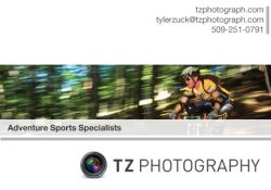
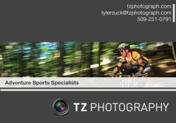
How about something like this?

Obviously I have used the Aperture logo as a placeholder for your company logo:
 

Attachments

  • tz.png
    tz.png
    107.1 KB · Views: 96
  • tz2.png
    tz2.png
    106.7 KB · Views: 106

imac/cheese

macrumors 6502a
Jun 7, 2007
555
2
As a photographer, you need to make sure the image you put forth on your business card portrays your ability. the photo you have chosen looks like a good one, but with the way the text is placed, it took me a few moments to even see what was in the photo. Your website address really covers up the bridge and makes it hard to deteminre what I am looking at.
 

Earendil

macrumors 68000
Original poster
Oct 27, 2003
1,567
25
Washington
just say no to papyrus

To Dornoforpuros and the rest...
wow.

Thanks for the advice guys, I didn't realize quite how extremely inadequate my own views were ;-)

While I appreciate every single piece of advice, and am writing down most of it, and book marking this thread, I feel that some didn't take my serious on some of my points, while others were misunderstood.
I am in no way starting an official business. I have a (more than) full time job testing and writing software, with photography on the side. I've considering going a little more pro, and have been the 2nd photog at a wedding. But honestly I don't have the time to commit to something like that, nor do I feel I have all the skills required for it.

Here is the way shop is set up so far. At events (or windy days) I go out and shoot photos, mostly for fun. Those that I get pictures of are away that I am taking them, and are given my website. If they like anything they see, they may purchase a photo. Handing them my web address on a card would be a huge step up ::cool:

That said, I have full intentions of getting my own domain. However it will be forwarded to smugmug because I do not have the skills or time to manage my own site.

*I can't believe I forgot to put my name on the card :rolleyes:

*I do think the background image is distracting. But I was wrestling (as a photographer) with the idea of printing any sort of image EVEN smaller. However I think I can come to grips with it.

*Different fonts, check :)

*A logo I'll look into. My sister is going into graphics design, maybe she can whip me up something unique.

*My physical address is an interesting concept, being a university student. While I know the address for a physical location can put the costumer at ease, I think it would put me at even more ease if they didn't know. having them just contact me and asked for a good address, and what they plan on sending me sounds like a better idea with my intended services.

I think at this point I'm going to ditch the background image all together, and find 3 different photos to place on one side, maybe pull off an OOB effect, and put my info on the other side. The photo of the bridge and mountain are highly recognizable landmarks out here. They represent the windsurfing capital of the world for those that are into the sport. And a dozen or so sports exist between the river and Mt. Hood. My thought was that anyone in the area to relate my card to the Gorge.

> Elppa
I really like that design, as simple as it is.
I think one of my problems is that I haven't seen too many business cards, and the ones I have are very...white. Company logo, black text, period. Doesn't suit me.

I'll work on another one and maybe I'll have the courage to come back here and see if anyone is willing to take another look :eek:

~Tyler

ps
blackstone said:
Without those things, my first impulse to assume that you are a 14-year old operating out of your mom's basement.

Funny story there. I do live in my Mom's basement, however I'm 22. My parents happen to live near where I have my internship working with robotic aircraft. They have a heluva basement, great food and free internet. My pride isn't so great to refuse that ;-)
 

Earendil

macrumors 68000
Original poster
Oct 27, 2003
1,567
25
Washington
As a photographer, you need to make sure the image you put forth on your business card portrays your ability. the photo you have chosen looks like a good one, but with the way the text is placed, it took me a few moments to even see what was in the photo. Your website address really covers up the bridge and makes it hard to deteminre what I am looking at.

I was afraid of just that sort of thing, which is why I came here. Damn the human brain for filling in details it knows are there. Knowing the scene and the original photo, even with the text it's painfully obvious to me what it is. Thanks for affirming my suspicions.
 

elppa

macrumors 68040
Nov 26, 2003
3,233
151
Just a thought.

Nothing stopping you having a picture on one side and the details on the back.

I think the double sided printing would add to the cost though.

It would solve the problem of wanting to have an image without clutter.
 

one3

macrumors regular
Aug 13, 2004
186
1
Vancouver-ish
Just a thought.

Nothing stopping you having a picture on one side and the details on the back.

I think the double sided printing would add to the cost though.

It would solve the problem of wanting to have an image without clutter.

That's a good thought :) I was going to suggest similar.
Depending on how many cards and your budget you can even have different photos printed but keeping the back info the same. I know my local small scale printer can print out a 8.5x11" page of business cards on their digital printer and then cut to size - the point being is that you can fit about 8 cards per page and if they are printing a page at a time you can have 8 different photos on one side of the card. You have to be smart in laying it out so proper trimming and alignment comes through - but it's a thought.
 

wongulous

macrumors 6502a
Dec 7, 2002
952
2
My heart sank when I read the OP's first post, but as I read on, and my initial criticisms were echoed in following posts, and a good example or two of design were heard, I began to feel better... but I just want to assure the original poster that any business card remotely like the one first shown would serve no purpose, because no one would want to contact an amateur; you'd be doing yourself a disservice.

Remember, let the photo speak by using composition and whitespace to draw attention, using simple typefaces to not detract, and avoiding gee-whiz effects that compound problems instead of solving them.
 

Jimmieboy

macrumors 6502
Oct 30, 2005
297
0
Australia
I like the idea of the proposed business card by elppa. Your lacks in having some kind of punch line, though that isn't the correct word. It has nothing about what you do. Obviously photograpgy, but elppa had "Adventures sports photography', which just seems to make it a whole lot more appealing in my opinion.
 
Register on MacRumors! This sidebar will go away, and you'll see fewer ads.