Become a MacRumors Supporter for $50/year with no ads, ability to filter front page stories, and private forums.

bluetooth

macrumors 6502a
Original poster
May 1, 2007
662
1
Toronto
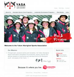
attached is an initial mock up for a web design I am doing. the client is the YASA youth-aboriginal-sports-association. sort of like a YMCA for aboriginals (learning and development, fun and fitness).

the colours are red, white and black. the client requested these colours be used in the template.

the client also requested that the homepage just be like a splash page, but with a menu for navigation. they do not want any text or info on the homepage, visual with menu/navigation is the request.

let me know your thoughts?
 

bluetooth

macrumors 6502a
Original poster
May 1, 2007
662
1
Toronto
yeah, I know the thumb appears really bright, but when you click on it to enlarge, it is nowhere near that bright...try clicking on it and let me know if you still think it is really bright?

thanks.
 

one3

macrumors regular
Aug 13, 2004
186
1
Vancouver-ish
Quick comment / question on the design.
You show it with the submenu active on mouse event. But when the mouse is 'off' the menu and the submenu does not show ... won't you see this really wide white gap between the menu and the content on the right?
 

bluetooth

macrumors 6502a
Original poster
May 1, 2007
662
1
Toronto
Yes, there will be a white gap in that area. I wanted some negative space as two of the menus have large secondary or drop menus as indicated on the mock up. I really didn't want these to interfere with the visuals.

Any suggestions on this? Do you think it looks really off with that gap...or not too bad? Should I possibly widen the main menu?
 

bluetooth

macrumors 6502a
Original poster
May 1, 2007
662
1
Toronto
Sorry about that - I wasn't bumping, I was just having issues with the attachment.

I took a new direction. please see attached and let me know your thoughts.

Two versions. The paint stroke is slightly smaller and a little washed on the right attachment. The paint stroke is a play with the paint on the kids faces etc...thought it made things more "fun" and youth oriented.

thanks,
 

BBC B 32k

macrumors 6502
Aug 5, 2005
353
6
London
Personally I prefer the first one. The red paint looks a little funny where the hand is on the second washed out one.

Just my 2p worth :eek:
 

one3

macrumors regular
Aug 13, 2004
186
1
Vancouver-ish
Sorry about that - I wasn't bumping, I was just having issues with the attachment.

I took a new direction. please see attached and let me know your thoughts.

Two versions. The paint stroke is slightly smaller and a little washed on the right attachment. The paint stroke is a play with the paint on the kids faces etc...thought it made things more "fun" and youth oriented.

thanks,

I think I like this one more, the only thing is the way you are presenting the proof, with the browser window, reflection, logo, etc actually makes it more difficult to focus on and isolate the design. This makes it a little hard for me to give you feedback ... also you're only showing the top part of the design and it's hard to visualize the rest of the page.

I found the best 'quick' way to present a design to a client is to save the entire design as a JPG, then create a simple HTML file that has the JPG positioned as if it were on a live site and add a background color to match the background color of the design. This way you make it look like a full working website without actually having to code it all out. I then post it on a subfolder / subdomain off of my site (ex: http://www.yoursite.com/yourclient/). I have found this method to really help clients visualize what the site will REALLY look like, versus just having an attachment to an email.
 

bluetooth

macrumors 6502a
Original poster
May 1, 2007
662
1
Toronto
ok great - thanks for the tip. I have attached the jpg I sent to the client. The frame was just a way to showcase it, but you're right, if I am looking for acritique, best to show the whole page. :rolleyes:

So I have attached the full page for all to view - please see attached.

thanks,
 

Attachments

  • YASA_home 2c.jpg
    YASA_home 2c.jpg
    1.1 MB · Views: 119

one3

macrumors regular
Aug 13, 2004
186
1
Vancouver-ish
I do like this design over the first one you did. It has a much more contemporary feel to it. It's clean, information is presented in a very easy to find way. I love the use of the large photo - if you have more photos as good as that I would think about using some sort of 'slideshow' to show them off... but use a good one like slideshowpro.net - I've seen my share of cheesy ones.

My only two comments / criticisms are:
1. It's a little "Apple-esque" -- which may not be bad - it's just that it does have a lot of Apple design cues.
2. It could use a little more solid color / stronger color - it's a little washed out looking - with the exception of the photo. Nothing over the top - just something more to ground and balance the design better.

Overall though I really like this direction.
 
Register on MacRumors! This sidebar will go away, and you'll see fewer ads.