Become a MacRumors Supporter for $50/year with no ads, ability to filter front page stories, and private forums.
Rate my site's design.
- Thread starter MegaMan1311
- Start date
- Sort by reaction score
You are using an out of date browser. It may not display this or other websites correctly.
You should upgrade or use an alternative browser.
You should upgrade or use an alternative browser.
Dreamweaver and Photoshop.it's pretty cool. What did you make it with?
The gradient on the smaller text doesn't work too well. It could definitely be worse to read, but it can get better. Possibly thinning the outline will help some.
Eh, it's not really my style, but it doesn't look bad. Few questions:
1. Is there supposed to be a line between the menu options on the top right? This is on IE6, but I'm seeing a 1px white line between them, instead of flowing into each other like it looks like it's supposed to. EDIT: Also on Firefox for Mac. It looks really out of place.
2. Can you fill in the content area either with actual content or just lorem ipsum text so we can get a feel for both how big it's expected to get and how it fills out the section? It looks like it might need larger margins than you've given it, but it's hard to tell with just a single phrase in place.
Also part of that, I was wondering if the side bar on the right was going to remain that much longer than the content section or if the content was expected to expand to the same size or larger? Usually, you don't want sidebars to be longer than the main section, so you'll need to make sure you either shorten that section or expand the middle somehow.
jW
i would recoment changing Menu Font (it looks very tacky) and adding a margin to the left of the content text so its not up against the edge.
PS: i realy like the favicon. very original.
PS: i realy like the favicon. very original.
I think you mean where the content goes. If so, then, where the gradient is, there will be a title image and not normal small text there. After the gradient is where the content will be.The gradient on the smaller text doesn't work too well. It could definitely be worse to read, but it can get better. Possibly thinning the outline will help some.
1. Yes, the line is supposed to be there. It helps with the drop-down menus. 2. Done. I've fixed that. 3. Yes. I see the design flaw with that. I'm not sure how I will fix that.Eh, it's not really my style, but it doesn't look bad. Few questions:
1. Is there supposed to be a line between the menu options on the top right? This is on IE6, but I'm seeing a 1px white line between them, instead of flowing into each other like it looks like it's supposed to. EDIT: Also on Firefox for Mac. It looks really out of place.
2. Can you fill in the content area either with actual content or just lorem ipsum text so we can get a feel for both how big it's expected to get and how it fills out the section? It looks like it might need larger margins than you've given it, but it's hard to tell with just a single phrase in place.
Also part of that, I was wondering if the side bar on the right was going to remain that much longer than the content section or if the content was expected to expand to the same size or larger? Usually, you don't want sidebars to be longer than the main section, so you'll need to make sure you either shorten that section or expand the middle somehow.
jW
The ones you mouse over or the ones that appear when you mouse over? If you mean the ones you mouse over, that was done to go with the logo.Nice design, but I don't like the color on the text in the menu.
The menu font was doen to match the site's logo. Just fixed the margins Thanks. I just learned how to make favicons like that.i would recoment changing Menu Font (it looks very tacky) and adding a margin to the left of the content text so its not up against the edge.
PS: i realy like the favicon. very original.
Thanks.not bad...i like it.
Yeah. I was making a few changes. Its fixed now.
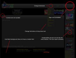
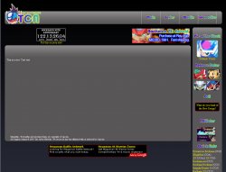
I'll be honest, I find the design of the website to have a dated 90s feel. Something about that jet black background doesn't set right with me. The drop down menus also feel dated especially with the yellow font color / red rollover. As far as constructive improvements, I have attached a screenshot with changes I would make to clean up the design. I have also posted a screenshot of your website with a slight gradient background (black to dark blue), I feel something as simple as a slightly gradient background will help it feel a bit more modern. PM me if you would like more suggestions 
Attachments
Thanks for the suggestions. I like some of them. The background sounds like a good idea. I'll play around with that. The yellow / red font color is the default color for links. I found that they stand out, which I wanted. I agree with you on the corners also. I should round them some more.I'll be honest, I find the design of the website to have a dated 90s feel. Something about that jet black background doesn't set right with me. The drop down menus also feel dated especially with the yellow font color / red rollover. As far as constructive improvements, I have attached a screenshot with changes I would make to clean up the design. I have also posted a screenshot of your website with a slight gradient background (black to dark blue), I feel something as simple as a slightly gradient background will help it feel a bit more modern. PM me if you would like more suggestions
The font color on the menus root, were done to match the logo, but I will play around with them. I realize that there is a gap difference between the interactive menu and the others. I try to design my sites to work in 800x600 and above. If I make the interactive button larger, it will make screen-stretch.
The right nav's buttons were done to make consistency, but I will try some different things on them.
Thanks again!
EDIT: Did the gradient. Looks pretty good. Thanks.
Thanks for the suggestions. I like some of them. The background sounds like a good idea. I'll play around with that. The yellow / red font color is the default color for links. I found that they stand out, which I wanted. I agree with you on the corners also. I should round them some more.
The font color on the menus root, were done to match the logo, but I will play around with them. I realize that there is a gap difference between the interactive menu and the others. I try to design my sites to work in 800x600 and above. If I make the interactive button larger, it will make screen-stretch.
The right nav's buttons were done to make consistency, but I will try some different things on them.
Thanks again!
EDIT: Did the gradient. Looks pretty good. Thanks.
The fully rounded corners look much better! My suggestion would be to use a slightly more subtle and warmer blue for your background, maybe #090920 (even though this isn't a 'web' color). My other suggestion is to modify your drop down menus to expand larger (width) than the button they sprouted from. I have included a screen grab from a website I made to show you how I think your menu should look, compare this and your menu to a drop down menu in MacOS X.
Attachments
It's a starting point. If you're proud of it, that's what matters the most.
Try making the buttons on the left hand side of the page though, because if you want some traffic, you will need to shoot for usability.
Also, the drop down boxes aren't really my thing.. users tend to get caught up in drop-downs (says Jakob Nielsen), so if you could opt for an alternative, it would be better .
.
However, if you're proud of it, then you've done a great job! You'll learn in time how to work out designs and photoshop, just look for some inspiration.
Try making the buttons on the left hand side of the page though, because if you want some traffic, you will need to shoot for usability.
Also, the drop down boxes aren't really my thing.. users tend to get caught up in drop-downs (says Jakob Nielsen), so if you could opt for an alternative, it would be better
However, if you're proud of it, then you've done a great job! You'll learn in time how to work out designs and photoshop, just look for some inspiration.
Register on MacRumors! This sidebar will go away, and you'll see fewer ads.


