Become a MacRumors Supporter for $50/year with no ads, ability to filter front page stories, and private forums.
iDict App Icon?
- Thread starter TheZimm
- Start date
- Sort by reaction score
You are using an out of date browser. It may not display this or other websites correctly.
You should upgrade or use an alternative browser.
You should upgrade or use an alternative browser.
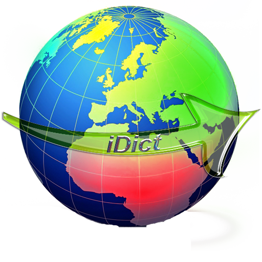
it's a bit big...
(looks good though)
thanks.
Heres the size it would be on the iphone, that was the version going into the appstore:

Zym
Font looks really cheesy.
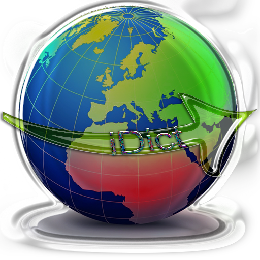
If your talking about the first pic, then I had already changed that. The developer had already asked me to change it. What about the second pic? Would you like that on your homescreen?
Zym
Google images at their best 
Oh, and Photoshop effects:
- Plastic Wrap
Anyone would think you were trying to prove a point.
R-Fly
Oh, and Photoshop effects:
- Plastic Wrap
Anyone would think you were trying to prove a point.
R-Fly
too many colors, little crowded looking.
just doesnt look clean enough to be on the front page, thats what u gotta shoot for!
just doesnt look clean enough to be on the front page, thats what u gotta shoot for!
New!
Okay, well I've took in some suggestions, and here's what I've come out with:
for iTunes:
![iDictiTunes-1.png]()
for iPhone:
![iDictiPhone-1.png]()
I think they're better. R-Fly thank you very much for pointing out the bubble wrap stuff. IMO it looks much better without it.
Better, worse?
Thanks,
Zym
Okay, well I've took in some suggestions, and here's what I've come out with:
for iTunes:

for iPhone:

I think they're better. R-Fly thank you very much for pointing out the bubble wrap stuff. IMO it looks much better without it.
Better, worse?
Thanks,
Zym
Personally, I think the icon looks ok at 512px (needs a better mask though!) but bad at 59px (or whatever the iPhone's odd icon size is) ... At that low resolution, you can't even tell that it's a globe! The multi-colored continents are impossible to distinguish, and the text doesn't stand out enough (try a small white glow around the text to isolate it) ...Better, worse?
You might try something that'll fit in more with the other icons, perhaps a squared globe/map with the text running across? Simple is good.
Personally, I think the icon looks ok at 512px (needs a better mask though!) but bad at 59px (or whatever the iPhone's odd icon size is) ... At that low resolution, you can't even tell that it's a globe! The multi-colored continents are impossible to distinguish, and the text doesn't stand out enough (try a small white glow around the text to isolate it) ...
You might try something that'll fit in more with the other icons, perhaps a squared globe/map with the text running across? Simple is good.
Hopefully I fixed the mask, I think I did(but what do I know =]) The little picture that I gave is at the iphone's resolution. I did the text thing like you said. What does the globe look like then? Is it at all better?
Here's my newer pictures:


Should I maybe make the globe bigger, like this?

Thanks for all the great feedback
Zym
Register on MacRumors! This sidebar will go away, and you'll see fewer ads.


