"Opposites" Contest Results: (Contest Closed)
Some very interesting shots submitted for this contest--well done all!
My appologies for closing out the contest a little early--the next chance I will have at judging the results would be 11 hours from now...not really fair for those who entered.
These contests are so subjective, so preference-based--as art should be. My intent is to come across as helpful and not overly critical. This is a first for me...so If I do not get it right please provide the feedback I would need in order to do it better next time.

My thoughts:
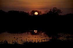
golfmaster: I LOVE the deep color and the blacks you managed to capture. Contrast such as this adds drama to the photo. Heads up--you have dust on your sensor and it shows through very readily.
techie4life: Your photo was one of the few that was able to state the theme without any additional explanation on your part. Well done...as you will see this is more difficult than it would first seem. I enjoy how you've split the picture between the grass and the sky on top of the nature / cityscape theme. Both are opposites in their own right. Very clever.
lu0s3r22: Nicely composed. You could find a shot such as this in ads. I wonder if you could have done something else with the flags? Just a thought. Also, could have this photo been more arresting if you waited for a different time of the day? The lighting is somewhat flat-ish. This is another example of a photo that does not need explanation.
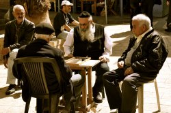
Indydenny: Conceptually this photograph is genius. I would have enjoyed a tighter composure (the background detracts from the shot with all of the extra stuff that is going on). If you can find a way to make it obvious to the viewer that they are looking at a Catholic, Arab, and Jew--an older generation at that--getting along like this then you would have a politically powerful picture. Take the captions away and given my western-culture upbringing, I would only see a group of old men playing backgammon.
JDDavis: Again we have another picture that does not need explanation. Conceptually you nailed the contest. Compositionally your shot requires a great deal of visual interpretation in order to discern what is going on. A different angle might have helped, or waiting for a different time of day might provided added color saturation / contrast that would help the viewer understand the context of the picture. Sometimes you get the picture you get--in this case I'd try some post processing to add some simplification and maybe some drama. Let the viewer see what you want them to see, not just what the sensor captured.
doubleohseven: This is nice, dramatic picture. The post process treatment (I am assuming this was not done in camera here) is nice--I find the vignetting to be distracting. I am also not to clear on the concept here and how it fits in with the theme. My guess is the metal / wood material in the picture but that is all I can think of. The halo effect around the apple logo distracted me from the overall effect. Compositionally--what if you had moved the vase a titch to the right, removed the chairs, and tightened the shot so that some of the blinds were still in the picture? Just a suggestion, but I think more can be done with this arrangement given the look you've applied. Visually one of the more arresting photos of the contest.
Joe King: You've managed to get some complimentary colors to dance well with each other in this picture (yellow / purple and orange / blue). Nicely done! My eyes keep going to the "floor" wondering if it really is that polished, if its water, or if you cleverly flipped the picture in post processing. There is a line about 2/3 the way up the floor where some interesting things are happening. Look to the columns on the left and you will see that they do not match up like they should on a reflection. The same goes with the statue, white-clothed table, wooden banister at that table, and most telling of all...clipping on both sides of the picture...the people are not reflected as the should be and the table clips into the wall on the other side. And finally, it would be very difficult for a floor to reflect in this manner--unless it was water or a mirror or something like that. So if I were a betting man, I'd say you flipped the image in post processing. Doing this can present some amazing effects...even mimicking water that is not really there. But it has to be done right. I would have focused my shot on the far back wall and a few of the nearby pillars and cropped the rest.
01jamcon: Just got back from Venice. Thanks for the nice reminder. This is an "aha!" photo....it would have taken me a bit of searching, but I think I might have seen what you saw, the old / new contrast. Had this happened I would have been a tad proud of myself for figuring it out. It is a clever shot--and one of the few instances where captioning might be of benefit. Clever and well done.
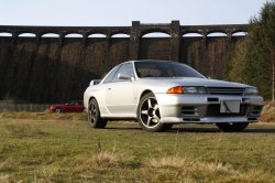
Mattyb240: I am not much of an auto fan, so the statement of what these machines are (capabilities etc...) is lost on me. Not your fault. The car in the background should be brought closer to the foreground--it is very tiny back there...almost noticeable. Judging from the shadows....you were either leaving a time of day or entering a time of day where the lighting could have been more for your benefit. The foreground (grass) and the sky would not be missed from this picture. The structure in the back? Good call. Re-compose to make it more impactful and interesting...you may find that you need only a small part of the structure to add extra zip to the photo. If there had been no captioning to this picture I would not have understood it.
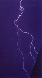
Chappers: I do not have a lightning strike photo...these are difficult indeed. I like this, not only is there an "electricity" message here but also a light / dark message as well. You are fortunate to have this...well done!
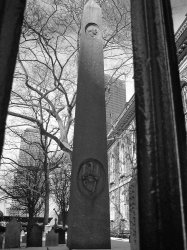
mariahlullaby: I used to live in NYC and have never seen this. I like it. Without the captioning I would not have understood the application to the theme. I do, however, love the composition and the black and white treatment. Just enough to let my eyes wander, and just enough to let them settle on something interesting. This is a good shot.
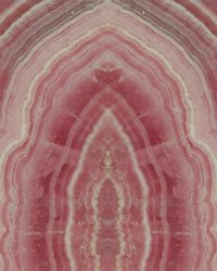
deep diver: You've found a way to take something I personally find dull and make it interesting--something fun to visually explore. I wonder if there is something that you could do with the lighting, or with the post processing (a gradient on the mirrored portion or the image?) That would add even more highlight to the image? I have nowhere to fasten my eyes to...
LittleCanonKid: You could take the captioning out of this and be just fine. I really like this shot--and have thought of about 3 different (read: laborious) ways that you could have done this. Care to share? This is a VERY interesting photo.
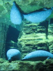
daustin: I like the color on this and your application to the theme....very obvious. The Manatee on the right is cropped out...could you have recomposed on the one to the left and zoomed in? Stuff like this and zoos are difficult because of the limited space you have to work with to compose.
Freewayjim: One of those photos that requires a caption....there is no way I could have figured this one out on my own. I wonder if there is a way you could have made me figure it out via composition? I cannot think of one offhand. This is one of those "funny signs / interesting signs" photos--but with a very clever twist on the theme. While the photograph is somewhat nondescript, the thinking behind it is not.
jmdfd415: For me you've portrayed a sense of absence in this photo. My immediate reaction is "a lonely old man." If I've missed the boat altogether here please forgive me. Compositionally you balanced the subject out with the taller buildings in the background. I like how you've managed this one. Well done.
mickbab: Clever! Interesting! And well composed to boot...Your black and white treatment is fairly light in the foreground--sometimes thats just the way it is, but the effect is more flat. Play around with your levels, contrast, and dodge/burn and see if you cant coax some more out of it. Once again, if there were no captions for this I wouldnt understand the application. Would there have been a way to better portray the message?
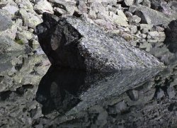
Razeus: I love this photo and I hate this photo. Congrats for capturing a subject at a time and in an environment that can do this. This is a compelling shot. The high noise level / grain only adds to the overall effect. Very well done....
NeGRit0: You could have left off the captions and clearly identified with the theme. Just a heads up...the photo is very unflattering to either product (finger prints, grime, etc...) which distracts from the overall effect.
1st Place:
Razeus--congrats...you have 48 hours from this timestamp to create a new thread with the next contest.
2nd Place: LittleCanonKid--the baton is yours should
Razeus miss the boat.
3rd Place: techie4life--multiple interpretations of a single theme in one photo. Nice indeed!
Honorable Mentions: mickbab, jmdfd415, and mariahlullaby.


