Become a MacRumors Supporter for $50/year with no ads, ability to filter front page stories, and private forums.

feedmeister

macrumors member
Original poster
Hey everyone,

I just finished designing my blog, and I'm quite pleased with it. It's just an idea I had and I'm planning to go with it. Please let me know what you think of the design and flow of the website.

The link's in my signature. Thanks in advance for any constructive criticism.
 

shesmu

macrumors newbie
Jul 26, 2009
17
0
Ukraine
Start using Akismet plugin, because you already have one spam comment. )

Regarding design, it's nice. Of course, using the Apple logo is not good idea, but I believe you know it yourself.

One minor thing I would do is remove author name from the post info. Since it's your personal blog, every entry will be posted "by Rafeed", so it doesn't make much sense. )

Good luck with your blog!
 

feedmeister

macrumors member
Original poster
Start using Akismet plugin, because you already have one spam comment. )

Regarding design, it's nice. Of course, using the Apple logo is not good idea, but I believe you know it yourself.

One minor thing I would do is remove author name from the post info. Since it's your personal blog, every entry will be posted "by Rafeed", so it doesn't make much sense. )

Good luck with your blog!

shesmu,

Thanks for the feedback! I agree, so I removed the author name, and I also 'edited' the spam comment name to the match with the spammer's email address. :p
 

clancemasterj

macrumors regular
Jan 31, 2007
161
21
Somewhere outside of time.
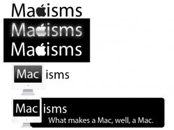
here are some ideas for logos... pm for psd. Also you should set the banner as a home link.
 

Attachments

  • test logos.jpg
    test logos.jpg
    63.1 KB · Views: 60

Greedo

Guest
Jul 26, 2009
53
0
typography is wonky; do not track out the sidebar headers. comment number is far too important from a hierarchy standpoint, leading is too tight on the masthead.
 

feedmeister

macrumors member
Original poster
here are some ideas for logos... pm for psd. Also you should set the banner as a home link.

Thanks for those ideas clancemaster! I'd prefer making them on my own, so no need for the PSD's but they're definitely going to help me get in the right direction. :)


miles01110 said:
I'll check back when there's some content. Design looks fine, but there's no point in visiting a blog with nothing to read on it.

Thanks for the feedback. Yeah, I practically have no content right now, but before I did, I wanted to make sure I had a sound design.

greedo said:
typography is wonky; do not track out the sidebar headers. comment number is far too important from a hierarchy standpoint, leading is too tight on the masthead.

Greedo, thanks for the feedback, although, I was wondering if you could explain what you meant a little more.

ian.maffett said:
I like these. But I would use the as the A and not the C. Just my opinion, though.

ian.maffett,

I see your point with the :apple: logo. I think it could go either way, really. It would definitely work better if the bite on the apple was more pronounced than the regular :apple: logo.
 

michaelsviews

macrumors 65816
Sep 25, 2007
1,478
467
New England
Nice layout

Nice layout and have to agree with others need some content and than give opinion's from there.

As for your signature and the nations fastest 3G network , well your either on Sprints or Verizon's network because AT&T's 3G is NOT the fastest, actually its horrible compared to the other two listed. But your new and will find out on your own
 

feedmeister

macrumors member
Original poster
Nice layout and have to agree with others need some content and than give opinion's from there.

As for your signature and the nations fastest 3G network , well your either on Sprints or Verizon's network because AT&T's 3G is NOT the fastest, actually its horrible compared to the other two listed. But your new and will find out on your own

Thanks for the feedback.

About the nation's fastest 3G network, it was a parody and not what I actually believe. :p I saw a commercial one day and it said that so it was pretty random, and from a while back. Anyways, thanks for the info. Could've sworn it was Verizon :p
 

adamfishercox

macrumors 6502
Aug 15, 2007
474
10
The design overall is pretty indistinct, so the logo definitely needs to be something unique and nice. I like the designs shown earlier in the thread, but to use the apple logo without modification is going to be a copyright issue if the blog ever attracts Apple's lawyers' attention.
 

Greedo

Guest
Jul 26, 2009
53
0
Greedo, thanks for the feedback, although, I was wondering if you could explain what you meant a little more.

sidebar headers (stay up to date, recent posts, etc.) have too much letter spacing, looks bad.

number of comments was very large text size, making it more important than it needed to be. (tho at the moment i do not see them anymore)

the line spacing on the header text to the right is too tight.
 

feedmeister

macrumors member
Original poster
The design overall is pretty indistinct, so the logo definitely needs to be something unique and nice. I like the designs shown earlier in the thread, but to use the apple logo without modification is going to be a copyright issue if the blog ever attracts Apple's lawyers' attention.
Yeah, I'm definitely working on that.

sidebar headers (stay up to date, recent posts, etc.) have too much letter spacing, looks bad.

number of comments was very large text size, making it more important than it needed to be. (tho at the moment i do not see them anymore)

the line spacing on the header text to the right is too tight.

Thanks for clearing that up.. I'll work on it.
 

feedmeister

macrumors member
Original poster
Hey Guys,

So I cleaned up the logo replacing the a with the apple and cleaned up some formatting issues. What do you guys think now? I'll be posting some new content soon, so I got the point about no content ;)
 

adamfishercox

macrumors 6502
Aug 15, 2007
474
10
No, the font in the logo still doesn't work at all. Use Myriad pro or some other heavier font, it doesnt even match the apple in height.
 

adamfishercox

macrumors 6502
Aug 15, 2007
474
10
Much better, but still doesnt quite fit as a letter. Type a c in it's place and then fit the apple to match the curve of the C and it'll look a lot better.
 

GoCubsGo

macrumors Nehalem
Feb 19, 2005
35,741
153
here are some ideas for logos... pm for psd. Also you should set the banner as a home link.

Nice clean layout, lacks content clearly and STOP using the Apple logo! Any recommendations on logos with the Apple logo should be trashed.
 
Register on MacRumors! This sidebar will go away, and you'll see fewer ads.