Become a MacRumors Supporter for $50/year with no ads, ability to filter front page stories, and private forums.

California

macrumors 68040
Original poster
Aug 21, 2004
3,885
90
How can I make a fixed space font (courier) into a non fixed space font?

Or at least print it out that way? I know that old IBM selectrics could do this because I see it all the time. There has to be some program or some way to do this ?
 

dmz

macrumors regular
Jan 29, 2007
139
0
Canada
Not to be a smartass, but...?

Two ways I can think of that are somewhat practical:

1. Redesign the font with Fontographer or some-such font maker, if the text is lengthy, or

2. A serious amount of hand-kerning, if the text is not too lengthy.

So-called "non-proportional" fonts are designed to look correct with all characters the same character-width. and are not that amenable to kerning, and kerning usually does not really improve the look. To the best of my recollection, Selectric I did not have this capability - they used two differently labelled "typeballs" of the same font - one marked "proportional" and the other "non-proportional", however you could "fool" the system into printing non-proportionally using a proportional ball, and there was a lever on the carriage you could press to adjust spacing up to a "half-space". (Selectric II only)

There is something similar in the digital age - I seem to remember seeing at least one font that is available as monospaced or proportional, but it wasn't Courier. Sorry, I can't remember which particular font it was...

ps: e.g. Verdana comes in a Verdana Mono version, and Bitstream has a Vera Sans and Vera Sans Mono

:apple:dmz
 

MisterMe

macrumors G4
Jul 17, 2002
10,709
69
USA
There is a proportional font that kinda looks like Courier. It is called American Typewriter. It would be a critical mistake to try to force a monospaced font to look proportional.
 

RainForRent

macrumors 6502
May 31, 2006
291
3
Greenville, SC
There is a proportional font that kinda looks like Courier. It is called American Typewriter. It would be a critical mistake to try to force a monospaced font to look proportional.

Agreed. With the millions of fonts that exist in this day and age, I can hardly see a benefit to working this hard to make the font into what you want. There are options for fonts that are very very similar and more of what you are looking for. If it were only a few words, then have at it, but if it's a paragraph, use a new typeface.
 

RedTomato

macrumors 601
Mar 4, 2005
4,155
442
.. London ..
How can I make a fixed space font (courier) into a non fixed space font?

Your thread title above that post says "How to make a proportional font non proportional?"

Either you want (in your own words) to make a fixed space font into a non-fixed space font, or you want to make a proportional font into a non-proportional font. These are two completely opposite aims.

Which do you want?
 

California

macrumors 68040
Original poster
Aug 21, 2004
3,885
90
I still need to remedy this problem!

I want to make a fixed space Courier font into a proportional font.

I've seen it on old IBM Selectrics all the time.

Making Courier proportional makes it read TEN TIMES BETTER.

Hate it in the fixed or nonproportional style.
 

Jim Campbell

macrumors 6502a
Dec 6, 2006
902
27
A World of my Own; UK
Hate it in the fixed or nonproportional style.

Use a different font. Seriously. The whole fixed-width thing means that the 'm' is the same width as the 'n', for example, and the 'i' takes up the same space as an 'o'.

Short of redesigning all the offending characters in a package like Fontographer, your easiest option is to use a similar-looking font. The web is full of proportional typewriter-style fonts but, as already suggested, American Typewriter is probably as good a place to start as any.

Is there a specific technical reason why you can't change font?

Cheers

Jim
 

MisterMe

macrumors G4
Jul 17, 2002
10,709
69
USA
I still need to remedy this problem!

I want to make a fixed space Courier font into a proportional font.

I've seen it on old IBM Selectrics all the time.

Making Courier proportional makes it read TEN TIMES BETTER.

Hate it in the fixed or nonproportional style.
So you are still trying to push that rope? I am afraid that you misremember what you saw on those IBM Selectrics. IBM Selectric proportional fonts looked nothing like Courier. The point of these fonts was to approximate the look of typeset text in correspondence and other business documents. A Courier-like proportional font would not have served the purpose. IBM offered two proportional fonts, Boldface and Title.

The font most similar to Boldface today is probably New York. Title was a bolder font that looks kinda like Optima. As I told you in my previous post, American Typewriter is a proportional font that is designed to be reminiscent of Courier. However, IBM offered nothing like American Typewriter.

If you need reminding of the fonts available on IBM typing elements, then you may find them here. Scroll down to the scan of Page 12 to see the Proportional Space Correspondence Typestyles.
 

monokakata

macrumors 68020
May 8, 2008
2,035
582
Ithaca, NY
If you need reminding of the fonts available on IBM typing elements, then you may find them here.

Hey, thanks for the trip down memory lane. God, I loved some of those faces -- I'd forgotten entirely about Bookface Academic and Delegate.

When the Correcting Selectric II came out I was so overwhelmed that I signed up to teach summer school, so I could make $750 and buy one. I wrote a book on that sucker, not to mention a lot of other stuff. The worst problem I had was that my workroom was chilly in the winter. The Selectric didn't work well at 55 F.

At one point in the early 80s there was a device that sat over your Selectric keyboard, and solenoids pushed the keys, as instructed by your CP/M computer. Maybe MS-DOS also; I can't remember. But you could get letter-quality printing that way.
 

California

macrumors 68040
Original poster
Aug 21, 2004
3,885
90
So you are still trying to push that rope? I am afraid that you misremember what you saw on those IBM Selectrics. IBM Selectric proportional fonts looked nothing like Courier. The point of these fonts was to approximate the look of typeset text in correspondence and other business documents. A Courier-like proportional font would not have served the purpose. IBM offered two proportional fonts, Boldface and Title.

The font most similar to Boldface today is probably New York. Title was a bolder font that looks kinda like Optima. As I told you in my previous post, American Typewriter is a proportional font that is designed to be reminiscent of Courier. However, IBM offered nothing like American Typewriter.

If you need reminding of the fonts available on IBM typing elements, then you may find them here. Scroll down to the scan of Page 12 to see the Proportional Space Correspondence Typestyles.

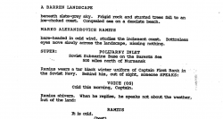
Here is the Courier font that I think has proportional spacing from an old screenplay Hunt for Red October, which had to be typed around the year 1989? How do I get this look? I presumed it was written on a Selectric.

Hey, thanks for the trip down memory lane. God, I loved some of those faces -- I'd forgotten entirely about Bookface Academic and Delegate.

When the Correcting Selectric II came out I was so overwhelmed that I signed up to teach summer school, so I could make $750 and buy one. I wrote a book on that sucker, not to mention a lot of other stuff. The worst problem I had was that my workroom was chilly in the winter. The Selectric didn't work well at 55 F.

At one point in the early 80s there was a device that sat over your Selectric keyboard, and solenoids pushed the keys, as instructed by your CP/M computer. Maybe MS-DOS also; I can't remember. But you could get letter-quality printing that way.

Look at my above post? Do you think this is an IBM Courier font from the year 1989?
 

Attachments

  • Screen shot 2012-01-08 at 7.45.57 AM.png
    Screen shot 2012-01-08 at 7.45.57 AM.png
    160.1 KB · Views: 288
Last edited by a moderator:

MisterMe

macrumors G4
Jul 17, 2002
10,709
69
USA
Here is the Courier font that I think has proportional spacing from an old screenplay Hunt for Red October, which had to be typed around the year 1989? How do I get this look? I presumed it was written on a Selectric.
Computers were commonplace in 1989. IBM lost control of its own platform to Microsoft and the clones two years earlier. In an earlier post, I told you about the American Typewriter font. In 1989, the this font was already 15 years old. It is quite likely that your script was written using a Mac in the American Typewriter font.
 

Jim Campbell

macrumors 6502a
Dec 6, 2006
902
27
A World of my Own; UK
Here is the Courier font that I think has proportional spacing from an old screenplay Hunt for Red October, which had to be typed around the year 1989? How do I get this look? I presumed it was written on a Selectric.

I'm sorry, but this is getting really tedious. The sample you show, regardless of whether it was produced on a Selectric, a Mac, or any number of generic word-processors that were available at the time* is NOT a proportional font. Observe that all the uppercase characters are basically the same width, crucially the M and the N, and that this is also true for the lowers:

Monospace_Type.jpg


The tracking is very tight in that sample, but the characters themselves are monospaced; they're just spaced very close together.

And, again, is there any technical reason why you can't use a Courier-like font instead? I remain utterly baffled as to why you're insisting on a modern solution to a problem that hasn't existed for over twenty years.

Cheers

Jim

*And I agree with MisterMe that it's unlikely that a screenplay would have been typed on anything other than a computer in 1989.
 

dmz

macrumors regular
Jan 29, 2007
139
0
Canada
I'll second that . . .

I have just duplicated almost precisely the "look" of the script sample by setting the type in Courier Bold and applying negative tracking. Try it. It looks identical as to the character spacing, and as Jim already mentioned, it's still monospaced, just set tight. The character names are set with no tracking.

Probably done in a word processor that had tracking, or possibly PageMaker or Quark.

Done?:eek:

:apple:dmz
 

California

macrumors 68040
Original poster
Aug 21, 2004
3,885
90
I have just duplicated almost precisely the "look" of the script sample by setting the type in Courier Bold and applying negative tracking. Try it. It looks identical as to the character spacing, and as Jim already mentioned, it's still monospaced, just set tight. The character names are set with no tracking.

Probably done in a word processor that had tracking, or possibly PageMaker or Quark.

Done?:eek:

:apple:dmz

Yipee! But I don't know what "negative tracking" is or how to apply?! Sorry I'm so out of it. I love the look of that old script font as I sampled above. I think it's more readable.

I googled around and found this killer article on negative tracking but don't know how to apply it here. I'm actually going for a more readable text and this article starts to get into the graphic impact of font spacing, precisely my intent.

BTW some of the most interesting ideas on a thread on MR I've ever read, and i've been here a long time!

http://www.thinkingwithtype.com/contents/text/
 

dmz

macrumors regular
Jan 29, 2007
139
0
Canada
Depends what software you're using. Word hides it in the Format/Font window under the character spacing tab, and they call it condense/expand. Pages has it directly under the Font/Tracking menu item - set Looser or Tighter. I replicated your sample by hitting Tighter five or six times in a row.

Page Layout and Graphics programs have infinitely more precise adjustments, but I don't think you need that for what you're trying to do.

The character spacing can be saved in a style sheet, so you don't have to constantly be tracking/untracking from paragraph to paragraph. Only the "speaking" pertions of the sample you showed have this tracking - the rest appears either un-tracked or slightly positively tracked - so just don't apply the stylesheet to those portions and...

Bob's your Uncle!

I too must thank MrMe for that blast from the past - I haven't lusted after an exotic typeball in about thirty years, but I did today.

Cheers!

:apple:dmz
 

California

macrumors 68040
Original poster
Aug 21, 2004
3,885
90
Depends what software you're using. Word hides it in the Format/Font window under the character spacing tab, and they call it condense/expand. Pages has it directly under the Font/Tracking menu item - set Looser or Tighter. I replicated your sample by hitting Tighter five or six times in a row.

Page Layout and Graphics programs have infinitely more precise adjustments, but I don't think you need that for what you're trying to do.

The character spacing can be saved in a style sheet, so you don't have to constantly be tracking/untracking from paragraph to paragraph. Only the "speaking" pertions of the sample you showed have this tracking - the rest appears either un-tracked or slightly positively tracked - so just don't apply the stylesheet to those portions and...

Bob's your Uncle!

I too must thank MrMe for that blast from the past - I haven't lusted after an exotic typeball in about thirty years, but I did today.

Cheers!

:apple:dmz

DMZ thank you so so so much. I've been trying to figure this out -- as you can see from the original thread -- for years. Worked perfect in Word. Thank you again.
 

dmz

macrumors regular
Jan 29, 2007
139
0
Canada
Np

As usual, always a thrill to help someone out here. The amount of knowledge uncovered in pursuit of your answer is non-proportional to the size of your problem - which was simply a bunch of expert designers taking your use of unfamiliar jargon quite literally. Any of us could have answered your question on the first try if we had used our beginner-minds (Zen?) instead of our expert minds!

You almost threw me again with your use of the word "script" in one previous post, "I love the look of that old script font as I sampled above" - because to a designer a script font isn't one you use for a script, but rather a cursive or chancery-type font.

Thanks to all I say - that was fun!

Cheers!

:apple:dmz
 

Jim Campbell

macrumors 6502a
Dec 6, 2006
902
27
A World of my Own; UK
Any of us could have answered your question on the first try if we had used our beginner-minds (Zen?) instead of our expert minds!

Absolutely. I'd like to apologize for the rather tetchy tone of my previous post -- I made an assumption about California's level of understanding of technical terms and couldn't then understand some of the subsequent posts on that basis.

Sorry about that!

Cheers

Jim
 

California

macrumors 68040
Original poster
Aug 21, 2004
3,885
90
As usual, always a thrill to help someone out here. The amount of knowledge uncovered in pursuit of your answer is non-proportional to the size of your problem - which was simply a bunch of expert designers taking your use of unfamiliar jargon quite literally. Any of us could have answered your question on the first try if we had used our beginner-minds (Zen?) instead of our expert minds!

You almost threw me again with your use of the word "script" in one previous post, "I love the look of that old script font as I sampled above" - because to a designer a script font isn't one you use for a script, but rather a cursive or chancery-type font.

Thanks to all I say - that was fun!

Cheers!

:apple:dmz

Dude you saved me. Didn't see this until today. THANK you again.

Absolutely. I'd like to apologize for the rather tetchy tone of my previous post -- I made an assumption about California's level of understanding of technical terms and couldn't then understand some of the subsequent posts on that basis.

Sorry about that!

Cheers

Jim
No worries. I really really thank you.
 

MacBoobsPro

macrumors 603
Jan 10, 2006
5,114
6
Here is the Courier font that I think has proportional spacing from an old screenplay Hunt for Red October, which had to be typed around the year 1989? How do I get this look? I presumed it was written on a Selectric.


Look at my above post? Do you think this is an IBM Courier font from the year 1989?

That to me looks like courier with faux bold applied and scanned about a million times. Hence why kerning and tracking is all over the place and the glyphs heavy with soft edges.

Scripts are written in Courier, this just has tighter tracking.
 
Register on MacRumors! This sidebar will go away, and you'll see fewer ads.