Some comments:
mikshayne: I think this is a really effective composition. Great use of perspective, depth of field, colour. Sharp and well shot - fits the brief perfectly.
magnetdoc13: Again, a well executed picture that makes great use of depth of field and colour. Nice and sharp - but I feel that the composition lets it down. Centering the glass as a subject robs the picture of interest, and the glass and straw feel truncated.
gnd: I'm feeling a wonderful warmth from this picture - well done. Nice use of selective focus and colour. For me, the picture does lack a strong element that's in focus, and the background doesn't contrast enough with the subject (white would work better), but overall it's very effective.
nomad01: Nice shot. I was in Rome this summer, and really identify with this... the city has drinking fountains on every street corner - carry an empty bottle and top up as you go! I feel the shot is a bit let down by the cluttered foreground and background - try to get in closer.
Chappers: Good take on the competition topic. A well composed shot of a difficult subject. Improvements could be made both with the sharpness (the flower seems a little soft) and with the lighting - which is quite harsh (flash gun from above?). Good effort though.
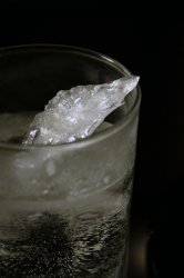
El_Cabong: I'm liking this - good subject matter, nice and sharp. Good lighting too, with the black background. Suggestions I would make would be to be careful about unwanted items in the picture (something hiding behind the glass?) and maybe take a look at the composition - I'm not sure that the blank space on the right adds to this.
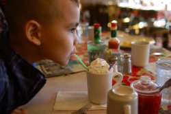
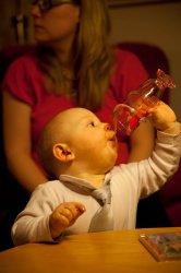
joepunk: Really like this. The child is an interesting subject for the picture - good and sharp. The drink looks enticing and really draws the viewer in. I love the interesting array of bottles and jars on the table. To criticise, where there's a person in a picture I would always make sure their eyes are clearly in focus. Sharpness here is OK, but focus was on the drink.
liljohnny51: Simple and to the point. Who doesn't like a fresh cup of joe in the morning?
flosseR: Lovely picture - the little guy is clearly in charge here. Going to be a handful when he grows up!
")
Clearly an un-staged snap, I think you could make a few improvements to this in post processing. Although it's nice to have Mom(?) in the shot, her head's truncated, and that detracts. It would have been nice if a wider aperture had been used to make her more blurred. Personally I'd crop in on the little guy with a square composition, and increase the colour temperature to compensate for the warm tungsten light this was shot in.
mpr131: A simple but effective composition. Nice use of selective focus - but with the full frame of a D700 I'd expect to see even better blurring of the background with the use of a wider aperture. I'd be inclined to crop in closer, edit out the distracting green sign and increase saturation a bit for more 'pop' to the image.
JDDavis: Absolutely beautiful image. I think the composition works well, the background is suitably out of focus and neutral to really highlight the foreground. Nice and sharp too. I think you could boost the saturation on this a little... and a prime lens or a dedicated macro lens might give slightly better 'bokeh' to the background grass on the right hand side, but these are minor points.
dmmcintyre3: Nice sunlit shot, lovely cat - good interpretation of the competition theme. For an animal picture, as with a human subject, the head and eyes are a natural central point - so it would have been good to take several photos of this scene to see if the cat would turn around, or bring its head out of shadow.
OrangeCuse44: I'm liking it. Strong composition - great use of selective focus. Nice complementary colours. I can almost taste it!
deep diver: Nice shot - sharp, good composition and well captured. I'm not feeling the 'drink' theme too strongly with this one though
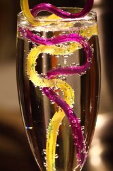
zildjansg: Great shot. Really sharp - this screams out 'drink' for me! Loads of detail and good lighting. If you shot RAW, and if your editing program allows (I know lightroom does), I'd be tempted to take some of the luminance and saturation out of those pink cones - they look a bit unreal, and distract a little from the photo.
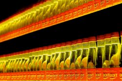
maddagascar: Technically this is interesting. You've shot up at ISO 3200 and at a long 1/8th of a second (I guess you've got IS on your lens, which is why the picture is sharp). I think it's good - by slowing the shutter right down it's a great way to highlight motion, which you've done well. I think it would benefit from a bit of work in 'post' - increase the colour temperature slightly to compensate for the very warm lighting, and maybe rotate 1/2 to 1 degree counter clockwise to correct the slight tilt.
SmileItIsTravis: I'm a cat lover, so I can't get enough of cat pics
. The cats eyes are in focus - great expression and makes for a good pic. I think there are two things you could do to make improvements here... be careful with background objects (the bird table looks like it's growing out of the side of the car). Even better, switch to aperture priority and choose the widest aperture possible to take those distractions out of focus and add a blur.
Patriks7: I like this - it certainly says 'drink' to me!
. I'd give you the same advice as SmileItIsTravis though - be careful to take notice of the background (in this case the trees are too similar in colour to the pipe, and the pipe therefore gets a little 'lost' in the picture). Either recompose with a more neutral background, or really open up the lens aperture to make the background blur.
Well done all... some great shots here, which is going to make it difficult to decide a winner!