Become a MacRumors Supporter for $50/year with no ads, ability to filter front page stories, and private forums.
C&C please
- Thread starter isianto
- Start date
- Sort by reaction score
You are using an out of date browser. It may not display this or other websites correctly.
You should upgrade or use an alternative browser.
You should upgrade or use an alternative browser.
1 2
3 4
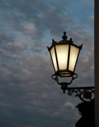
#1- Fairly pedestrian subject, but otherwise it looks like you got a nice effect with the available lighting.
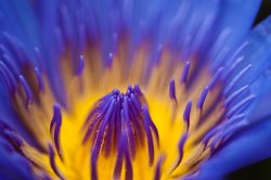
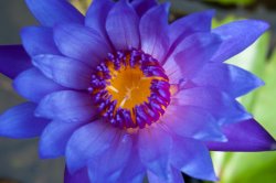
#2,3 - Flower pictures are boring. #2 is the more interesting shot, though.
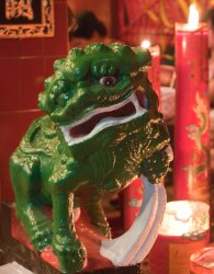
#4- not great. Image looks flat... subject crowds the frame. Almost looks like it was taken by accident.
3 4
#1- Fairly pedestrian subject, but otherwise it looks like you got a nice effect with the available lighting.
#2,3 - Flower pictures are boring. #2 is the more interesting shot, though.
#4- not great. Image looks flat... subject crowds the frame. Almost looks like it was taken by accident.
...
#4- not great. Image looks flat... subject crowds the frame. Almost looks like it was taken by accident.
Hallo miles01110, thanks for your honest critique, appreciate it, btw, can you explain more what do you mean by image looks flat? thanks
I mean that there is little contrast between the foreground and the background in terms of lighting and depth of field.
One interesting subject.
All four photos are well exposed and technically fine.
But the first flower is the only one I want to spend more than two seconds looking at. Very interesting shapes in there to go with the terrific colors.
All four photos are well exposed and technically fine.
But the first flower is the only one I want to spend more than two seconds looking at. Very interesting shapes in there to go with the terrific colors.
This is a beautiful macro shot. You got sharp focus at the point of visual resolution, and the OOF areas lend a painterly, mystical quality to the image. It looks like tentacles emerging out of a fiery nebula. Nonetheless, I think the composition could be a bit stronger. The flower is not completely centered, but the point of resolution lands too close to the center, and the bottom part of the flower is slipping out of the frame too much.
As for the others, again, you have compositional problems. Try experimenting with the "rule of thirds" as a starting point (google it if you're not familiar with the term). Your photos are too centered and therefore static. The eye is naturally attracted to the center of anything with four edges (that is, all photos), so by placing your subject/point of resolution outside of the center, you encourage the eye to travel. The longer you can keep the eye moving around in a frame, the more successful your photo will be.
Also, keep in mind that you are responsible for everything in the frame; anything that is not helping the photo shouldn't be there. Look into the corners when you're composing. Move around and up and down to get the best angle.
As for the others, again, you have compositional problems.
you're right, I try to learn the composition,
I know that other than no. 1, it's all in the center of the frame. I was told that in macro photography (especially flower), need to be put in the center. I was wrong. But isn't it in photo no. 1 , it's already comfirm to the rule of third?
Thanks
you're right, I try to learn the composition,
I know that other than no. 1, it's all in the center of the frame. I was told that in macro photography (especially flower), need to be put in the center. I was wrong. But isn't it in photo no. 1 , it's already comfirm to the rule of third?
Thanks
In the first one, the lamp is centered vertically in the frame, although it is offset to the right. Also, the thin strip of wall at the right isn't quite working, and the blob of something at the bottom detracts from the silhouette of the light. It leaves me wondering what other angle you could have chosen to either eliminate those distractions or else make them work for you.
Whoever told you that macro shots should be in the center of the frame was giving you bad advice. The basic guidelines of composition apply to all types of photographs, whether they are landscapes, macro, nights shots, or anything else. Learn those rules/guidelines, and then you'll learn when it makes sense to bend or break them.
I tend to agree with the constructive feedback you've gotten. If you are interested, we have a forum that is all C&C. The theme changes every 2 weeks (hence the name Fortnightly Challenge). The current theme is "mechanical" and can be found at https://forums.macrumors.com/threads/846703/
In the first one, the lamp is centered vertically in the frame, although it is offset to the right. Also, the thin strip of wall at the right isn't quite working, and the blob of something at the bottom detracts from the silhouette of the light. It leaves me wondering what other angle you could have chosen to either eliminate those distractions or else make them work for you.
Thanks, I'll try to photo again using rule of third, thanks alot. Really appreciated. One question though, if I left the thin strip of the wall, and just crop it, wouldn't it be like something missing? (the lamp is not anchor). Sorry for my english
Register on MacRumors! This sidebar will go away, and you'll see fewer ads.