Become a MacRumors Supporter for $50/year with no ads, ability to filter front page stories, and private forums.
Another Logo Critique...
- Thread starter Intel Inside
- Start date
- Sort by reaction score
You are using an out of date browser. It may not display this or other websites correctly.
You should upgrade or use an alternative browser.
You should upgrade or use an alternative browser.
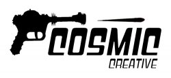
Little tip, stand back from your screen about 2m and look at it to see what it looks like small and from a distance. The creative will be very hard to read as it is not the most legible font and you've made it quite small in relation to the whole logo.
Try making that a larger and using a typface that is a bit clearer (the 'c' is a bit weird)
P
Try making that a larger and using a typface that is a bit clearer (the 'c' is a bit weird)
P
The purpose of creating a logo is not just to present a flashy graphic, it should relate in some way to the company or in this case you. Using a gun to describe your identity may not be the best choice for a high school student.
The purpose of creating a logo is not just to present a flashy graphic, it should relate in some way to the company or in this case you. Using a gun to describe your identity may not be the best choice for a high school student.
I might agree if it was a 9mm or a .357
(the 'c' is a bit weird)
A BIT?!?
Also, your gun is a little phallic, and it kinda looks like it just finished...
I like it, but also agree that it may be a bit difficult to read from a distance away. One question I would have is what is the objective of the graphic? to be seen on a web page or printed material? or a sign?
The gun reminds me of a paintball gun or a kid's nerf gun. It looks light and playful and maybe a bit immature, but I like it a lot.")
Edit: could also substitute the words "relating to sports" for "a bit immature." I don't want that word to come across wrong, cause I didn't mean it to sound condescending.
The gun reminds me of a paintball gun or a kid's nerf gun. It looks light and playful and maybe a bit immature, but I like it a lot.
Edit: could also substitute the words "relating to sports" for "a bit immature." I don't want that word to come across wrong, cause I didn't mean it to sound condescending.
Well, thank you all for the feedback, i felt they were very constructive comments Sorry i didn't give a lot of background info on what it is going to be used for. Like i said, it is my "identity" for my GCSE graphics project. In the project we will be making a themed activity pack for a child, therefore, i didn't want to make it too mature or boring. Also, the logo will be printed in the corner of an A3 page, and on all the products i design, so it will not be used on the web or as a large sign.
For the overall feel of the design i was going for a bit of a retro/sci-fi vibe. The logo is not mean to be linked to our theme at all, it is meant to be generic, but i liked the retro idea and went with it.
Thank you PixelFactory for your suggestions and effort you put into that quick rendering. I will work on the logo further and post the results back here, but otherwise please keep the comments and ideas coming in, they are being very greatly appreciated.
Sorry i didn't give a lot of background info on what it is going to be used for. Like i said, it is my "identity" for my GCSE graphics project. In the project we will be making a themed activity pack for a child, therefore, i didn't want to make it too mature or boring. Also, the logo will be printed in the corner of an A3 page, and on all the products i design, so it will not be used on the web or as a large sign. For the overall feel of the design i was going for a bit of a retro/sci-fi vibe. The logo is not mean to be linked to our theme at all, it is meant to be generic, but i liked the retro idea and went with it.
Thank you PixelFactory for your suggestions and effort you put into that quick rendering. I will work on the logo further and post the results back here, but otherwise please keep the comments and ideas coming in, they are being very greatly appreciated.
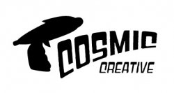
Great. You got rid of the gun. Now lose the font and you'll be there.
How is that constructive criticism?
Intel Inside: look at Kwill's crappy artwork
http://penrules.com/portfolio/logos/hollywood-center-studios.html
I might agree if it was a 9mm or a .357
Unfortunately I lol'd when reading that... Very quick
But you have a good start, the Sci Fi thing works well and marrying it to a retro concept is a nifty idea. IMHO I would scrap the gun, and use a saturn styled effect on the "o" and use something a little bit more retro/art deco like Futura, League Gothic or maybe even Alexandra FLF.
I would personally look at the older "retro scifi" posters, Flash Gordon and some of Andy Gilmore's work comes to mind...
But the following links should give you some great ideas.
http://blog.iso50.com/2009/06/03/new-work-from-andy-gilmore/
http://www.dafont.com/theme.php?cat=115
http://www.smashingmagazine.com/2010/01/08/showcase-of-beautiful-vintage-and-retro-signage/
http://www.smashingmagazine.com/2009/06/08/retro-futurism-at-its-best-designs-and-tutorials/
Hi, why not try conveying your message with typographically, then you can add other elements like ray guns if needed. This way you build your logo up piece by piece from the ground up & some thought goes into your design.
cheers,
mp
cheers,
mp
The gun should not be a separate entity from the font. Maybe you can somehow make a gun from the C?
I'd drop the gun entirely. What the "splonge" does do is enhance the 50's vibe with it's retro shape. I like that much better than the gun. Of course, it needs to be explored further.
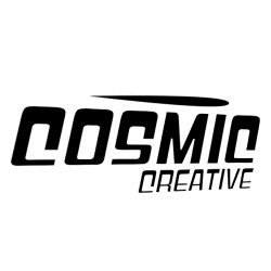
I think people are responding to the font because it's just too over the top. It would be better if only the word "cosmic" were in that style and the word "creative" more simply rendered, especially if it's going to be much smaller.
One thing I've always found is that no matter how much you hate, or how idiotic the suggestions from the peanut gallery (or client), the process of rethinking the logo almost always produces a better product in the end. It's not easy to put your work out for critique, and I applaud your openness and courage.
Register on MacRumors! This sidebar will go away, and you'll see fewer ads.