Become a MacRumors Supporter for $50/year with no ads, ability to filter front page stories, and private forums.

Cromulent

macrumors 604
Original poster
Oct 2, 2006
6,802
1,096
The Land of Hope and Glory
There is a very thin line between boring and uninspired and a really good minimalist design. How does one go about making sure that their design is good, with enough interesting elements without overwhelming the user with unnecessary kruft?

I'm having a hard time deciding just how to go about styling a site. I'm very conscious that I want the layout to invisible and that at most I'd like to use lines to delimit different areas of the site but at the same time I'm having difficulty trying to make it look interesting.

Any tips are very much appreciated.
 

angelwatt

Moderator emeritus
Aug 16, 2005
7,852
9
USA
What kind of site is it? Though designers like to think visitors will take notice of their hard work, often they just care about some specific information and just want it to be easy to find and easy to read. So just make sure the design accommodates the visitor's interest before your own. Google's page layout are very simple and uninspiring, but drive a lot of traffic due to useful content and tools. Most of its pages are actually a fugly in my opinion, but I don't use their pages for their design, I'm there for their usefulness.
 

MacBoobsPro

macrumors 603
Jan 10, 2006
5,114
6
The trick is good typography. If you have that then you don't need any other (or very few) elements.

My site is quite minimal in the fact its basically a picture with some text below but it still remains interesting. Well i think its does anyway :)
 

SrWebDeveloper

macrumors 68000
Dec 7, 2007
1,871
3
Alexandria, VA, USA
You can still use lines, just make them elegant and less old school boxy.

By that I mean:

1 single pixel height
60% width instead of 100%, always centered
A color that contrasts nicely with background, but not too stark - i.e. a soft light gray on black as opposed to white or yellow on black.
Consider adding 40-60% transparency to certain block, box or border elements - "subtle fade".

Or use a subtle graphic as a horizontal rule, something fancier than just a straight line, following same basic rules as above except the height can obviously be a bit taller.

What I'm getting at is you can be minimalistic and elegant at the same time.

-jim
 

SrWebDeveloper

macrumors 68000
Dec 7, 2007
1,871
3
Alexandria, VA, USA
I'm glad you linked both sites, H00513R.

The first is, to me, more pleasant to the eye compared to the second, and if you look carefully nearly all of the horizontal rules follow almost exactly the suggestions I posed in my last response. The second site, as minimal as it could be, looks unfinished. Even though both are easy to navigate and score highly on usability. A little touch of elegance goes a long way to bringing users back with a smile. Even Wikipedia and boring web accessible resource logs for user analytics have a few touches of elegance to not only make the data easier to read and understand, but allow the site to maintain its look and feel throughout. Google, as mentioned earlier, is minimalist but also - think about it - brand recognizable. The concept is so simple, it's brilliant.

I know this stuff seems unimportant to some, but simple design concerns like these often are equal to development concerns, even on minimalist sites, I think.

-jim
 

Cromulent

macrumors 604
Original poster
Oct 2, 2006
6,802
1,096
The Land of Hope and Glory
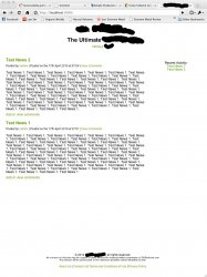
Thank you very much for the feedback it was very useful. Rather than keep talking in abstract terms I thought I'd attach an image of what I have so far, sorry for blocking out certain parts but I'm not supposed to reveal that information at present.

Could anyone give some tips based on it? Thank you for your help.
 

Attachments

  • website.jpg
    website.jpg
    161.1 KB · Views: 97

Cromulent

macrumors 604
Original poster
Oct 2, 2006
6,802
1,096
The Land of Hope and Glory
Never use the word "Ultimate". Especially not when promoting something minimalist. If you have to tell everyone it's "The Ultimate", then the rest of your message has failed.

It's just a dev site on my own computer at the moment. All the wording will be rewritten before it goes live anyway.

Thanks for the tip though.
 
Register on MacRumors! This sidebar will go away, and you'll see fewer ads.