Become a MacRumors Supporter for $50/year with no ads, ability to filter front page stories, and private forums.
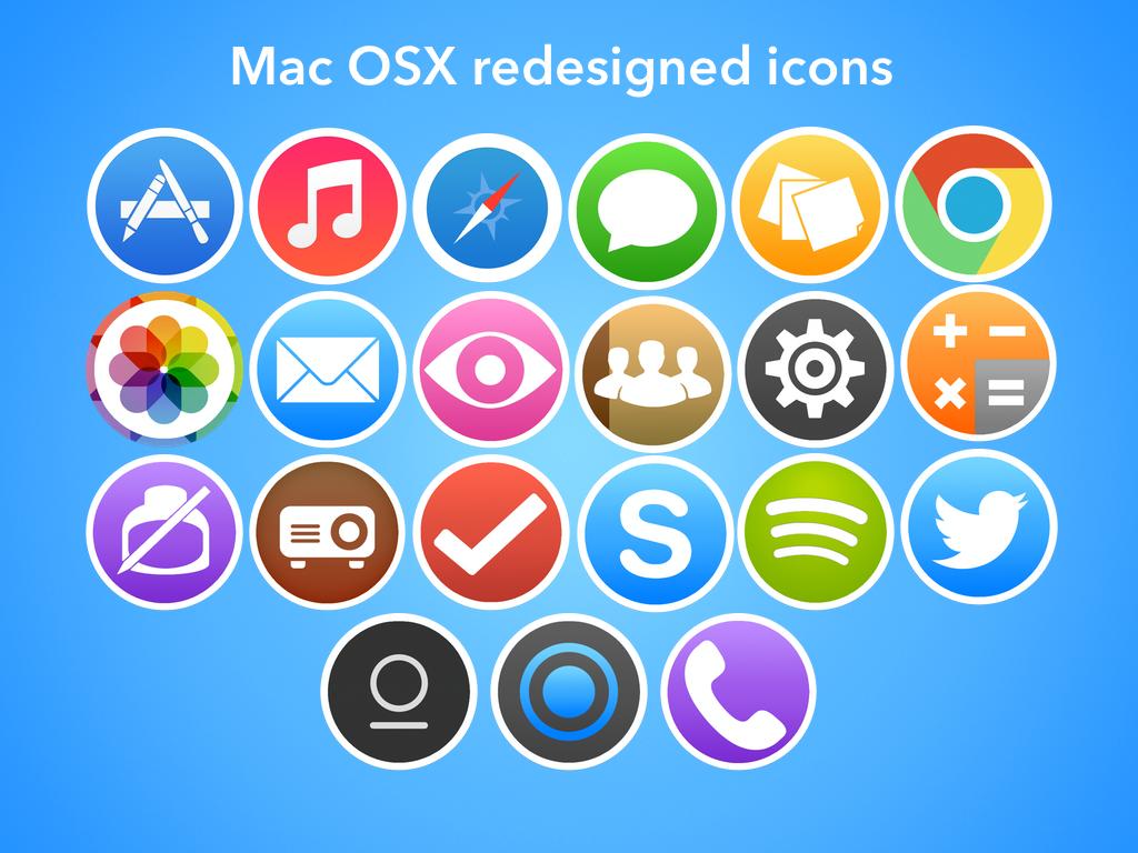
iOSX? iOS 7 inspired Mac icons
- Thread starter Ryantcairns
- Start date
- Sort by reaction score
You are using an out of date browser. It may not display this or other websites correctly.
You should upgrade or use an alternative browser.
You should upgrade or use an alternative browser.
I don't mind them, but I really hope OS X doesn't move in the direction of iOS's design. Not that yours are bad, I just can't see my mac looking like iOS 7.. I would be horrified.
It must. It has to. We cannot have this inconsistency.
MacBooks still look like iPhones used to when the battery dies.
The OSX interface is old and stale. Apple has got to change the font, eliminate the shadows and 3D buttons, and adopt the white aesthetic and icons of IOS7.
Despite your obvious sarcasm I would actually agree.
What's depressing is that Apple making OS X look like iOS 7 is completely possible.
I have yet to understand some people's obsession with change for change's sake. Every feature that Apple introduced with iOS 7 could have been done with iOS 6's aesthetics. They could have just removed the gloss, textures, and made the gradients more subtle. But instead… (sigh)
PS. What's the deal with Notes/Reminders? They still have textures. WTF?
Can't say I'd like these on my Mac, but Apple should have hired you to do their Safari icon for iOS 7.
This has been one thing that irks me with Macs. I love consistency. I like things to look like they belong together. This is the reason I was first attracted to iPhones. I think if OSX was more consistent with iOS and itself even, it would be beautiful. I'd love OSX to have a corresponding similarity to iOS. Symbiotic.
Nice but a bit too flat for me.
Well OP was trying to create icons that matched ios 7's, so yeah they kinda have to be that flat
Not bad at all, I rather like that look in the dock. I don't think I'd choose that over the current design but it's a pretty nice look.
OSX has been going the other way in recent times; removing all the colour seems to be on Apple's agenda. The Finder icons went to grey, amongst others.
Register on MacRumors! This sidebar will go away, and you'll see fewer ads.


