Become a MacRumors Supporter for $50/year with no ads, ability to filter front page stories, and private forums.
New Logo critique required.
- Thread starter dogbone
- Start date
- Sort by reaction score
You are using an out of date browser. It may not display this or other websites correctly.
You should upgrade or use an alternative browser.
You should upgrade or use an alternative browser.
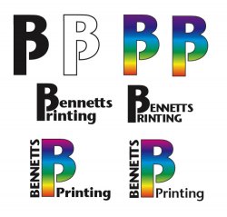
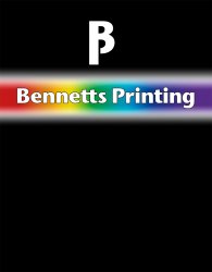
dogbone said:I've settled on this font and I sort of like the symbol, now I'm trying to make the words work with the symbol.
Does 'bennetts' going vertically look a bit naff?
Any suggestions on how the words might work with the symbol?
Leave off the rainbow gradient !
 I would stay away from vertical text as well. Otherwise, I like the middle row best.
Unfortunately, there *has* to be a rainbow gradient in there *somewhere*. The original brief calls for...wait for it...a horizonal spectrum fading off to white top and bottom with the words in the centre in white with a black outline. I might still have to do this.
In the middle one do you think caps or LC works better?
In the middle one do you think caps or LC works better?
dogbone said:Unfortunately, there *has* to be a rainbow gradient in there *somewhere*. The original brief calls for...wait for it...a horizonal spectrum fading off to white top and bottom with the words in the centre in white with a black outline. I might still have to do this.
In the middle one do you think caps or LC works better?
I like bold lowercase best. It's too bad about having to use that rainbow, I'm not surprised they want you to put that in there. Sounds like they know what they want, you might have to show them something that matches their requirements better with the words in the center and all.
the BP logo almost seems like it's too much to work into the actual text of the company name. Not to mention it's hard to read at first glance.
I'd also advise against the rainbow gradient, I think the best solution would be to present the logo both ways and have a strong argument to why they don't need the gradient. Ok, you're a printer, I understand that you can print any color in the rainbow, but can you not pick one of them for your own branding? It's distracting and very "desktop publishing" looking (i.e designed in word).
Alternatively you could suggest that they add other printer identification to their logo like crop marks, registration marks or C, M, Y and K all neatly arranged in little square boxes under their logo.
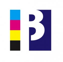
I did a quick solution in illustrator. I'll try my hand at the alternative suggestions too. Just remember, just because a client wants something doesn't mean they won't change their mind if they see something "better than they imagined"
I'd also advise against the rainbow gradient, I think the best solution would be to present the logo both ways and have a strong argument to why they don't need the gradient. Ok, you're a printer, I understand that you can print any color in the rainbow, but can you not pick one of them for your own branding? It's distracting and very "desktop publishing" looking (i.e designed in word).
Alternatively you could suggest that they add other printer identification to their logo like crop marks, registration marks or C, M, Y and K all neatly arranged in little square boxes under their logo.
I did a quick solution in illustrator. I'll try my hand at the alternative suggestions too. Just remember, just because a client wants something doesn't mean they won't change their mind if they see something "better than they imagined"
Attachments
it's 1978 all over again!
sorry, but everything there looks like the same horrible logo that every printing company founded in the 70's has. I can just see this logo on a book of matches in some small town coffee shop where the farmers go on all day about the late harvest and how the government is screwing them.
whoo, ok that was a bit of an odd tangent there, in other words, it looks very dated out of the gates. I'd scrap the whole thing and start from scratch personally.
sorry, I'm not trying to offend, just being honest.
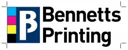
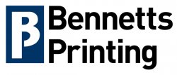
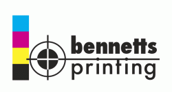
dizastor said:Second attempt, less clean, but a good alternative to the "we must have a rainbow" idea.
Heh, do you get a cut if they choose these designs?
Seriously though, dizastor has some good ideas, though the 2nd design has many too many elements but I think they're both much better than Dogbone's original ideas. Good examples to reference from.Foxglove9 said:Heh, do you get a cut if they choose these designs?
My paypal account is ready for victory.
Seriously though I know about the stubborn client thing. We present better ideas to clients every day where I work, the key is to have sound reasoning. Of course, you always present them with "exactly what they asked for" as well. You just have to explain to them why your concepts will work better.
Like dornoforpyros said the rainbowdient looks very cheesey 70's. If they are a print company looking to get work from designers the first thing we're going to see is that goofy logo and say, hmm, do I want these guys to print my stuff.
Just more fuel for you to counter the client's wants with your design sensibilities.

dornoforpyros said:Just to back up my statements, here's the logo from the printing company from the town I grew up in. Yes, it's a farming community.
You have their number, I have a number of jobs to send out to print
dornoforpyros said:Just to back up my statements, here's the logo from the printing company from the town I grew up in. Yes, it's a farming community.
Looks like it should be a logo for a "Greatest Hits of the 70's" vinyl record collection.
Act now and get a 5th LP free!!
I like the LC better. Easier on the eyes, more attractive and such.dogbone said:Unfortunately, there *has* to be a rainbow gradient in there *somewhere*. The original brief calls for...wait for it...a horizonal spectrum fading off to white top and bottom with the words in the centre in white with a black outline. I might still have to do this.
In the middle one do you think caps or LC works better?
I may be misreading your summary of the brief, but it reads like you could get away with a greyscale gradient instead of rainbow, and that it could be one of those white to black to white gradients. If I was smarter, I bet I'd even know the fancy name for it. At least it wouldn't be so 70s...
Thanks for the feedback so far. OK I'll go with C+LC.
dizastor, That looks pretty good, I'll give that concept a go with a couple of registration marks as well. The cmyk looks much better than a spectrum and even though it has also been done to death it still has a clean look to it especially with some extra reg marks. I'll try to come up with something interesting based your your suggestion.
dornoforpyros, no offence taken at all. You are spot on, I might use your LP logo in order to talk them out of going down this road.
nbs2, it's definitely a spectrum, I worded it badly.
Here's two images I'm going to submit first as I can at least give the client what they asked for. He also asked for the white to fade to black so an ad can be made white reversed out for the local paper.
Attachments
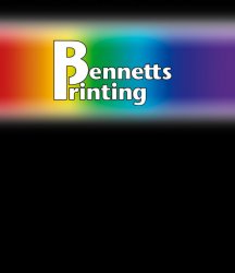
dogbone said:Here's two images I'm going to submit first as I can at least give the client what they asked for. He also asked for the white to fade to black so an ad can be made white reversed out for the local paper.
Oh goodness. Might as well close up shop now with those last 2 logos, if can even call them logos. I bet they'll like them though, clients always seem to like the worst stuff ever.
Definitely show them lots of choices from great to ..well whatever that last example they wanted looks like. They might, and hopefully will, reconsider.
Foxglove9 said:Definitely show them lots of choices...
I find the best solution is to show them 3 choices.
1) Exactly what they wanted
2) A slight departure
3) A totally new concept
Showing them a lot of choices can backfire and confuse a client more than it helps. Showing three is a good balance between, I did what you asked but I'm also proactively thinking about the project.
If you showed me 30 designs my thought would be that you couldn't decide yourself what looked best... and you're the designer. How am I (the lowly client) supposed to chose?
No matter what you show them, clients usually end up "frankensteining" all of your ideas into one stiched-together abomination of unrelated ideas. Your next challenge is to make that work.
The one on the left, with the lettering to the right to complete the thought on that symbol, works way better. Without the text attached it looks like, well,dogbone said:Here's two images I'm going to submit first as I can at least give the client what they asked for. He also asked for the white to fade to black so an ad can be made white reversed out for the local paper.

dizastor said:I find the best solution is to show them 3 choices.
That's a safe way to go. Generally you just have to feel out your client. In my first design job, if I went to his office with just 3 logo designs I would get screamed at for 20 minutes about how lazy and uncreative I am, no less than 12 designs or something ridiculous. The things we designers put up with
dizastor said:I find the best solution is to show them 3 choices.
1) Exactly what they wanted
2) A slight departure
3) A totally new concept
I agree with that as far as the range of ideas, always good to cover all your bases. The number of logos/ideas can vary from client to client. I was once a part of a logo presentation that was more than 5000 logos deep and that was not the only phase.
ATD said:...more than 5000 logos deep...
I'd ask the client to get back to me when they figured out a clear direction they wanted to go in, or find another agency.
Thats beyond excessive.
dizastor said:Thats beyond excessive.
Not always. The design firm I was freelancing for this did this presentation was Saul Bass, the client was Exxon. Presentations like that were quite common there.
ATD said:Not always. The design firm I was freelancing for this did this presentation was Saul Bass, the client was Exxon. Presentations like that were quite common there.
How long does it take to present and explain 5000 logos?
"If you'll turn to page 3864 you'lll see our next idea..."
yikes.
dizastor said:How long does it take to present and explain 5000 logos?
"If you'll turn to page 3864 you'lll see our next idea..."
yikes.
LOL. The presentation took a day or 2. The logos were mounted on large foamcore boards, (maybe a couple dozen per board) 5 deep around a very large conference room and done in sets. He wanted to show he covered all the bases, he actually was only pushing 3 logos, the rest were research.
Register on MacRumors! This sidebar will go away, and you'll see fewer ads.