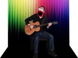
Become a MacRumors Supporter for $50/year with no ads, ability to filter front page stories, and private forums.
Nov 28, 2010
22,670
31
located
how do i put it in?

Why did you create this thread, when you didn't know how to insert an image?

Anyway, you can use the ATTACH button (
attach.gif
) to do so or use the INSERT IMAGE button (
insertimage.gif
) to embed an image stored online on some image hosting site or your personal webspace.


help please?

FASTER, FASTER, FASTER.
 

Buchey

macrumors newbie
Original poster
Nov 30, 2010
23
0
Why did you create this thread, when you didn't know how to insert an image?

Anyway, you can use the ATTACH button (
attach.gif
) to do so or use the INSERT IMAGE button (
insertimage.gif
) to embed an image stored online on some image hosting site or your personal webspace.


FASTER, FASTER, FASTER.


how do i find the attach button?
 
Nov 28, 2010
22,670
31
located
how do i find the attach button?

By looking for this:
attach.gif
in the first row above the text entry filed you used when creating this thread (why again*) and the subsequent posts?

* I'm seriously curious, why you did create a thread without putting the image in. WHy didn't you ask for help on how to put an image into a post or taken a look at the numerous threads about the same issue or even the FAQ?
 
Nov 28, 2010
22,670
31
located
look now, and i haven´t used any of them to create the image??

What did you use then?

tilchristoffer.jpg


And what is the intent of this image, as the bottom third is really black and sucks up the legs of the musician and the chair?


why did you post them?

To foreshadow the use of rainbow colours? Messy reminded me of that thread and I had to share these abominations.

Anyway, it is an okay use of masks, but the background still doesn't fit a theme and the person seems kinda off in it.

And why did you purchase the Adobe products but didn't use them?
 

Messy

macrumors 6502
Sep 5, 2010
426
12
Sim won this thread tbh.

Also, fixed your image OP.

attachment.php
 

Attachments

  • Untitled-1.jpg
    Untitled-1.jpg
    265.3 KB · Views: 372

Buchey

macrumors newbie
Original poster
Nov 30, 2010
23
0
What did you use then?

tilchristoffer.jpg


And what is the intent of this image, as the bottom third is really black and sucks up the legs of the musician and the chair?


To foreshadow the use of rainbow colours? Messy reminded me of that thread and I had to share these abominations.

Anyway, it is an okay use of masks, but the background still doesn't fit a theme and the person seems kinda off in it.

And why did you purchase the Adobe products but didn't use them?

what would you set as background?
 

Messy

macrumors 6502
Sep 5, 2010
426
12
What do you want to achieve?

Ie whats the end point you want to get to, whats the result? Know that and work backwards.

If your intention was to portray a gay rights guitarist then you possibly achieved that.

I think to be fair you should have spent a good while doing tutorials and learning about Photoshop, Graphics in general and the theory/concept of designing.

and *then* bought yourself all that fancy software.

Just going on your ability to not understand how to attach an image to a forum, would have me think you arent really ready to be designing websites!

Just giving you my observations!
 
Nov 28, 2010
22,670
31
located
what would you set as background?

It´s for a web page, and i used photoshop

Okay, this will be running in circles and pulling everything out of your nose then, I guess?

With intention I mean, what do you intent to display or show with this image and what should it represent and does it conform with the music that artist makes? As of now, the background is too distracting and too coloured compared to the musician with his three/four colours (jeans, shirt, skin, guitar).

Have you taken any classes in graphics and design?


better words than mine

Thanks.
 

Buchey

macrumors newbie
Original poster
Nov 30, 2010
23
0
Okay, this will be running in circles and pulling everything out of your nose then, I guess?

With intention I mean, what do you intent to display or show with this image and what should it represent and does it conform with the music that artist makes? As of now, the background is too distracting and too coloured compared to the musician with his three/four colours (jeans, shirt, skin, guitar).

Have you taken any classes in graphics and design?


Thanks.

yes he just wanted a page where theres a little bit about him and his music. it´s one of my dads friends. no i haven´t taken any classes, and i have removed the background so now it´s just black, what would you have done now?
 

Messy

macrumors 6502
Sep 5, 2010
426
12
yes he just wanted a page where theres a little bit about him and his music. it´s one of my dads friends. no i haven´t taken any classes, and i have removed the background so now it´s just black, what would you have done now?

I would have used the past 10 years experience I had and planned out what I wanted to achieve, how i wanted it to look, got a colour palette together, sketched out layout designs, got together content, done some concepts etc etc.

I think you need to spend a little while learning how to use the fancy new programs you have, and possibly how to use computers/speak english as well.

No point asking how we would have done it differently, as we havent got a clue what you want to achieve, frankly i dont think you do either.
 

Buchey

macrumors newbie
Original poster
Nov 30, 2010
23
0
I would have used the past 10 years experience I had and planned out what I wanted to achieve, how i wanted it to look, got a colour palette together, sketched out layout designs, got together content, done some concepts etc etc.

I think you need to spend a little while learning how to use the fancy new programs you have, and possibly how to use computers/speak english as well.

No point asking how we would have done it differently, as we havent got a clue what you want to achieve, frankly i dont think you do either.

he just want a small web site nothing fanzy? ;)
 

camomac

macrumors 6502a
Jan 26, 2005
778
197
Left Coast
why is nobody pointing out the obvious? the "rainbow" background and the black "stage" do not line up on the left. very sloppy in my opinion. the outer glow around the guy looks cheap and way over used.

there doesn't seem to be any obvious point or idea behind anything on this image. sorry if this seems harsh, but that is my observation...
 
Register on MacRumors! This sidebar will go away, and you'll see fewer ads.