Scroll down to reveal the toggle.
Found it thanks!!!
Scroll down to reveal the toggle.
could u post a preview, please?!
----------
Some preview, please, pleaseeee!
The only real issue I have with Apple's new GUIs is the amount of gray impeding on what used to be a colorful OS. That was certainly a harsh jump from Snow Leopard to Lion. Other than color, I don't really see a decline in GUI quality from Apple. I would certainly feel different if Apple's new OS booted up to a bunch of squares, however. *cough*Windows 8*cough*There's one thing I have started to hate about Apple - Bad UI design.
I mean - we have great UI experts at Apple and some of the UI elements on OS X and iOS are just so bad-looking.
Just look at the volume bar or status bar on iOS, notification centre on iPad and OS X, now this switch button with the exact same UI from iOS, the whole final cut pro in helvetica.
There's something wrong going on in 1 Infinite Loop. Apple needs to come up with much more innovating and better looking UI designs even those these ones solve a purpose and do it just fine. It's all we Apple geeks have craved for years - great UI design and its implementation.
Or perhaps they just disagree with you. After all, this is an Apple-oriented forum, so one could safely assume that most users on here enjoy the look and feel of Apple products.Some pro-Apple people on this forum are seriously butthurt over any critical comments made. Sad thing, is they fail to understand that this is for our benefit as well as for Apple.
This was used to be a constructive forum - now its just people getting butthurt over any critical comments made on Apple or Apple products. Grow up.
Enjoy
There's one thing I have started to hate about Apple - Bad UI design.
I mean - we have great UI experts at Apple and some of the UI elements on OS X and iOS are just so bad-looking.
Just look at the volume bar or status bar on iOS, notification centre on iPad and OS X, now this switch button with the exact same UI from iOS, the whole final cut pro in helvetica.
There's something wrong going on in 1 Infinite Loop. Apple needs to come up with much more innovating and better looking UI designs even those these ones solve a purpose and do it just fine. It's all we Apple geeks have craved for years - great UI design and its implementation.
EDIT: Apple needs to fix the font in the notification centre on OS X- Helvetica is not suitable for low PPI displays running OS X and it looks crippled.
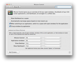
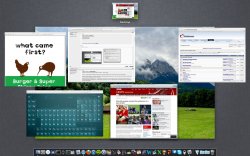
Could u please post a preview where is lets say more windows from one app so we will see "ungrouped" windows ?
Thank you!
here
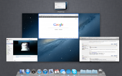
seems like the same behavior that was in old Exposé just without the "grid" structure of spaces.
The only real issue I have with Apple's new GUIs is the amount of gray impeding on what used to be a colorful OS. That was certainly a harsh jump from Snow Leopard to Lion. Other than color, I don't really see a decline in GUI quality from Apple. I would certainly feel different if Apple's new OS booted up to a bunch of squares, however. *cough*Windows 8*cough* (....)
Awesome!
EDIT: Although I would have kind of liked it if they had implemented what I suggested here. I enjoy the fact that you can send entire applications to another space with the current Mission Control by grabbing the app's icon. It seems that that wouldn't be possible anymore once you disable grouping windows by application?!
seems like the same behavior that was in old Exposé just without the "grid" structure of spaces
What is that icon after Spotlight, anyone have any ideas?
I am going to file a bug report with Apple and ask them to add the Cmd modifier to send all the application windows to another space, much like how Spaces in 10.5 and 10.6 worked.
That's what I was waiting for since 10.6...!
I'm buying ML as soon as it is available just for that one function.
The only real issue I have with Apple's new GUIs is the amount of gray impeding on what used to be a colorful OS. That was certainly a harsh jump from Snow Leopard to Lion. Other than color, I don't really see a decline in GUI quality from Apple. I would certainly feel different if Apple's new OS booted up to a bunch of squares, however. *cough*Windows 8*cough*
Or perhaps they just disagree with you. After all, this is an Apple-oriented forum, so one could safely assume that most users on here enjoy the look and feel of Apple products.
Yea, Im still on 10.6, too and my only hope since dev version of Lion was to get back Expose.
Now reinstate 'Save As' and do away with this stupid 'Save a Version/Duplicate' crap and I'd upgrade from 10.6.8 in a heartbeat.
I've been using iWork for years and I see Auto Save and Versions as a very compelling reason to use Microsoft Office.