Become a MacRumors Supporter for $50/year with no ads, ability to filter front page stories, and private forums.

adamvk

macrumors 65816
Original poster
Oct 29, 2008
1,308
0
Phoenix, AZ
Hey,

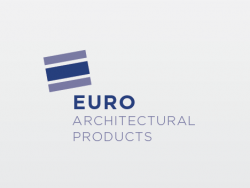
So I'm wondering what y'all think of this logo. I'm rebranding a glazing company that builds and installs storefronts, commercial windows, etc. I'll uploaded both their current logo and the one I designed. The thought process behing the logo was to 1) represent the "e" in euro, and also represents a cut though of glass, showing the various logos. What do you think? Thanks!

I've never thought of posting online for comments and crits, but I keep hitting that mental wall with this project, so I though, what the heck!
 

Attachments

  • Screen Shot 2012-07-10 at 9.11.05 PM.png
    Screen Shot 2012-07-10 at 9.11.05 PM.png
    28.8 KB · Views: 831
  • Screen Shot 2012-07-10 at 11.23.57 PM.png
    Screen Shot 2012-07-10 at 11.23.57 PM.png
    17.8 KB · Views: 167

twietee

macrumors 603
Jan 24, 2012
5,300
1,675
This won't be a lot of help, yet i wanted to say that i like it! Yours is the upper one, right? The idea with the reference to the technical expression of glass is very good..although i have to admit that i haven't noticed it until i reread your explanation..part of this problem, if you see it as a problem at all, is the square form of the logo. But i like it kind of how it is right now - abstract.

The reference to the letter E is clear, personally I'm a bit biased by the euro2012 soccer cup, so that's what came to my mind at first..with EURO being bold..

..nice work!
 

fig

macrumors 6502a
Jun 13, 2012
916
84
Austin, TX
Well, assuming yours is the top one it's certainly better but it would've been difficult to make it worse ;)

The concept behind the mark is cool, I like the idea of the layers. I might tighten it up a bit though, maybe a bit less space between the "layers" and I'd try making those colors just a bit more contrasting for clarity's sake. I can't decide if it's rotated quite enough; when objects are rotated only a slightly off the horizontal axis they can sometimes look accidentally rather than intentionally rotated, just something to keep in mind.

The type concerns me a bit. Good choice of typeface (Gotham I think?) but the fact that it's a long name all on one horizontal line and that it's tracked out means you have a realllllly long narrow logo, something that can be a bit awkward to fit on business cards or webpages. I'd tighten up the text a bit and maybe even try some sort of stacked type, even if it's just an alternate version it would be nice to have something that could fit in a shorter area.

Also, any reason to bold "Euro" apart from the other words? I think it could work either way, just wondering what the reasoning was.

Hope that helps!
 

citizenzen

macrumors 68000
Mar 22, 2010
1,543
11,786
I like your version. It's much, much better than the original.

Things that I'd want to explore still ...

  • Length. It's a very long and thin logo. There may be times where those proportions become problematic.

  • Color. I'd look to introduce a second color other than blue.

  • Typography. I'd look at caps/lower case for the lighter text.

Just a few thoughts.
 

Xian Zhu Xuande

macrumors 6502a
Jul 30, 2008
941
128
Length would be the concern that jumps out at me. It scales reasonably well due to the font face you have chosen (definitely the biggest problem with the original logo). Not sure want to suggest in regard to the length. That is frequently solved with a variation or by dropping text, but the latter only works with great brand recognition.
 

citizenzen

macrumors 68000
Mar 22, 2010
1,543
11,786
The more I look at the mark, the more out of scale the graphic feels to me.

It feels too big.
 

adamvk

macrumors 65816
Original poster
Oct 29, 2008
1,308
0
Phoenix, AZ
This won't be a lot of help, yet i wanted to say that i like it! Yours is the upper one, right? The idea with the reference to the technical expression of glass is very good..although i have to admit that i haven't noticed it until i reread your explanation..part of this problem, if you see it as a problem at all, is the square form of the logo. But i like it kind of how it is right now - abstract.

The reference to the letter E is clear, personally I'm a bit biased by the euro2012 soccer cup, so that's what came to my mind at first..with EURO being bold..

..nice work!

Thanks! Yea, mines the top.

If yours is the upper one I love it :) Nice and simple, yet still elegant.

Thank you!

Well, assuming yours is the top one it's certainly better but it would've been difficult to make it worse ;)

The concept behind the mark is cool, I like the idea of the layers. I might tighten it up a bit though, maybe a bit less space between the "layers" and I'd try making those colors just a bit more contrasting for clarity's sake. I can't decide if it's rotated quite enough; when objects are rotated only a slightly off the horizontal axis they can sometimes look accidentally rather than intentionally rotated, just something to keep in mind.

The type concerns me a bit. Good choice of typeface (Gotham I think?) but the fact that it's a long name all on one horizontal line and that it's tracked out means you have a realllllly long narrow logo, something that can be a bit awkward to fit on business cards or webpages. I'd tighten up the text a bit and maybe even try some sort of stacked type, even if it's just an alternate version it would be nice to have something that could fit in a shorter area.

Also, any reason to bold "Euro" apart from the other words? I think it could work either way, just wondering what the reasoning was.

Hope that helps!

Thanks for the tip, I did tighten up the spaces between the lines. Yea, the type was an issue, (It is Gotham) I tried putting it on multiple lines. The name might also be changing to EuroGlass, so then it would work much better. I'll attach both versions below.

I like your version. It's much, much better than the original.

Things that I'd want to explore still ...

  • Length. It's a very long and thin logo. There may be times where those proportions become problematic.

  • Color. I'd look to introduce a second color other than blue.

  • Typography. I'd look at caps/lower case for the lighter text.

Just a few thoughts.

Hmm, I need to play around more with it, but yea, more color might be a good thing. As far as the caps/lowercase goes, I personally hate lowercase Gotham, so it's staying uppercase for now. :)

Length would be the concern that jumps out at me. It scales reasonably well due to the font face you have chosen (definitely the biggest problem with the original logo). Not sure want to suggest in regard to the length. That is frequently solved with a variation or by dropping text, but the latter only works with great brand recognition.

Yea, length is biggest issue, but hopefully the below images fixed it for ya.

The top one looks nice, don't really care for the bottom one.

Haha good, the bottom one's the old one.

The more I look at the mark, the more out of scale the graphic feels to me.

It feels too big.

Yea, agreed.
 

Attachments

  • Screen Shot 2012-07-11 at 5.23.24 PM.png
    Screen Shot 2012-07-11 at 5.23.24 PM.png
    10.1 KB · Views: 88
  • Screen Shot 2012-07-11 at 5.23.02 PM.png
    Screen Shot 2012-07-11 at 5.23.02 PM.png
    13.8 KB · Views: 85

decksnap

macrumors 68040
Apr 11, 2003
3,075
84
The first one is closer than your revised ones. There is some irony in these where it looks like a building toppling over the side of the type. It may seem more boring but I wonder if you took the first mark and straightened it back out to level if it wouldn't make more sense for architecture. Match the height of the center bar with the cap height of the type, and maybe try moving 'euro' to the left of the mark. Just some quick thoughts.
 

Carlanga

macrumors 604
Nov 5, 2009
7,132
1,409
Umm I think the blocks should be next to EuroGlass instead of at the top; makes it look unbalanced. Maybe make the word EURO "glazed"

or

take the bricks colors and make them part of the word EURO and eliminate those blocks if those have no real meaning.

Also, are they called EuroGlass or the long name, if so you can't make EuroGlass the new company name on the logo or can you?
 

adamvk

macrumors 65816
Original poster
Oct 29, 2008
1,308
0
Phoenix, AZ
The first one is closer than your revised ones. There is some irony in these where it looks like a building toppling over the side of the type. It may seem more boring but I wonder if you took the first mark and straightened it back out to level if it wouldn't make more sense for architecture. Match the height of the center bar with the cap height of the type, and maybe try moving 'euro' to the left of the mark. Just some quick thoughts.

Haha, you're right, I never saw it as a building. I have to work on that. Actually, it's funny, my Mac froze today, and when I reset it I realized the last place I saved was when I finished the first logo design. Maybe the universe is telling me to stick with the original one. :)

Umm I think the blocks should be next to EuroGlass instead of at the top; makes it look unbalanced. Maybe make the word EURO "glazed"

or

take the bricks colors and make them part of the word EURO and eliminate those blocks if those have no real meaning.

Also, are they called EuroGlass or the long name, if so you can't make EuroGlass the new company name on the logo or can you?

Ah ok. Good suggestions, I'll try them!

And the company name might be changing to EuroGlass, hence why I was playing around with it. Unfortunately I don't know what they're sticking with.
 

adamvk

macrumors 65816
Original poster
Oct 29, 2008
1,308
0
Phoenix, AZ
Ok, I tried some of your suggestions, and here's another revision. Thoughts?

Haha, sorry, I left some of Illustrator in the screenshot. Ignore that, it's not part of the logo. :p
 

Attachments

  • Screen Shot 2012-07-18 at 8.13.27 PM.png
    Screen Shot 2012-07-18 at 8.13.27 PM.png
    24.5 KB · Views: 96
Last edited:

ktbubster

macrumors 6502a
Jan 20, 2007
794
1
US
I feel like you're going backwards. I'd like to see the first one you posted but with the blocks rotated a bit more (5-10 degrees) counter clockwise, and a smidge bigger and your text slightly more condensed (I much prefer the Gotham or similar to the bold text in your newest. The bold text seems very 90s.)

Perhaps try what I mentioned above but with the blocks on top of the text and larger?

I'd also play around with more contrasts hues of blue too, perhaps the blue from your most recent paired with the darker of your first?
 

phrehdd

macrumors 601
Oct 25, 2008
4,313
1,311
More peanuts from the gallery.

These are just random thoughts and please take it all as constructive.

The original logo was pushing the "EAP" facet of the name of the company. Did they do this to be known in a shorthand reference as EAP? How significant is this to their identity?

Here is the hard part for me as it comes off negative - You seemed to be trying to make everything fit around your cut of glass "E." I highly suggest you do an exercise and take it out of the logo entirely. What is left? Actually nothing really is left. This force fit of your addition has entirely monopolized your ability to be creative. As well, the E has no real impact on helping to identify the company the way that "EAP" does. I am not a fan of their logo but I do get the value of EAP. I do like a clean look of your work but it really seems more like what one might see on an envelope.

I guess my point is rather simple - it becomes very easy to get lost in a project like this when one of the components becomes too important. This is why I suggest trying to remove it for a moment and see what is left. It is a hard pill to swallow but a worthy exercise.

Just my two cents.
 

adamvk

macrumors 65816
Original poster
Oct 29, 2008
1,308
0
Phoenix, AZ
I feel like you're going backwards. I'd like to see the first one you posted but with the blocks rotated a bit more (5-10 <a class="inlineAdmedialink" href="#">degrees</a>) counter clockwise, and a smidge bigger and your text slightly more condensed (I much prefer the Gotham or similar to the bold text in your newest. The bold text seems very 90s.)

Perhaps try what I mentioned above but with the blocks on top of the text and larger?

I'd also play around with more contrasts hues of blue too, perhaps the blue from your most recent paired with the darker of your first?

Thanks for the reply! Ok, I tried what you suggested. See attachment one. What do you think?

Was better before ... Your first and second one was nice; the circle in your last one kills it (for me)

Ok, thanks for the comment! I made a small modification really just removing the circle and making the typeface less bold. (attachment 2)

More peanuts from the gallery.

These are just random thoughts and please take it all as constructive.

The original logo was pushing the "EAP" facet of the name of the company. Did they do this to be known in a shorthand reference as EAP? How significant is this to their identity?

Here is the hard part for me as it comes off negative - You seemed to be trying to make everything fit around your cut of glass "E." I highly suggest you do an <a class="inlineAdmedialink" href="#">exercise</a> and take it out of the logo entirely. What is left? Actually nothing really is left. This force fit of your addition has entirely monopolized your ability to be creative. As well, the E has no real impact on helping to identify the company the way that "EAP" does. I am not a fan of their logo but I do get the value of EAP. I do like a clean look of your <a class="inlineAdmedialink" href="#">work</a> but it really seems more like what one might see on an envelope.

I guess my point is rather simple - it becomes very easy to get lost in a project like this when one of the components becomes too important. This is why I suggest trying to remove it for a moment and see what is left. It is a hard pill to swallow but a worthy exercise.

Just my two cents.

The EAP was established awhile ago, and they don't really use it anymore. They would like to just use the full company name.

Removing the "E" is a very good idea, and it's an exercise I'll try shortly. You're completely right when you say when the E is removed, there's nothing there. I need to work on that. Thank you!
 

Attachments

  • Screen Shot 2012-07-22 at 8.49.03 PM.png
    Screen Shot 2012-07-22 at 8.49.03 PM.png
    15.4 KB · Views: 91
  • Screen Shot 2012-07-22 at 8.47.59 PM.png
    Screen Shot 2012-07-22 at 8.47.59 PM.png
    14 KB · Views: 87

ktbubster

macrumors 6502a
Jan 20, 2007
794
1
US
#1 of your most recent post is much closer now I think. Perhaps decrease the space between the glass block and the words a smidge. Can also play with different alignment and the blocks on top of the text or others etc, but better definitely.

The #2 of your most recent ... ugh. that font. That font is aging it. I'd stay away from that and go back to #1 and work with that. - also removing the block and thinking about it for a while from that perspective is good advice.
 

adamvk

macrumors 65816
Original poster
Oct 29, 2008
1,308
0
Phoenix, AZ
#1 of your most recent post is much closer now I think. Perhaps decrease the space between the glass block and the words a smidge. Can also play with different alignment and the blocks on top of the text or others etc, but better definitely.

The #2 of your most recent ... ugh. that font. That font is aging it. I'd stay away from that and go back to #1 and work with that. - also removing the block and thinking about it for a while from that perspective is good advice.

Ok, awesome! Yea, I'll play with the spacing. I think I'm going to go with #1, and just ditch #2 all together. The owner likes the first one as well.
 

adamvk

macrumors 65816
Original poster
Oct 29, 2008
1,308
0
Phoenix, AZ
Few more
 

Attachments

  • Screen Shot 2012-07-23 at 5.57.19 PM.png
    Screen Shot 2012-07-23 at 5.57.19 PM.png
    15.6 KB · Views: 111
  • Screen Shot 2012-07-23 at 5.55.38 PM.png
    Screen Shot 2012-07-23 at 5.55.38 PM.png
    16.7 KB · Views: 84
  • Screen Shot 2012-07-23 at 5.52.06 PM.png
    Screen Shot 2012-07-23 at 5.52.06 PM.png
    16.7 KB · Views: 100
  • Screen Shot 2012-07-23 at 5.50.40 PM.png
    Screen Shot 2012-07-23 at 5.50.40 PM.png
    19.3 KB · Views: 95
  • Screen Shot 2012-07-23 at 5.42.24 PM.png
    Screen Shot 2012-07-23 at 5.42.24 PM.png
    12.2 KB · Views: 92

ChristianVirtual

macrumors 601
May 10, 2010
4,122
282
日本
Like left top and middle; left down is an obvious one but not too sure. Right side top looks bended; right down is kind of ok but also standard
 

adamvk

macrumors 65816
Original poster
Oct 29, 2008
1,308
0
Phoenix, AZ
Like left top and middle; left down is an obvious one but not too sure. Right side top looks bended; right down is kind of ok but also standard

Yea, I know left side on the bottom is very obvious, but I like it for some reason. Haha. Not sure why.
 
Register on MacRumors! This sidebar will go away, and you'll see fewer ads.