Become a MacRumors Supporter for $50/year with no ads, ability to filter front page stories, and private forums.
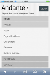
patent10021

macrumors 68040
Original poster
Apr 23, 2004
3,504
792
which of these two mobile menu style do you prefer?

I've never liked the wheel. I like the traditional cascade.
 

Attachments

  • ?? 1.PNG
    ?? 1.PNG
    75.5 KB · Views: 180
  • ?? 2.PNG
    ?? 2.PNG
    230.8 KB · Views: 145

Padaung

macrumors 6502
Jan 22, 2007
470
104
UK
The traditional menu for me, without a doubt. The wheel is fine for setting an alarm time in the Clock app and things like that, but not as a user interface menu on a website.
 

patent10021

macrumors 68040
Original poster
Apr 23, 2004
3,504
792
The traditional menu for me, without a doubt. The wheel is fine for setting an alarm time in the Clock app and things like that, but not as a user interface menu on a website.

Really that's interesting because at least half, more like most of these templates from all these template companies are using the wheel. I like the traditional one too.
 

sk3pt1c

macrumors 6502a
Nov 29, 2005
918
6
a simulacrum
The traditional menu works better, especially if it's responsive and the text is big and easy to tap on the iphone.

BUT consider that when you have a large menu with lots of options, the user would have to scroll up and down and tap on items to reveal submenus and so on which basically takes extra time.

In that case, the wheel is far more usable, especially with a structure like so:

Menu Item 1
Menu Item 2
-- Sub Menu Item 1
Menu Item 3

and so on ;)

It's easier to scan and find the page you want to go to
 
Register on MacRumors! This sidebar will go away, and you'll see fewer ads.