Click on an app in the App Store on your mini (portrait mode) and check out the small text which appears (e.g. in the Ratings and Reviews section) - is it me or is this really nice quality compared to Safari say at a similar font size? 
I think/hope this means there is potential for an OS update to improve the quality of small text.
I think/hope this means there is potential for an OS update to improve the quality of small text.
Instead of improving the quality of small text then how about eliminating it all together?
My opinion has always been that the lack of retina isn't what hurts the screen experience, it's the lack of a default for minimum text size.. Throughout the Mini you can see the UI and 1st party apps are ideal for a 9.7" tablet but a bit too small and jagged when scaled down for a 7.9".
Many 3rd party apps allow users to adjust text size so in apps like Kindle, Pocket, Flipboard etc then the default text is a bit small but the next size up looks great even without retina. So the fix isn't in new hardware, but an OS update that addresses text size.
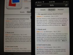
This is a picture of the app store on the iPad Mini (back) vs iPhone 5 (front) where the iPhone text is actually bigger than the tablet text. Yes, the text is readable on both but it's far from ideal to have a 4" phone easier to read than a 7.9" tablet.
I did already try it, it helps in some sites for sure, but breaks others (especially forum post lists where text starts to overlap buttons) - as above though, just making the text larger may not be the answer.Just found out about the mercury browser. Try it out. Better font rendering and can change the default font size.
I think/hope this means there is potential for an OS update to improve the quality of small text.
last time someone tried (KittyKatta who posted here, in this thread, too), people were not getting the point.I think the observations here are correct, and instead of everyone posting "iPad mini screen sucks" threads, it would be much wiser if everyone would start posting "Default text font and size in Safari on the iPad mini is not optimal for the screen" threads. Who wants to be the first to start?
).I don't have an iPad at hand... one question: is it true in landscape too?the small text in the app store info section looks good. I don't know why, but it does!
no, I mean,Landscape is much better generally, even in Safari, so the difference between the app store and Safari is much less noticeable.
I think it is anti aliased differently. The font in the App Store looks identical to me in portrait and landscape. As you say, Safari doesn't seem to have the same capability.no, I mean,
you're talking about the app store. I ask you if the size of font is the same in landscape for the reviews.
because of orientation changes capability, sub-pixel anti-aliasing isn't used on iOS.
text in Safari could be anti-aliased differently than in the app store (not even talking about orientation).