Right, here we go!
Nice colours but quite a "busy" image. I'm not sure where my eye is meant to be drawn, to the water, to the rainbow, to the light or even to the benches. I feel that without context I am not entirely sure what is going on. Part of me also feels that if you have stepped back to get the light post in you might as well step back a little further and get the bin in swell OR step forward and skip out both!
Nice image but I feel the PP is perhaps a bit too much. The lighting on the driftwood(?) feels a bit too unnatural to me and the strong darkening of the skyline creates a large black void at the top of the picture. I think if you toned down the PP a little it would become more compelling.
An interesting shot. It instantly had me turning my head to the right. I think the only thing I would say is that the shoreline is slightly tipping down to the right and with this composition it might have been better to appear completely horizontal. I like the haze in the background but would have probably preferred the subject to be facing the sunlight and not in so much shadow but assuming it was taken on the fly I realise these things can be difficult.
Using the rule of thirds? Some changes I would have made would be perhaps to attempt to fill the bottom 1/4 which feels a bit empty and perhaps move a tad forward to get rid of the object bottom right. Also PP-wise have you tried playing with the contrast/clarity/definition to get some more detail in the far away hazy background?
Lovely shot, great vibrant colours and a really dreamy effect with the clouds. Lucky the sun was behind the clouds so no one area is too blown out. I would have maybe cropped in a tad to get rid of the harsh black area at the beginning as my eye is drawn down a bit. But that might have brought the shoreline too far down.
I like the use of desaturation here. It gives it a feeling of abandonment. My only comment would be that I feel quite removed from the building and I wonder whether filling more of the frame with it might have helped get rid of some of the empty space to the left. I like the cool feel too.
Whilst a good example of a straight as can be horizon line I feel there is not enough going on in the frame. The sky is bland and the beach is not really full of any objects. Was there anything else you could have put in the picture to have a focal point?
Nice capture. For me a bit too much saturation and contrast as some detail is lost on me in the rocks and the sky feels too blue. Also the WA distortion is a little off for me. My eye was instantly drawn to the rock bottom left which I don't think is the subject.
Nice silhouette but it might have been nicer if the head had been risen so it doesn't disappear into the body. The sea also feels a bit to hot (in terms of exposure!) and could maybe be toned down. If you had walked a little further down the beach you would have got rid of the area of sand where there isn't water in the bottom right.
Nice colours but I think the effect might have been taken a bit too far. The highlights on the rocks and the metal bar top right seem too pink to be real. The composition also feels very low in the scene and it seems awkward to cut off the structure. Also I tend to like pictures where there is an obvious subject and in this one I am not sure what it is, the two sand mounds, the shoreline, the pebbles, the structure?
Not sure if this is a film shot or a digital convert. Seems to be little DR as the highlights are blown whilst there is no detail in the shadows of the rocks. Still it's a compelling image. It has a very moody feel to it and I like the rock in it's own pool at the bottom.
Interesting scene but again one with too much PP for me. The dark area on the left just feels strange to me and there is something odd about the colours, I don't know if it's because you uploaded in ProPhoto RGB? Also I would have stopped down further as where my eye is drawn, the brightest area bottom right, is actually out of focus.
A nice shot with a very cool (WB) feel to it. It feels a bit soft though but an interesting reflection all the same. There is not much I would change but the scene doesn't jump out at me. Have you boosted the shadows in the woods something feels a little strange with the colours to me?
I like shots with people! Similar to above did you try positioning her a bit more on the 1/3 line to the left? Also I might have composed it a bit higher as there feels to be too much beach. Also I think you have a grad. filter on the sky which might have been more subtle if there was more sky to use it on.
Nice shot. I love this light when blue is dominant but there is still a tinkle of oranges and pinks. Until blowing it up I thought it was a lake at the bottom but now I realise it's snow! I would have liked either a little more detail in the shadows or a complete silhouette of the mountain as the dark snow is a little distracting but I am being a bit picky!
Not a huge fan of the border as I'm not sure what it adds to the photo. I like the fact the bridge in the shot and I hope you selected to take it because of this. It's a nice piece of detail that you wouldn't often get in a shoreline picture. I like the strong blues/greens of the ocean too.
At first glance I liked the colours in this image however, upon closed inspection I think you might have gone a bit to far as I can see clear blue/red fringing around the edges of the buildings. Nice to see a different interpretation of the theme and a cityscape in the scene adding some variety. All that being said I much prefer it to the original.
Whilst the horizon is straight (I checked ) the fact that there is something off about the symmetry of this picture makes it feel to me like it's slanted to the right. I think the blandness works in it's favour but I can't work out whether the grasses help or hinder the composition due to their sporadic nature.
Far too much PP on this for my liking. It looked like a nice scene but I don't see the need to make it look unnatural. You might also want to correct some of the WA distortion and the PP has lost some sharpness in the clouds.
Nice to have a subject in there! Second thing I noticed though was the horizon line which is slanted to the right. I think with these sorts of shots where their is an obvious line in the background which is normally straight it just feels unnatural if it isn't. I really like how dynamic the sky is behind with pretty much every type of cloud!
I really like this shot. The natural (I hope!) graduation of the sea colour draws the eyes down to the subject. I only wonder if she could be doing something more interesting or we can see her face. Is she picking up a rock to throw or found something on the beach? Is she happy is she sad?
Really love the colours in this just wondered how the shot would differ you had angled so we could see a bit more of the boats so the horizon line is higher or if you have crouched lower to compress the empty space of the water between the boats and the treeline (if that makes sense!). I love the dark shadows on the boats too and the rich colours are just great.
This is awful. Why do you even consider entering! Don't quit your day job...
A nice shot but I would like to be closer to the action. If the shot had been taken from the first bare hill outcrop that is in the shot it might have been more compelling for me. Also if the house is the intended subject in the image it feels a little low to me.
I like this shot a lot. I think the business works for it and there are lots of different elements I can enjoy looking at. It's a lovely light too and I can't really think of anything I would change.
For some reason this feels like a painting to me. Not sure if its the clouds or the actual horizon line but it feels like it's tipping to the left. Also not so keen on the bush framing the bottom and right. If you had zoomed in a little more you would have also had less sky space which might have been nice.
A lovely scene but like a few others you need to watch your horizon line which is dipping to the right. Since the sun is partially obscured I might have tried to hide it behind the wooden pole it's just above as at the moment it's a little distracting. I realise you can't get rid of it but the bush right of centre at the bottom is a tad annoying.
Removals of clues that this is a film shot? I like the colours but don't understand the much darker sky than the reflection. I always like reflections when they are almost perfect mirror images.
A nice shot but your watermark is off putting. I'm not a huge fan of watermarks and I think that Flickr's copyright controls are strong enough now to negate them. Also the WA distortion is a little too much for me. I really like the colours though and I assume your solitary footstep on the beach.
One of the few snow scenes. I feel the vignette is too strong and the red light on the building on the left is very distracting, especially accentuated against the vignette. I like the fact that you put in the backstory which adds some meaning to me.
Nice scene. In terms of changes compositionally, it might have been nicer to have the horizon a bit higher and to have just taken the shot a few feet forward in front of the bush! I really like the way the few lone figures have come out on the beach. I think I also like the FOV on this shot. Was it something similar to a slightly longer lens? It just feels right rather than some of the more WA shots.
I get a bit confused with this picture with the portrait orientation, the horizontal subject on the right and the vertical subject on the left with the shoreline sort of running vertically between them. Although I can't think of how I would have changed it, its always important to look at the relationship of the lines and here they are too opposite to work for me.
What a great shot. I would have liked a link so I could see it bigger as it looks so small on my screen. Love the vibrant colours and everything seems to just work in this image. In other photos I have commented on the negative space but the top half blue really adds to the contrast of the bright red bridge. Conscious decision or not the way the wave leads us from the centre all the way right to the corner is another lovely touch. Again, great shot!
Interesting shot but I find the tree in the foreground a little distracting. If I was able to see all of it I might feel a little bit different. I think the fact that the branches are very saturated makes it distracting to the point where I almost didn't notice the dog! If you hadn't been so wide as well the dog and horizon wouldn't feel so small and far away.
Again, another one I would have liked to see a little bigger as it is very small on my screen. I like the fact that you have been a little different in that you have cut off the top of the tree line in favour of seeing the reflection and planting the shoreline on the top 1/3 line. I know it's cheating nature a bit but I might have liked the water and reflection on the right to be a little brighter to compete with the bright ferns(?) on the left.
Clicked on the link and apparently the gallery is empty?
A nice panorama and a good way to make sure there isn't too much negative space at the top or the bottom. I would have liked to have seen the complete boat as the fact that it is cut out mid-word makes it a little distracting. Love the cirrus clouds floating around in the sky.
Looking East
Nice colours but quite a "busy" image. I'm not sure where my eye is meant to be drawn, to the water, to the rainbow, to the light or even to the benches. I feel that without context I am not entirely sure what is going on. Part of me also feels that if you have stepped back to get the light post in you might as well step back a little further and get the bin in swell OR step forward and skip out both!

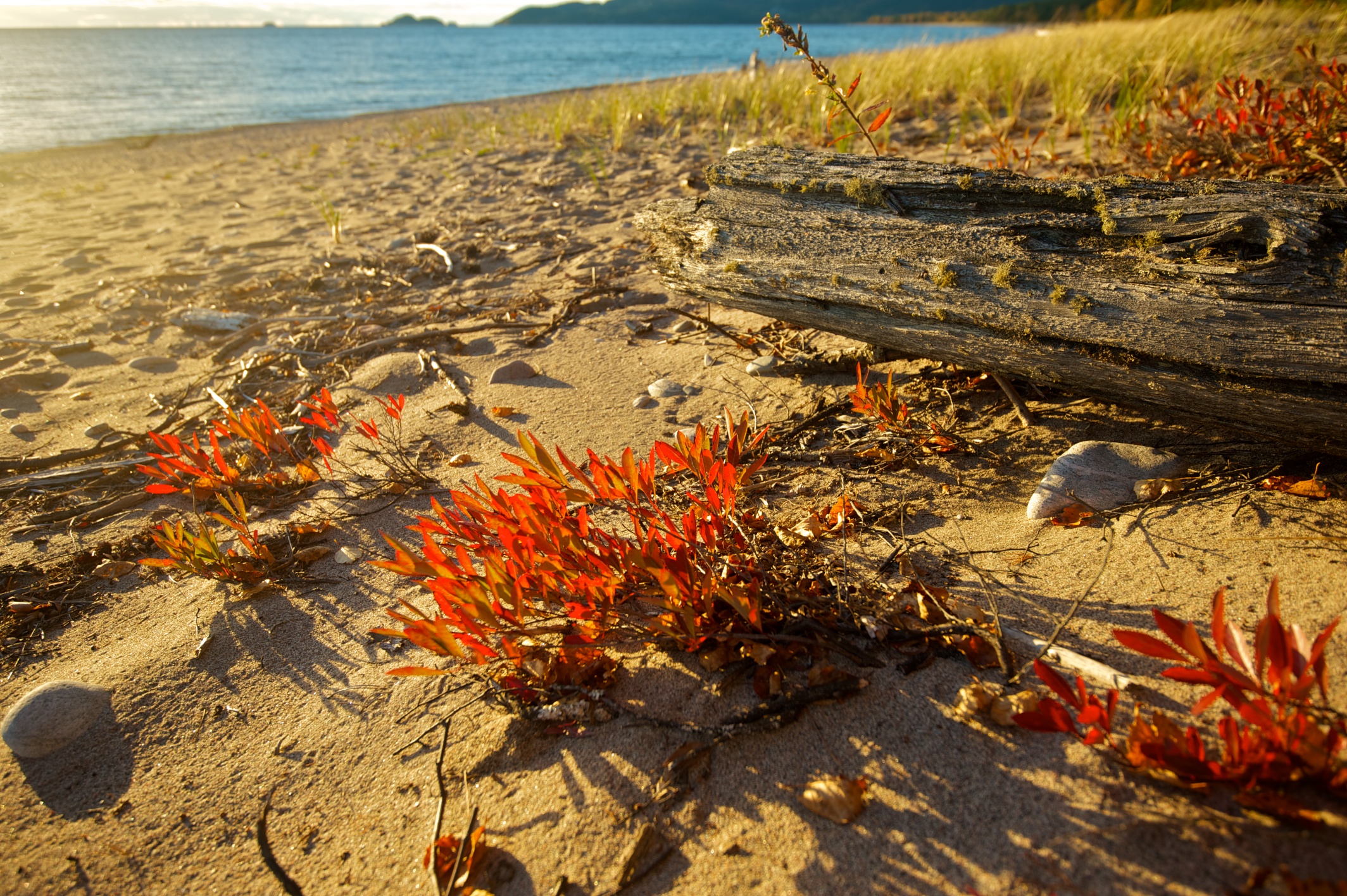
Nice image but I feel the PP is perhaps a bit too much. The lighting on the driftwood(?) feels a bit too unnatural to me and the strong darkening of the skyline creates a large black void at the top of the picture. I think if you toned down the PP a little it would become more compelling.
![]()
Tilted Beach

An interesting shot. It instantly had me turning my head to the right. I think the only thing I would say is that the shoreline is slightly tipping down to the right and with this composition it might have been better to appear completely horizontal. I like the haze in the background but would have probably preferred the subject to be facing the sunlight and not in so much shadow but assuming it was taken on the fly I realise these things can be difficult.

Using the rule of thirds? Some changes I would have made would be perhaps to attempt to fill the bottom 1/4 which feels a bit empty and perhaps move a tad forward to get rid of the object bottom right. Also PP-wise have you tried playing with the contrast/clarity/definition to get some more detail in the far away hazy background?

Lovely shot, great vibrant colours and a really dreamy effect with the clouds. Lucky the sun was behind the clouds so no one area is too blown out. I would have maybe cropped in a tad to get rid of the harsh black area at the beginning as my eye is drawn down a bit. But that might have brought the shoreline too far down.
![8321154773_a0f7f64dba_c.jpg]()
Coral Harbour, Nassau, Bahamas

I like the use of desaturation here. It gives it a feeling of abandonment. My only comment would be that I feel quite removed from the building and I wonder whether filling more of the frame with it might have helped get rid of some of the empty space to the left. I like the cool feel too.

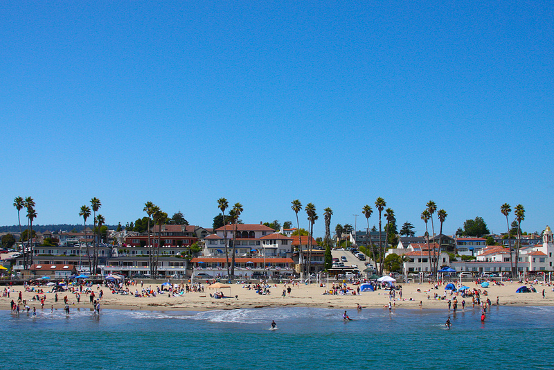
Whilst a good example of a straight as can be horizon line I feel there is not enough going on in the frame. The sky is bland and the beach is not really full of any objects. Was there anything else you could have put in the picture to have a focal point?
Baldwin Beach, Maui
Nice capture. For me a bit too much saturation and contrast as some detail is lost on me in the rocks and the sky feels too blue. Also the WA distortion is a little off for me. My eye was instantly drawn to the rock bottom left which I don't think is the subject.
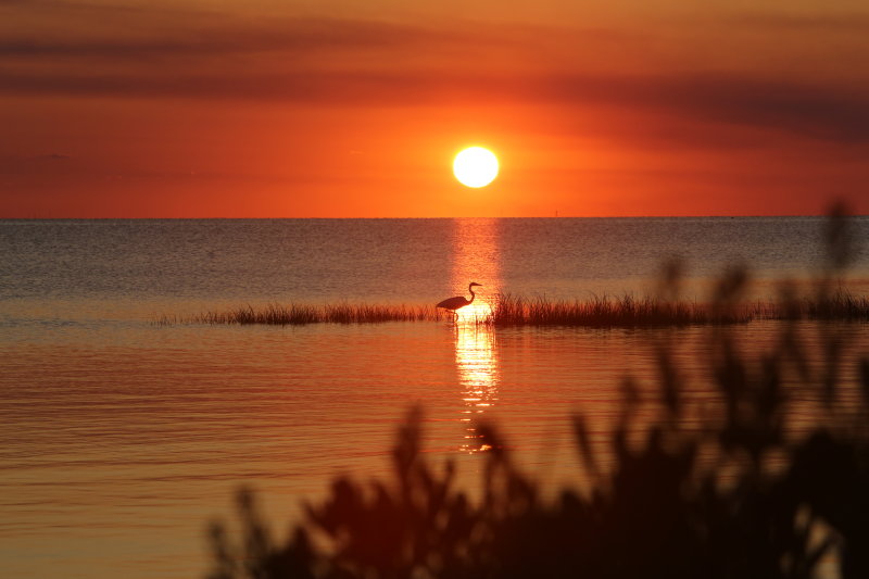
Nice silhouette but it might have been nicer if the head had been risen so it doesn't disappear into the body. The sea also feels a bit to hot (in terms of exposure!) and could maybe be toned down. If you had walked a little further down the beach you would have got rid of the area of sand where there isn't water in the bottom right.
![Venus%2520Transit-0734.jpg]()
Twilight at Torrey Pines, San Diego, California.
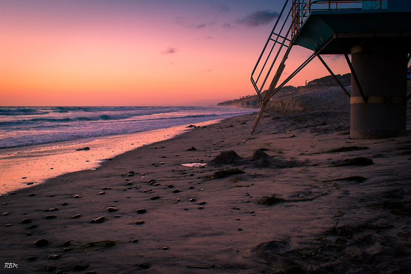
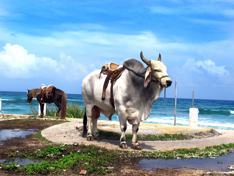
Nice colours but I think the effect might have been taken a bit too far. The highlights on the rocks and the metal bar top right seem too pink to be real. The composition also feels very low in the scene and it seems awkward to cut off the structure. Also I tend to like pictures where there is an obvious subject and in this one I am not sure what it is, the two sand mounds, the shoreline, the pebbles, the structure?
Dec. 26, 2012 (click for full quality photo)
Not sure if this is a film shot or a digital convert. Seems to be little DR as the highlights are blown whilst there is no detail in the shadows of the rocks. Still it's a compelling image. It has a very moody feel to it and I like the rock in it's own pool at the bottom.
Interesting scene but again one with too much PP for me. The dark area on the left just feels strange to me and there is something odd about the colours, I don't know if it's because you uploaded in ProPhoto RGB? Also I would have stopped down further as where my eye is drawn, the brightest area bottom right, is actually out of focus.

A nice shot with a very cool (WB) feel to it. It feels a bit soft though but an interesting reflection all the same. There is not much I would change but the scene doesn't jump out at me. Have you boosted the shadows in the woods something feels a little strange with the colours to me?
Island Beach
![islandbeach1c.jpg]()
Assateague Island, Maryland
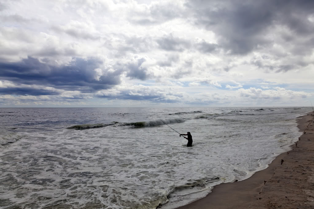
A nice shot. Did you do any PP work? I think this would benefit from a little lift in the shadows and a grad. filter to lower the exposure of the sky a little. I might have also attempted to get the horizon on either the 1/3rd or 2/3rds line and the fisherman intersecting the right 1/3rd line. Did you get any other shots?
![p1356614488-5.jpg]()
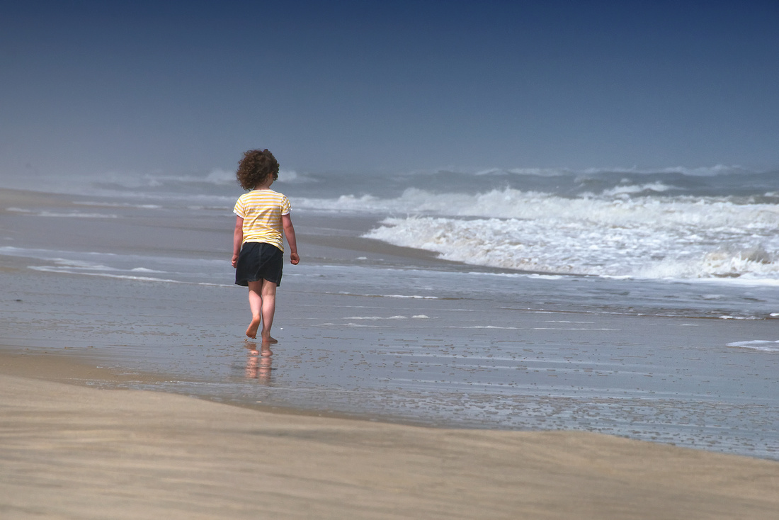
I like shots with people! Similar to above did you try positioning her a bit more on the 1/3 line to the left? Also I might have composed it a bit higher as there feels to be too much beach. Also I think you have a grad. filter on the sky which might have been more subtle if there was more sky to use it on.
shoreline ... canadian style
Nice shot. I love this light when blue is dominant but there is still a tinkle of oranges and pinks. Until blowing it up I thought it was a lake at the bottom but now I realise it's snow! I would have liked either a little more detail in the shadows or a complete silhouette of the mountain as the dark snow is a little distracting but I am being a bit picky!
![shoreline.jpg]()
Big Creek Cove, Big Sur, California
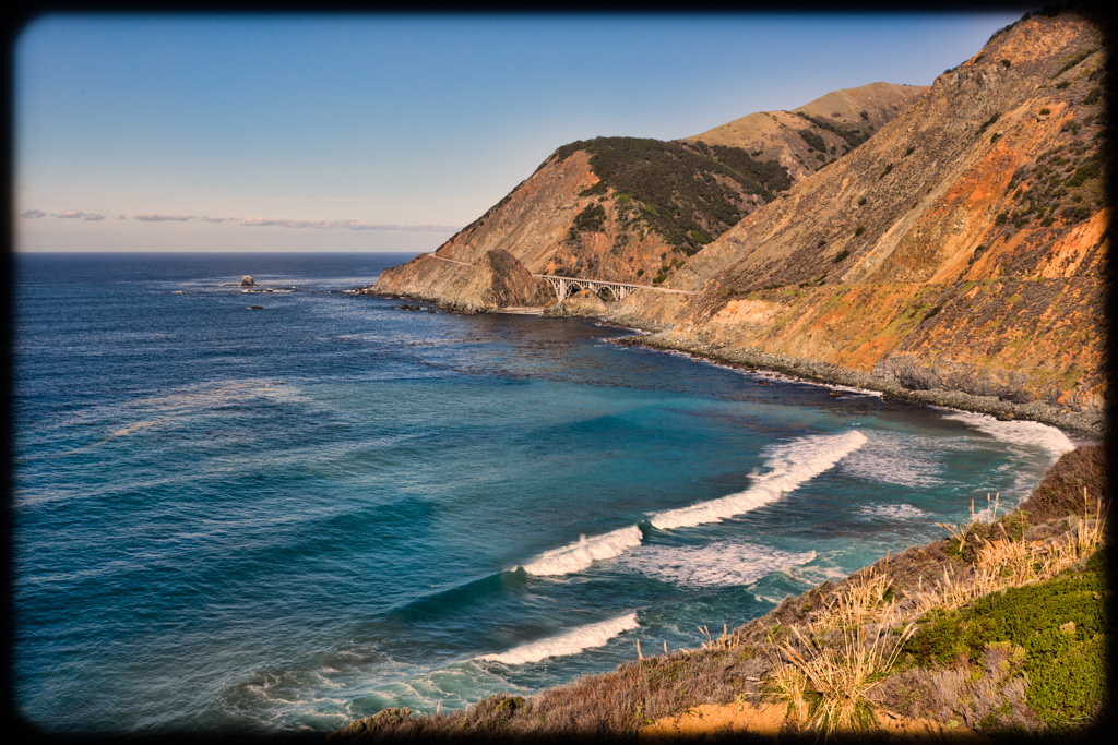
Not a huge fan of the border as I'm not sure what it adds to the photo. I like the fact the bridge in the shot and I hope you selected to take it because of this. It's a nice piece of detail that you wouldn't often get in a shoreline picture. I like the strong blues/greens of the ocean too.
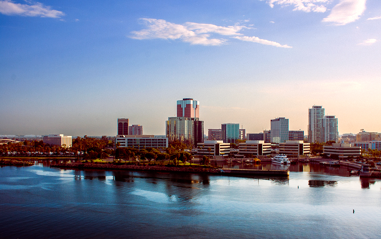
At first glance I liked the colours in this image however, upon closed inspection I think you might have gone a bit to far as I can see clear blue/red fringing around the edges of the buildings. Nice to see a different interpretation of the theme and a cityscape in the scene adding some variety. All that being said I much prefer it to the original.

Whilst the horizon is straight (I checked
) the fact that there is something off about the symmetry of this picture makes it feel to me like it's slanted to the right. I think the blandness works in it's favour but I can't work out whether the grasses help or hinder the composition due to their sporadic nature. 
Far too much PP on this for my liking. It looked like a nice scene but I don't see the need to make it look unnatural. You might also want to correct some of the WA distortion and the PP has lost some sharpness in the clouds.
Cozumel
![8326801243_986cf57a17_o.jpg]()
Nice to have a subject in there! Second thing I noticed though was the horizon line which is slanted to the right. I think with these sorts of shots where their is an obvious line in the background which is normally straight it just feels unnatural if it isn't. I really like how dynamic the sky is behind with pretty much every type of cloud!
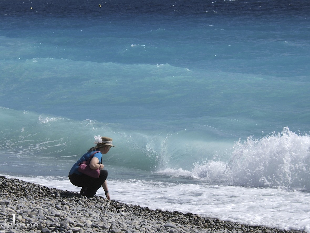
I really like this shot. The natural (I hope!) graduation of the sea colour draws the eyes down to the subject. I only wonder if she could be doing something more interesting or we can see her face. Is she picking up a rock to throw or found something on the beach? Is she happy is she sad?

Really love the colours in this just wondered how the shot would differ you had angled so we could see a bit more of the boats so the horizon line is higher or if you have crouched lower to compress the empty space of the water between the boats and the treeline (if that makes sense!). I love the dark shadows on the boats too and the rich colours are just great.

This is awful. Why do you even consider entering! Don't quit your day job...
California Living.
A nice shot but I would like to be closer to the action. If the shot had been taken from the first bare hill outcrop that is in the shot it might have been more compelling for me. Also if the house is the intended subject in the image it feels a little low to me.
I like this shot a lot. I think the business works for it and there are lots of different elements I can enjoy looking at. It's a lovely light too and I can't really think of anything I would change.
Blue Marsh Lake, Sinking Spring, PA
For some reason this feels like a painting to me. Not sure if its the clouds or the actual horizon line but it feels like it's tipping to the left. Also not so keen on the bush framing the bottom and right. If you had zoomed in a little more you would have also had less sky space which might have been nice.

A lovely scene but like a few others you need to watch your horizon line which is dipping to the right. Since the sun is partially obscured I might have tried to hide it behind the wooden pole it's just above as at the moment it's a little distracting. I realise you can't get rid of it but the bush right of centre at the bottom is a tad annoying.
No touch-ups or removal of clues.
Removals of clues that this is a film shot? I like the colours but don't understand the much darker sky than the reflection. I always like reflections when they are almost perfect mirror images.

A nice shot but your watermark is off putting. I'm not a huge fan of watermarks and I think that Flickr's copyright controls are strong enough now to negate them. Also the WA distortion is a little too much for me. I really like the colours though and I assume your solitary footstep on the beach.
![]()
Arcadia Sewer by Eric Mazzone, on Flickr
I entitled this Arcadia Sewer because it's a reclaimed sewer in downtown Kalamazoo. Some bigwig got the bright idea a number of years ago that the city should pay him to uncover the old creek being used as a sewer for decades and clean it up. This project is one of the few proposed in such a way that actually paid off for the city.
Saturday December 29, 2012
Canon T3i
Canon Nifty Fifty
1/60 @ f/4, ISO 100
Eric Mazzone Photography

One of the few snow scenes. I feel the vignette is too strong and the red light on the building on the left is very distracting, especially accentuated against the vignette. I like the fact that you put in the backstory which adds some meaning to me.
My local beach, Port Noarlunga, South Australia.
![IMG_5085.jpg]()

Nice scene. In terms of changes compositionally, it might have been nicer to have the horizon a bit higher and to have just taken the shot a few feet forward in front of the bush! I really like the way the few lone figures have come out on the beach. I think I also like the FOV on this shot. Was it something similar to a slightly longer lens? It just feels right rather than some of the more WA shots.
Stormy Lake
I get a bit confused with this picture with the portrait orientation, the horizontal subject on the right and the vertical subject on the left with the shoreline sort of running vertically between them. Although I can't think of how I would have changed it, its always important to look at the relationship of the lines and here they are too opposite to work for me.
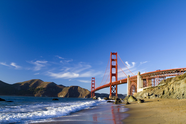
What a great shot. I would have liked a link so I could see it bigger as it looks so small on my screen. Love the vibrant colours and everything seems to just work in this image. In other photos I have commented on the negative space but the top half blue really adds to the contrast of the bright red bridge. Conscious decision or not the way the wave leads us from the centre all the way right to the corner is another lovely touch. Again, great shot!
Koh Samui
Interesting shot but I find the tree in the foreground a little distracting. If I was able to see all of it I might feel a little bit different. I think the fact that the branches are very saturated makes it distracting to the point where I almost didn't notice the dog! If you hadn't been so wide as well the dog and horizon wouldn't feel so small and far away.
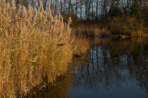
Again, another one I would have liked to see a little bigger as it is very small on my screen. I like the fact that you have been a little different in that you have cut off the top of the tree line in favour of seeing the reflection and planting the shoreline on the top 1/3 line. I know it's cheating nature a bit but I might have liked the water and reflection on the right to be a little brighter to compete with the bright ferns(?) on the left.
Clicked on the link and apparently the gallery is empty?

A nice panorama and a good way to make sure there isn't too much negative space at the top or the bottom. I would have liked to have seen the complete boat as the fact that it is cut out mid-word makes it a little distracting. Love the cirrus clouds floating around in the sky.