Become a MacRumors Supporter for $50/year with no ads, ability to filter front page stories, and private forums.
I Think This is Done. Any Input?
- Thread starter tony3d
- Start date
- Sort by reaction score
You are using an out of date browser. It may not display this or other websites correctly.
You should upgrade or use an alternative browser.
You should upgrade or use an alternative browser.
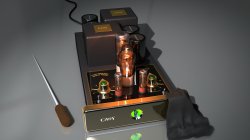
smacks of HDRI setup. No GI, no area shadows. Im a tough critic. Anything less than 100% in vray and i dont like it. all the modeling and composition are good. not sure i like the angle.
If you're creating an icon, I don't think the angle is bad. I do agree, however, agree with the comment about the lighting. A subtle second (and third) light source would help, or you could use an environment map.
I think that you've got everything but the lighting here going for you. The model and the textures look good. At small sizes, it'll look perfectly fine, but when being viewed larger....
It doesn't look bad at all, it just could look better.
Were you the guy that posted the rendering of a stereo the other day that used Lightwave? If so, I linked to a Global Illumination tutorial for Lightwave that might kick this up a notch.
It doesn't look bad at all, it just could look better.
Were you the guy that posted the rendering of a stereo the other day that used Lightwave? If so, I linked to a Global Illumination tutorial for Lightwave that might kick this up a notch.
I think that you've got everything but the lighting here going for you. The model and the textures look good. At small sizes, it'll look perfectly fine, but when being viewed larger....
It doesn't look bad at all, it just could look better.
Were you the guy that posted the rendering of a stereo the other day that used Lightwave? If so, I linked to a Global Illumination tutorial for Lightwave that might kick this up a notch.
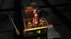
Does this look better? I'm using GI.
Attachments
the camera is set too wide, choose a higher focal length to make it look more professional. I dont know how focal length translates to 3d cameras but on a normal SLR a lens set to around 100mm would be closer to what the human eye sees. That looks more like 35mm. A higher focal length will zoom it in a lot which means you have to place the camera further away, you may think that defeats the purpose but it affects the perspective dramatically, it will make it protrude less and look like it was taken with a high quality camera and not a crappy point and shoot.
see this for how focal length affects the perspective http://www.expertphotography.com/wp-content/uploads/2011/06/focal-length-comparison.jpeg, the wider the more exaggerated the distance from near to far is, the longer the more flat. Anything around 100mm is best for portrait stuff like this, going up to 200mm isnt uncommon either, the good thing about 3d is you can have any focal length and aperture combination you want instead of spending thousands on different lenses.
see this for how focal length affects the perspective http://www.expertphotography.com/wp-content/uploads/2011/06/focal-length-comparison.jpeg, the wider the more exaggerated the distance from near to far is, the longer the more flat. Anything around 100mm is best for portrait stuff like this, going up to 200mm isnt uncommon either, the good thing about 3d is you can have any focal length and aperture combination you want instead of spending thousands on different lenses.
Last edited:
One thing I noticed is that the glass looks to perfect. OP what program are you using? I would say for the bulbs sculpt a few imperfections in them to make them look like a real glass bulb.
I also think the GI scene looks much better.
I also think the GI scene looks much better.
Does this look better? I'm using GI.
Yeah, I think that looks a fair bit better. Try turning on ambient occlusion too. It's meant to be a faster alternative to simulate the crevice darkening/ shadowing effects that you get with GI, but I like to use both most of the time, render time permitting.
Really just nitpicky stuff to make it look photorealistic past that, though. The paint might be chipped in certain parts, there might be scratches on the glass, etc.
I think it's looking good.
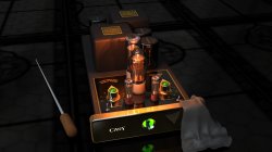
One thing I noticed is that the glass looks to perfect. OP what program are you using? I would say for the bulbs sculpt a few imperfections in them to make them look like a real glass bulb.
I also think the GI scene looks much better.
Thanks for the comments. Actually vacuum tubes really do look that perfect. This being a very high end amp, scratches wouldn't be appropriate.
Register on MacRumors! This sidebar will go away, and you'll see fewer ads.