Become a MacRumors Supporter for $50/year with no ads, ability to filter front page stories, and private forums.

acearchie

macrumors 68040
Original poster
Jan 15, 2006
3,264
104
Hi guys,

For a christmas gift for my Mum I am attempting to make a very basic online website with a "virtual gallery experience" of the paintings that she does as a hobby. Nothing fancy but fun and personal.

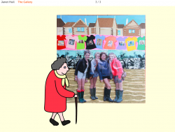
At the moment I have been doing a few very simple illustrations to put in and have yet to actually add the images I have of the paintings and the placeholder is a simple shot from my phone.

Can you guys tell me what you think? I realise it doesn't look very professional and it's still got a long way to go (hope I can achieve it in the few days I have!) but it would be nice to know if anyone has any suggestions or views on the idea?

You can find the site at http://ArtByJanet.co.uk

Thanks!
 

charlieegan3

macrumors 68020
Feb 16, 2012
2,394
17
U.K
Like the handwriting and nice clean bar at the top. I'm not a big fan of the gallery drawing on the homepage though. The virtual gallery guests are good though.

You sure you want to go with salon?

While I quite like the long horizontal gallery I think you might get a cleaner look from a tumblr (or even blogger) custom theme. You could try adding your illustrations in as a background. Just a thought.
 

acearchie

macrumors 68040
Original poster
Jan 15, 2006
3,264
104
Like the handwriting and nice clean bar at the top. I'm not a big fan of the gallery drawing on the homepage though. The virtual gallery guests are good though.

You sure you want to go with salon?

While I quite like the long horizontal gallery I think you might get a cleaner look from a tumblr (or even blogger) custom theme. You could try adding your illustrations in as a background. Just a thought.

Thanks for the feedback,

I'm not very good at drawing and struggled for anything for reference for the museum. What aspect don't you like about it?

I went with salon because the guy who started it went to my Uni and so I like being able to support him as well as having a one off fee rather than any sort of subscription fee.

It also allows you to drag things to different positions, for example all of my characters are separate elements that can be dragged to any position on the site. The same with the plug sockets and eventually, when I have put them up, the paintings.

My mum is also not technically minded to update the site so she doesn't require a blog style site. What do you think isn't clean about the current design as I can technically change anything about the site.

Thanks again for your help!
 

charlieegan3

macrumors 68020
Feb 16, 2012
2,394
17
U.K
Thanks for the feedback,

I'm not very good at drawing and struggled for anything for reference for the museum. What aspect don't you like about it?

I went with salon because the guy who started it went to my Uni and so I like being able to support him as well as having a one off fee rather than any sort of subscription fee.

It also allows you to drag things to different positions, for example all of my characters are separate elements that can be dragged to any position on the site. The same with the plug sockets and eventually, when I have put them up, the paintings.

My mum is also not technically minded to update the site so she doesn't require a blog style site. What do you think isn't clean about the current design as I can technically change anything about the site.

Thanks again for your help!

I think the museum would be better smaller and as part of a longer line of buildings and cars or something. Something like this but with a little less in the background, I like the clean background you have at the moment. as an example: http://brucenguyen181.files.wordpress.com/2011/11/stock-illustration-13779322-cartoon-city.jpg

I neither blogger or tumblr cost anything. But you do have to pay for your own domain - and that's only once a year. Still i think it's good you're supporting a guy and you're all set up here now.

The only thing that seems 'off' is the background color in the gallery, it changes from white to off white, not sure why. By cleaner I meant that the blog templates help to keep everything running fine and make it easy to add new content.

It's fine and I'll repeat that I like the virtual gallery part - just think the way the gallery is accessed is a little overly simplistic. You don't want to just have the galley on the homepage instead?
 

AFPoster

macrumors 68000
Jul 14, 2008
1,547
141
Charlotte, NC
Very clever, I like the illustrations a lot. However I agree with the above comments as well. Try to make the images more crisp if you can the one that's in there currently is a little blurry.
 

acearchie

macrumors 68040
Original poster
Jan 15, 2006
3,264
104
I think the museum would be better smaller and as part of a longer line of buildings and cars or something. Something like this but with a little less in the background, I like the clean background you have at the moment. as an example: http://brucenguyen181.files.wordpress.com/2011/11/stock-illustration-13779322-cartoon-city.jpg

The only thing that seems 'off' is the background color in the gallery, it changes from white to off white, not sure why. By cleaner I meant that the blog templates help to keep everything running fine and make it easy to add new content.

It's fine and I'll repeat that I like the virtual gallery part - just think the way the gallery is accessed is a little overly simplistic. You don't want to just have the galley on the homepage instead?

Thanks again for the detailed feedback.

That's a great suggestion for the homepage. I'll have to get on and be drawing all night to build up a city type atmosphere!

In the gallery I haven't continued the white across. I was just playing around last night and that's something that I can easily change.

The real purpose of the site is only for my Mum to be able to send it round to her friends and family. She doesn't aim to get any work from this or anything of that sort and from knowing her I think the current entry whilst gimmicky and simplistic is the sort of thing that she would like.

If I was aiming to make a pro-online portfolio I would get straight to the point!


Very clever, I like the illustrations a lot. However I agree with the above comments as well. Try to make the images more crisp if you can the one that's in there currently is a little blurry.

Which image do you see as blurry? All the ones I have uploaded so far should be 72ppi and be rendered as "sharp" on computer monitors.
 

AFPoster

macrumors 68000
Jul 14, 2008
1,547
141
Charlotte, NC
Which image do you see as blurry? All the ones I have uploaded so far should be 72ppi and be rendered as "sharp" on computer monitors.

The one with the 4 girls looks like it's shiny on the last 2 girls, screen shot attached. If it's supposed to be that way that's fine it just caught my attention as blurry.
 

Attachments

  • Screen Shot 2012-12-23 at 6.10.16 PM.png
    Screen Shot 2012-12-23 at 6.10.16 PM.png
    754.8 KB · Views: 179

acearchie

macrumors 68040
Original poster
Jan 15, 2006
3,264
104
The one with the 4 girls looks like it's shiny on the last 2 girls, screen shot attached. If it's supposed to be that way that's fine it just caught my attention as blurry.

Ah this is actually an element of the painting itself. It's not the greatest picture of it as the girls are printed on glossy paper so it's very difficult to take a shot without getting glare.

Thanks for pointing it out though!
 

enfant terrible

macrumors newbie
Dec 29, 2012
6
0
I like it. It's clean and simple. Not Flash-y at all. I harbour a strong dislike for sites that make me wait to load various images that swoop in and out for no apparent reason. The only suggestion I can think to make is possibly including a contact page in case someone out there wants to buy her artwork. Also, I'd get rid of the stray apostrophe before 'academic' on the Bio page.
 

thejadedmonkey

macrumors G3
May 28, 2005
9,180
3,327
Pennsylvania
Use some jquery to cause a vertical scroll to go horizontal (but only if there's no vertical scrollbars!), and make sure the floorboard with the electrical outlets line up, they seem to "jump" every so often.

Otherwise I quite like it.
 

citizenzen

macrumors 68000
Mar 22, 2010
1,543
11,786
I just wanted to say that I like your mom's paintings.

She has a certain spirit that really shines through.
 

fullauto

macrumors 6502a
Oct 19, 2012
918
322
Brisbane
Love the horizontal scrolling, do agree the illustrations take away / distract from the artwork. Maybe knock a couple out, keep them to the side of the artwork (there's some standing in front of the art?) reduce the size so they appear more behind the artwork / in the distance maybe? That will eliminate the bottom of the wall graphic (which doesn't repeat evenly). Move the text up closer to the bottom of the artwork.

Landing page is a little basic, I would go with 'Janet Hull' in the same type as up top, larger, centred horizontally and vertically. Ditch the building, ditch the handwriting. If you feel the need to prompt the user to 'click to enter' maybe have:

Janet Hull - large
enter the gallery - small, lowercase underneath

Page footer I would have gallery location, phone, email, Facebook fan page (if you have one).

Just thoughts. :)
 

mono1980

macrumors 6502
Feb 15, 2005
420
190
Lansing, MI
Don't you know that skeuomorphism is a horrible, horrible thing? Just kidding. I really like the illustrations inside the gallery. I'm not so enthused about the "click the doors" part. Just start off right in the gallery :D
 
Register on MacRumors! This sidebar will go away, and you'll see fewer ads.