Become a MacRumors Supporter for $50/year with no ads, ability to filter front page stories, and private forums.
Opinion on Web Design Homepage
- Thread starter rsnapeuk
- Start date
- Sort by reaction score
You are using an out of date browser. It may not display this or other websites correctly.
You should upgrade or use an alternative browser.
You should upgrade or use an alternative browser.
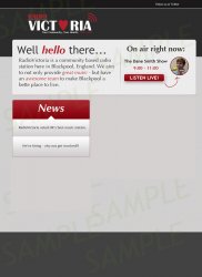
Seems like a workable design, but I'd embiggen the Radio Victoria logo because it's overwhelmed by the content that follows. Also, I'd work on the kerning VICT and RIA to bring the letters in tighter with the heart. And don't forget the TM on the logo to protect the mark.
You don't seem to be using a grid that determines where elements get placed. For example, why is the logo so much farther in from the left edge of the window than the following content?
If it were me, I'd make the layout two columns, with the left 75% the width of the right column. Make the logo the same width as the left column. Split the "Well Hello There" and "On Air Right Now" graphics into two columns too.
Make the rounded corners on all rectangles the same size. Make the picture of Dane Smith MUCH larger since our eyes are drawn to the human face.
Since you're going with more pastel looking shades on the right side elements, consider using pastel versions of the red and blue colors in the News and Tweet tweet. That or make the headings much smaller so they don't distract from the more important content in the right column.
Nitpick: Use an em dash instead of a hyphen after "great music". It looks much more professional.
Finally, don't use so many fonts. Stick to one with plenty of faces.
Noting this is a very early incarnation lacking menus, footer and other nav elements, so far...
I hate to say this, but I'm not a fan of this layout and agree a lack of a grid is a root cause as the other user noted in their comment. I'm not talking about the graphics (just remember to use CSS when possible so you reduce bandwidth and load time) or necessarily the colors, either, in this response.
I'm referring to the overall theme and layout choice. To me, it's like a bunch of cards posted on a bulletin board, all those content blocks in the two wells and the main block below the logo. I get the vibe someone created each block elsewhere then slapped some glue on the back and stuck them in there somewhat randomly. This might be because the contrast is so high and the colors so inconsistent. I do not sense a clarity in design other than one thing --- nice rounded corners for all blocks (which again, should be done in CSS).
Maybe that block below the header should span 100%, or be designed slightly differently or blended into the background better?
Of course with your radio station you are doing lots of promotions, showing off sponsors and such so I might be completely wrong. So I'm hesitate to say something like you're way off track or clumsy in design.
Based on your placeholder content maybe consider putting the promo stuff on the left side and the news and twitter stuff on the right, remember in web design and especially mobile device viewing, top left and left to right determines the most valuable real estate on the screen.
I'm sorry if this is not what you expected, I won't bug you on the little details because they'll get worked out in time. And this is only one man's opinion. I am interested too in what others have to say as I am on the fence a bit considering your business type, branding and purpose of the site.
You're off to a really good start
The color scheme is working really well, and the fun approach you are taking is something that quickly gets your attention and should work well for a radio station. I would take one small step back and start from the image I attached. From this point, it is fairly consistent in the design, layout and color scheme.
A few recommendations, as you work on refining the design.
Adjust the placement of the Radio Victoria logo (either centered, or I would recommend left-aligned with the edge of the "W" in "Well hello there..." below.)
Place some text in the gray bar at the bottom (copyright, social media, whatever is appropriate for the site).
Please share when you have an updated draft.
Attachments
Register on MacRumors! This sidebar will go away, and you'll see fewer ads.