Become a MacRumors Supporter for $50/year with no ads, ability to filter front page stories, and private forums.

MacRumors

macrumors bot
Original poster
Apr 12, 2001
63,489
30,727


9to5Mac reports that it has "been given a quick peek" at an early beta version of iOS 7, and while the report's source would not allow screenshots to be posted, 9to5Mac is able to share a description of the new design and has created a mockup (at right) highlighting some of the main features. Among the details:

- Skinny font as seen on the iOS 7 banner at WWDC.

- Carrier signal in status bar changed to five white/gray dots instead of bars.

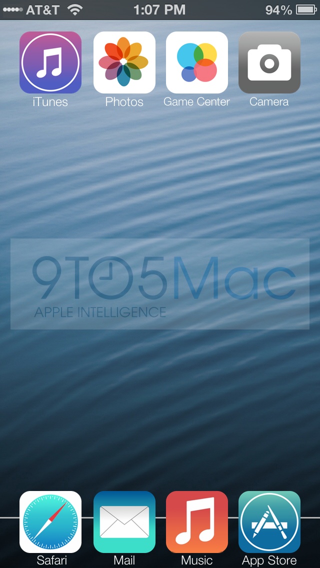
- Flatter icons, in many cases also redesigned.

- Separate black and white themes for each app, although it is unclear how they will be implemented.
We're not sure if they are A/B decoys, if white iPhones and Black iPhones will have their own color schemes or as someone else suggested, the different color schemes might be invoked by the amount of ambient light or the time of day. [...]

When in "Black mode", the keyboard is black with gray letters. In "white mode", gray keys with white letters - a little like Android.
- Walking directions in Maps.

- "Share" menu now scrolls sideways with one row dedicated to AirDrop sharing to other devices and a second row dedicated to services such as Facebook, Twitter, and the rumored Flickr and Vimeo integration. A third row supports system functions like print, copy, and "use as wallpaper".

Apple will be showing off iOS 7, as well as OS X 10.9, at its Worldwide Developers Conference keynote scheduled for later today. While the company should begin seeding versions of iOS 7 to developers today, a public launch is not expected until later this year alongside new iPhone hardware.

Article Link: Description and Mockup of Apple's Flatter iOS 7
 

maflynn

macrumors Haswell
May 3, 2009
73,448
43,369
I'm not sure I like what I'm seeing but I'll withhold my judgement until the keynote
 

definitive

macrumors 68020
Aug 4, 2008
2,050
894
Wow that guy has terrible Photoshop skills

agreed. 9to5shills have a liking for littering their front page with ugly and pointless concepts just to get hits from google and sell junk merchandise from shady sites.
 

PBP

macrumors 6502
May 13, 2011
313
33
And why would Gamecenter icon have 4 circles? What does 4 cirkels mean :confused:
 

iMcLovin

macrumors 68000
Feb 11, 2009
1,963
898
that mockup is dead ugly. I sincerely hope there´s something better than that. At least the banners around moscone center seems more promising.
 

Jsameds

Suspended
Apr 22, 2008
3,525
7,987
Dear Apple,

This is what we don't want iOS 7 to look like.

Regards,
Your Loyal Customers
 

irfaanfaki

macrumors member
Jan 11, 2013
95
0
Really liking the idea of the black or "night mode"
iUse it alot in iBooks with the white on black and find myself "replicating" the idea in safari and messages when using my phone in a dark room-
iDo this by toggling the "invert colours" option

As a result iHave less bright whites on screen and personally find it alot easier on the eyes- esp when the room is really dark

Overall prefer white text on black back so yea :) id appreciate that little feature- especially if it worked with the ambient light sensor
 
Register on MacRumors! This sidebar will go away, and you'll see fewer ads.