Become a MacRumors Supporter for $50/year with no ads, ability to filter front page stories, and private forums.

VSMacOne

macrumors 603
Original poster
Oct 18, 2008
5,760
2,742
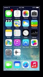
The picture was posted in a different thread regarding the Voice Memo app, but what I found more interesting was the look of the dock. It seems like this developer video shows (maybe?) beta 2 with a different dock. I like it much better.
What do you guys think?

https://forums.macrumors.com/posts/17408817/
 
Last edited:

VSMacOne

macrumors 603
Original poster
Oct 18, 2008
5,760
2,742
Here's the actual screenshot.

ImageUploadedByTapatalk1371065767.439631.jpg

And the current Beta 1 dock for comparison.

5eryrude.jpg
 

tymaster50

Suspended
Oct 3, 2012
2,833
58
Oregon
how in the world are we supposed to know what beta 2 looks like????? beta 1 just came out like 2 days ago man.
 

squeakr

macrumors 68000
Apr 22, 2010
1,603
1
The dock does look more translucent.

As for Beta 1, the correct answer is that it was just released to the Devs 2 days ago. It has been out there for some time, just not released for "public" use.
 

GreyOS

macrumors 68040
Apr 12, 2012
3,355
1,682
how in the world are we supposed to know what beta 2 looks like????? beta 1 just came out like 2 days ago man.
He's saying it looks like Apple developers are using a post-beta 1 iOS in their sessions, and it could give us hints as to what to expect in future betas. Seems fair to suggest they are still experimenting with the translucency of the dock and beta 2 could look like that.
 

thebrocode

macrumors regular
Mar 11, 2013
153
58
It looks real to me. And the OP of that thread has a reasonable explanation.
 
Last edited:

Pez555

macrumors 68020
Apr 18, 2010
2,285
775
I hope so as I don't like the dock at the moment....needs to be translucent.
 

TylerL

macrumors regular
Jan 2, 2002
207
291
It's not unheard-of for Keynote and WWDC presentation builds to be more recent than developer builds.
Packaging everything up and writing solid API documentation for "public" consumption take a lot of time, all the while the engineers continue working.

What you see in that screenshot is probably more representative of a future beta than an abortive old build.
 

VSMacOne

macrumors 603
Original poster
Oct 18, 2008
5,760
2,742
how in the world are we supposed to know what beta 2 looks like????? beta 1 just came out like 2 days ago man.

Don't kid yourself. The beta 1 they just released is at least a couple of weeks old, if not older. Apple is already using beta 2 internally.
 

fivedots

macrumors 6502a
Jun 29, 2011
695
3
Really wish they'd remove the blocking for the dock altogether, keep the page dots as a separator, and add a subtle shadow fading in toward the bottom of the wallpaper to help the dock icons pop.
 

stephen1108

macrumors 65816
Sep 30, 2007
1,098
351
I this in that same thread earlier. I hope Apple brings back the shadows on the icons and icon titles... if not that, then a light black overlay over the wallpaper because my icon titles get lost on certain backgrounds.
 

ProjectedLight

macrumors member
Aug 16, 2011
37
0
I understand its everyone's prerogative to have an opinion about stuff after a brief glance, but I'm thankful most opinions I'm hearing don't have any real world consequences. iOS 7 is really a lovely job of design, and I'll defer to Apple to think about how to continue to improve how it looks and functions. I've barely used it for a day and much of it is already invisible to me.
 

applelover1016

macrumors regular
Jun 12, 2013
175
126
http://thenextweb.com/apple/2013/06/12/why-does-the-design-of-ios-7-look-so-different/

The screenshot above makes even more sense after reading this article about the state of iOS 7. I believe this is going to be a totally different beta process and we'll be seeing a lot of changes between betas.
But people will still waste their time complaining about stuff ;)

Thanks for the intersting read, after reading i agree with you 200%, we are in for something great with ios 7.This needs to be posted in all those threads where people bash the icons lol:D
 

zerostar

macrumors regular
Apr 28, 2008
237
0
South Florida
Thanks for the intersting read, after reading i agree with you 200%, we are in for something great with ios 7.This needs to be posted in all those threads where people bash the icons lol:D

I think the next beta should tone people down a bit, we should see some changes that will refine the OS with each release.
 

DDustiNN

macrumors 68020
Jan 27, 2011
2,485
1,371
http://thenextweb.com/apple/2013/06/12/why-does-the-design-of-ios-7-look-so-different/

The screenshot above makes even more sense after reading this article about the state of iOS 7. I believe this is going to be a totally different beta process and we'll be seeing a lot of changes between betas.
But people will still waste their time complaining about stuff ;)

Thanks for the intersting read, after reading i agree with you 200%, we are in for something great with ios 7.This needs to be posted in all those threads where people bash the icons lol:D

Why? That article is nothing more than some random guy talking out of his ass and speculating (which is the exact same thing you see on this very forum).

Using that article to put your mind at ease is no different than choosing any random post here.
 

w0nker

macrumors member
Jun 7, 2008
40
0
The issue I see in that first screenshot is that the clock icon and time at the top don't match. Either a doctored pic or its a theme maybe.
 
Last edited:

fezzzer

macrumors regular
Jun 13, 2013
227
147
I can't believe people are whining about the icons.

Firstly as everyone knows its the first beta which is there for feedback and to be refined. Secondly moaning about icons, really? There are way more important things to sort out with this release rather than concentrating on such unimportant things as icons.
 

applelover1016

macrumors regular
Jun 12, 2013
175
126
Why? That article is nothing more than some random guy talking out of his ass and speculating (which is the exact same thing you see on this very forum).

Using that article to put your mind at ease is no different than choosing any random post here.

i actually read not just this article but another about newer leaked icons actually, it's not putting my mind at ease because im perfectly fine with ios 7 the way it is. Its even on my main device. I'm saying this for all the whiners who cry about how ugly ios 7 is knowing that, if apple did nothing, they would have critized like crazy. I'm good with ios 7. BRING ON FALL!!!!:)
 

C DM

macrumors Sandy Bridge
Oct 17, 2011
51,390
19,458
Why? That article is nothing more than some random guy talking out of his ass and speculating (which is the exact same thing you see on this very forum).

Using that article to put your mind at ease is no different than choosing any random post here.
A known tech writer for a very well known publication with known inside sources is really nothing more than a random guy speculating and is exactly the same thing as just some random post on a forum? Come on now. Even if there's speculation, it's still WAY different than something random on some forum.
 
Register on MacRumors! This sidebar will go away, and you'll see fewer ads.