For me the only bug is in Reminders, I set up a few on Tuesday night and from then on and all through wednedsay I had maybe a dozen reboots. I've deleted all remiders and it's been fine since. Everything else is working fine, battery fractionally down on ios 6, perhaps use is 10% faster. Other than that it's like I have a new iPhone and I've been unable to put it down since installing.
Become a MacRumors Supporter for $50/year with no ads, ability to filter front page stories, and private forums.
Wow. iOS 7 is a disaster.
- Thread starter joneun
- Start date
- Sort by reaction score
You are using an out of date browser. It may not display this or other websites correctly.
You should upgrade or use an alternative browser.
You should upgrade or use an alternative browser.
- Status
- Not open for further replies.
We don't want iOS 7.
At least we didn't want to see it go down like this.
They're literally ruining Steve Jobs idea.
If you don't want it, then don't download it. Redesigning something will almost always upset a group.
iOS 7 - in its current form - is hideous. Hopefully they fix it or I'm staying on iOS 6 for a very long time.
If you don't want it, then don't download it.
I don't understand why people always say this. You obviously don't understand that eventually those who stay on iOS 6 will be forced to go to 7 due to a necessary restore or to continue receiving updates to apps. With no reasonable downgrade methods, there's no way to stay on iOS 6 forever.
iOS 7 - in its current form - is hideous. Hopefully they fix it or I'm staying on iOS 6 for a very long time.
I have to respectfully disagree with you. The only thing that's hideous about iOS 7 is some of the stock wallpapers (easily changed) and some of the stock icons (easily hidden). With a good wallpaper, and attractive third-party app icons, iOS 7 is really quite lovely. I especially like the new zoom-in, zoom-out animations.
Attachments
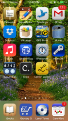
I have to respectfully disagree with you. The only thing that's hideous about iOS 7 is some of the stock wallpapers (easily changed) and some of the stock icons (easily hidden). With a good wallpaper, and attractive third-party app icons, iOS 7 is really quite lovely. I especially like the new zoom-in, zoom-out animations.
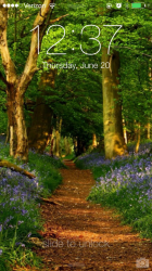
That's a beautiful wallpaper, but the thin white font is very hard to see on it. For me, that's a problem. They prioritized showing off the wallpaper over keeping the words legible, which, IMO, is the wrong thing to prioritize.
That's a beautiful wallpaper, but the thin white font is very hard to see on it. For me, that's a problem.
I agree. I wish they'd make the font thicker and give it a drop shadow so it would be readable against any color wallpaper. I also have a hard time reading the icon captions, but that's less of a problem since I recognize the app by its icon, not its caption.
I don't understand why people always say this. You obviously don't understand that eventually those who stay on iOS 6 will be forced to go to 7 due to a necessary restore or to continue receiving updates to apps. With no reasonable downgrade methods, there's no way to stay on iOS 6 forever.
That will be in a long time. New looks take time to refine: they aren't to their 100% in the first time. By then, hopefully iOS will be refined well enough.
I have to respectfully disagree with you. The only thing that's hideous about iOS 7 is some of the stock wallpapers (easily changed) and some of the stock icons (easily hidden). With a good wallpaper, and attractive third-party app icons, iOS 7 is really quite lovely. I especially like the new zoom-in, zoom-out animations.
Wow, those skoo-oh-morfik icons look really kitsch... too many 3D icons competing for one's attention - ugh. One style or the other is best
")
EDIT: Or, I think it could be that the saturation of the wallpaper is competing too much... it's quite a distraction to my eyes.
It's a good job we have free will - if you like it, that's super!
EDIT: Or, I think it could be that the saturation of the wallpaper is competing too much... it's quite a distraction to my eyes.
I used to use a more subtle wallpaper, but the "frosted glass" look of the dock took on a sickening, salmon color, so I had to change it.
Attachments
Its hard to get use to change but It's more than a small group of people.. there are posts, videos and rants all over on iOS 7. It's one step forward, one design step backwards and aesthetic step back.
Agreed. And functional regression.
We don't want iOS 7.
At least we didn't want to see it go down like this.
They're literally ruining Steve Jobs idea.
Speak for yourself, I have it and I love it.
----------
iOS 7 - in its current form - is hideous. Hopefully they fix it or I'm staying on iOS 6 for a very long time.
I am guessing you are basing this off images you have seen online. Wen you have it on your phone, in your hand it looks great. I was apprehensive at first but after a couple days I feel it's a big improvement.
----------
Agreed. And functional regression.
In what way?
Is the auto updating set not to use mobile data? As mine was.
It was, but that was turned off (I want them to update on WiFi only as I have a low data cap). Tried turning it on and still no go. It usually works eventually when cabled up to the PC, but not via WiFi at all, nor 3G
To me, disaster is something like the recent new firmware for PS3 which will brick your console.
I was expecting much worse seeing that it is still a Beta ONE !
Yes, my Skype does not work, Google+ does not work but that is expected.
Buggy ? Yes. Disaster ? Far from it.
By the way, I downgraded to iOS 6 and stay there for less than an hour,revert back to iOS7 and realized how much improvement iOS7 is, compare to iOS6. I have been using Android since the iPhone 3G and went to buy a 700 bucks iPhone again, just because of iOS 7.
Last edited:
Ask 10 people on the street, whom have never seen IOS7 or an iPhone, which icons were designed in 2006 and which icons were designed in 2013, and I suspect most people would associate the OS7 icons with 2006.
I know many on this forum are relatively young, but the new icons are very similar to the icon designs that we began to see in 1996 after the release of Windows 95. That's when we first got icons with 256 colors; the OS only shipped with 16-color icons, but users could add support for 256-color icons with an add-on (Microsoft Plus!). Over the course of the next five years, third-parties released flat 256-color icons in all shapes and sizes.
OSX's claim to fame, when it was released, was its design with 32-bit color icons (24-bit color plus an 8-bit alpha channel). OSX was the first consumer OS with detailed, three-dimensional icons with semitransparent areas like shadows, anti-aliasing, and glass-like shapes. Apple's three-dimensional icons have been the envy of Windows users ever since. Windows users languished for years with flat icons lacking depth, because the platform lacked support for the alpha channel necessary to deliver icons with transparency and shadows.
Windows 2000 and xp both had support for an alpha channel. Windows vista even had see through icons that were partially translucent.
iOS 7 - in its current form - is hideous. Hopefully they fix it or I'm staying on iOS 6 for a very long time.
That's certainly your choice, but I have a feeling many apps are going to require iOS 7 sooner than later.
You're bitching about a beta 1 without seeming to have read or paid attention to the keynote. This thread is a disaster.
So many drama queens. Get over it, things change.
Indeed! But what's more funny then anything is that people are complaining about a beta software, which is work on a progress!
I have to respectfully disagree with you. The only thing that's hideous about iOS 7 is some of the stock wallpapers (easily changed) and some of the stock icons (easily hidden). With a good wallpaper, and attractive third-party app icons, iOS 7 is really quite lovely. I especially like the new zoom-in, zoom-out animations.
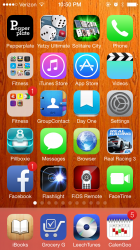
iOS 7 looks even worse with the mixing of 3D and 2D icons.
iOS 7 looks even worse with the mixing of 3D and 2D icons.
Some of those old app icons look cringeworthy now.
- Status
- Not open for further replies.
Register on MacRumors! This sidebar will go away, and you'll see fewer ads.