Great shot. Love the use of creative lighting which totally fits in with the subject matter. The ethereal feeling is really aided by the blown out sky. One thing I would mention is the white triangular object bottom right.
I don't know your stance on post work but I would burn it out.
![]()
Black Days / White Nights
Very surreal portrait. Whilst overall I like the concept and execution the thing that puts me off a little is the post work on the face, particularly the right hand side. Things like the eyebrow being slightly darker and the cheek being slightly brighter.
Unfortunately I don't have a solution to offer but that's what stuck out to me.
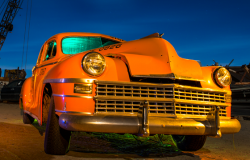
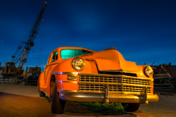
An interesting shot. To me it seems quite tight and I would have liked a little more space above the crane and below the tires.
The wires from the flash, I assume, are visible under the car and the green flash spills off under the car as well. Not sure where the bluey/red highlight comes from on the front left of the car but I would have tried to get rid of that.
Hydrangea lit up by a camping headlamp.
Lovely shot. At first I thought it was a CG image as it has a really 'unreal' look to it. I love the different tones and the the light is metered very well. Composition is nice as well. My only suggestion would be to burn the background on the right as some of the petals are a little distracting.
playing with an LED panel ...
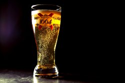
A nice little lighting experiment. From looking at other 'alcohol' pictures I noticed that the lighting seems to be a two light setup and more front on.
I reckon this might be a two light shot (key to the left, fill to the right). I think it is important to get the light onto the front of the logo as if you are going for the advertising style image then it's important to sell the brand.
Skin softening is too much for me. A moody shot with a good catchlight in the subjects eyes. Lighting contrast is a little too much for me as the blacks have been totally crushed. Not sure about the slight angle of the subject although it might have been to accommodate the text.
In terms of posing the model. If they had arched their back a little more it would have got rid of the roll in the stomach area which is a little distracting.
I just ran the Glow Run 5k here last night, so I figured one of the shots I snagged after the race would do fairly well for this contest.
A nice glow! I realise with these sort of shots it's difficult to get the perfect shot but the two figures either side are a little distracting. The photo is also on a slight tilt.
It's a pity there wasn't a little more ambient light to just fill in their faces and eyes especially. A nice surreal image though.
![]() Camera: Canon EOS Digital Rebel T2i
Camera: Canon EOS Digital Rebel T2i
Exposure: 10"
Aperture: f/3.5
Focal Length: 28 mm
ISO Speed: 100
A nice light painting scene. I would say the light feathering around the mushroom is a little too tight and it might have been nice to have the key light a little bit more front on.
I like the addition of the coloured lights behind. What did you use?
I might have cropped into the subjects a little more to get rid of some of the negative space to the right and above.
I have posted this before but since I dont have anything else that fits the theme as I shoot with ambient light most of the time. This is my first attempt as both astrophotography and light painting the trees.
![]() _DSC0193.jpg
_DSC0193.jpg by
dspector32, on Flickr
Overall the shot is a bit too dark for me. I have literally only taken 3-4 attempts at astrophotography and each time I have really enjoyed overexposing the scene a little to really show off the stars. If it's something that you are interested in pursuing maybe try out some star stacking images showing the rotation of the earth!
Just as an example here are two shots that I have taken.
![]() Everything Around Us
Everything Around Us by
acearchie, on Flickr
![]() France Star Trail
France Star Trail by
acearchie, on Flickr
In terms of the light painting I would have liked to see a few more of the background trees brighter rather than the foreground leaves as they aren't particularly sharp.
I guess I can post this here too
")
. Put it in the photo of the day thread, but noticed the theme of this contest.
Was a night Motocross picture, featuring remote flash, sunset, and a lit Ferris wheel
View attachment 426882
Nice capture. However, for me the composition is wrong. The left of the frame is too busy and the right too empty. Being an event I am sure that it's difficult to get to the 'perfect' location but I would have tried to get more to the left to frame the ferris wheel on the left and the biker more front on on the right.
Also in the future it would be nice to add another flash and get a backlight to separate the subject from the BG a bit more.
Corner of the roof of the Reichstag in Berlin, shot on a D200
![]() berlin06©SimeonJones_1
berlin06©SimeonJones_1 by
simbojono, on Flickr
Compositionally there is quite a lot of empty space. By cropping in from the bottom you would be able to get rid of some of the black on the left and right.
Not entirely sure why the light source is included in this shot as for me it doesn't really add anything for me.
Not had a chance to do much shooting lately. Then saw the way the sunlight was coming through our window and thought I finally have a picture for the creative lighting thread.
![]()
I like the guesswork associated with this image. The light is varied and interesting and and I like to find different shapes. It almost looks a but like a computer generated sound wave. Nice shot.
Shot a Stanford DE a while back. Used multiple strobes.
![]() Emanuel
Emanuel by
Bhupesh Patel Photography, on Flickr
A nice edgy portrait. It might have been nice to have a little more detail on the bottom left of the subject as the strong rim light causes the light on the arm to make it into a bit of an odd shape. I think it's a pity that we are missing a catchlight in the pupil of the eye and I'm not sure why there isn't one?
Did you mask the subject onto that circular gradient BG? If so I think I can see a few little odd bits. If not then I'm not sure what they are!
All in all a lot of good and interesting entries that hopefully made people think a little bit outside of the box.
In reverse order here are the winners.
3rd:
Apple fanboy
2nd:
JDDavis
1st:
AlexH
It was very tight between the top two but I liked that way that AlexH used the lighting that was available naturally to match the theme of the photo.
Over to AlexH for the next contest.


.jpg")