Become a MacRumors Supporter for $50/year with no ads, ability to filter front page stories, and private forums.

kevinfulton.ca

macrumors 6502
Aug 29, 2011
284
1
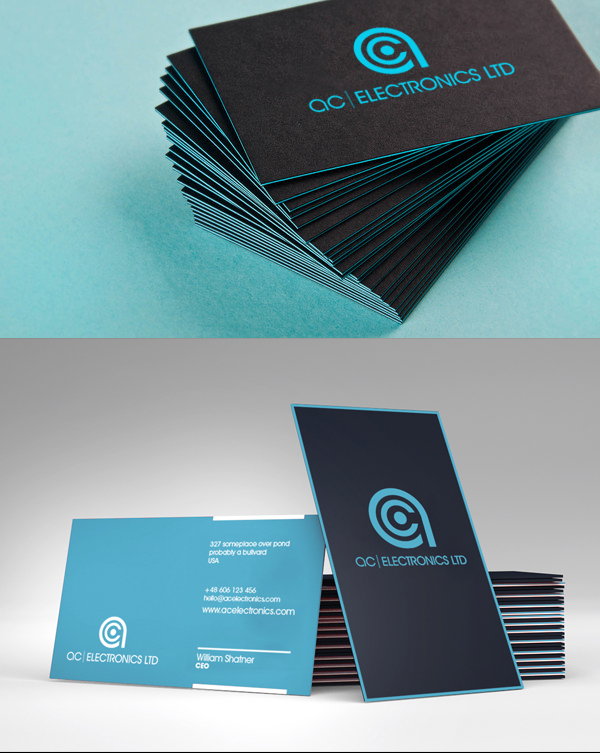
I'm trying to get into graphics design (not professionally, just as a hobby). That being said, I'm in the midst of making my brother a banner for his business: eCommerce-based. I whipped up a few renders and need some honest opinions, without the trolls on other forums. What do you guys think?

dxwYZ.jpg


fXCjH.jpg


If it helps, here's what the old one looked like, also still in use:
Kgdpk.jpg

The font is very dated and does not say "technology" to the viewer (try helvetica or something similar) and the waves behind it distracts from the message, making it hard to read. Also, it needs more contrast. Black letters over a black background doesn't work even with the wave behind it. Either try white text or black text on a white background. White backgrounds draw the eye to ads better. Hope this helps.
 

ZMacintosh

macrumors 65816
Nov 13, 2008
1,445
684
keeping it simple is the way to go. Try not to incorporate the logo as part of the word or text.
Use simpler, modern fonts that dont have too much to look at and are easily noticeable and readable.

I spent all of 5 minutes creating a mock up. in no way am i a designer but this may be a new direction to take inspiration from

acoutletdesigndemo.jpg


something that can be easily rendered onto business cards, handout flyers, etc is the best way to go, you dont want to have to print an all black image with a goofy spectrum.
if you want a spectrum make sure it looks good on white. but you dont want to send too many messages with the logo.
Something to the point and easily for people to say 'Oh, okay i get that' or 'Yeah, that looks interesting, let me find out more'.

Less is more, and leads to more. you dont want to put all your eggs in one basket as they say. let the logo identify a solution for the business and let your business do all the work.

its tough with design and branding, but once you get a feel for it, youll understand it more.
 

12dylan34

macrumors 6502a
Sep 3, 2009
884
15
Is it a banner, as in it will only be used on his website, or a logo, as in it will be the new symbol of his business?

If it's the latter, take some time to think about what a logo really is.
  • It should work, and generally be designed in a single color (i.e. it only uses positive and negative space to achieve its form).

    It can be embellished or stylized however you want later, but the original logo should just be the form.

    Look at literally any corporate logo to see what I'm talking about. Apple, TwelveSouth, HP, and WWF, for example. It should also be designed in a vector graphics program like Illustrator. Inkscape, I think, is a free alternative.
  • It should be legible/decipherable at both small and large sizes.
  • Above all, it should be SIMPLE. Less is more. The logo doesn't have to say everything about the business.

Sometimes clients aren't clear on all this either, but it's the designer's job to help them realize what makes a good logo a good logo.

Although I don't care for the old logo, it does/could follow all of these rules.
 

Squilly

macrumors 68020
Original poster
Nov 17, 2012
2,260
4
PA
Is it a banner, as in it will only be used on his website, or a logo, as in it will be the new symbol of his business?

If it's the latter, take some time to think about what a logo really is.
  • It should work, and generally be designed in a single color (i.e. it only uses positive and negative space to achieve its form).

    It can be embellished or stylized however you want later, but the original logo should just be the form.

    Look at literally any corporate logo to see what I'm talking about. Apple, TwelveSouth, HP, and WWF, for example. It should also be designed in a vector graphics program like Illustrator. Inkscape, I think, is a free alternative.
  • It should be legible/decipherable at both small and large sizes.
  • Above all, it should be SIMPLE. Less is more. The logo doesn't have to say everything about the business.

Sometimes clients aren't clear on all this either, but it's the designer's job to help them realize what makes a good logo a good logo.

Although I don't care for the old logo, it does/could follow all of these rules.
I forgot all about illustrator. Don't even remember how to use it; so accustomed to photoshop. From what I know, it is just a banner, nothing more. Pretty sure he doesn't have a "logo" yet (ie. Apple's Apple).
 

Eric E. Schmidt

macrumors member
Nov 14, 2012
77
0
Calif
i agree with most posts, a logo should be simple, recognizable and work in b&w. the way to go is sit down for a few hours with a sketchpad (yes, a physical one) and a pen. play around, focus… things will develop in your head, shapes that fit his business. present the best ones to your brother, refine the finalists.

best of luck!

del_ac.png
 

R1PPER

macrumors 6502
Oct 1, 2008
360
62
Hi Squilly, I spent 20 minutes having a play. Ive spent all day branding so i was in the zone.
 

Attachments

  • ac electronics.jpg
    ac electronics.jpg
    309.2 KB · Views: 574

VeitAnthonius

macrumors newbie
Jan 15, 2013
5
0
Hi Squilly, I spent 20 minutes having a play. Ive spent all day branding so i was in the zone.

Good work!

Squilly, try something like that.

The problem with your image is that the elements don't mix well, and there is too much going into that image.
 

Squilly

macrumors 68020
Original poster
Nov 17, 2012
2,260
4
PA
I'm curious. Do you guys create your own text or do you use something off of dafont.com (or similar)? If you create it yourself, it's not made through photoshop, is it?
 

R1PPER

macrumors 6502
Oct 1, 2008
360
62
I use dafont all the time...but i also have full access to all the traditional type foundries.
your welcome to have my illustrator files if you want them. this ID is abit of a jump from your Bros original. You could change the colours to be closer to his original branding and i was thinking continuing the line from the a under the type to become a plug flex. that would help soften the branding.
 

Squilly

macrumors 68020
Original poster
Nov 17, 2012
2,260
4
PA
I use dafont all the time...but i also have full access to all the traditional type foundries.
your welcome to have my illustrator files if you want them. this ID is abit of a jump from your Bros original. You could change the colours to be closer to his original branding and i was thinking continuing the line from the a under the type to become a plug flex. that would help soften the branding.

Illustrator. I remember using that in high school, sucked at it. But sure. Thanks.
 

tbjohn

macrumors newbie
Dec 19, 2012
25
0
IMO, keep the spectrum thing on the bottom with a little dimmed as a background and put the power button in the middle. Then the typo goes to the top. If I were you, I would make the typo white b/c I think less color & simpler is usually better. Good luck!
 

Squilly

macrumors 68020
Original poster
Nov 17, 2012
2,260
4
PA
Oh yeah, forgot to mention. He didn't like that design.

----------

Hi Squilly, I spent 20 minutes having a play. Ive spent all day branding so i was in the zone.

This one. Surprised.
 

Squilly

macrumors 68020
Original poster
Nov 17, 2012
2,260
4
PA
Business Logo

A few months back on another thread, someone introduced me to a style I was unfamiliar with. Got a little work done and experimented. It's three-toned, debating on which to use. To me, it feels like the dot in the middle is a bit big and overwhelming. All criticism appreciated. :)

PSD is attached.

So far:
3R7ao.png


Original:
Dy7m6b3.png


From MacRumors a few months back:
attachment.php
 

Attachments

  • Logo.psd
    109.5 KB · Views: 312
Last edited by a moderator:

.eric

macrumors member
Jul 30, 2013
43
0
Looks like a power button. Cards look good depending on perspective. I would, for example, take it as "just another start up trying to look like they are flashy" or something along those lines.
 

kevinfulton.ca

macrumors 6502
Aug 29, 2011
284
1
I could be wrong, but I swear that you just copied the original creators design and layout. If I'm wrong then I immediately apologize. The AC electronics seems VERY familiar and so does the style, color, font. I believe we even encouraged the OP to pay for this design in that thread. It was a while ago, but I definitely remember this.
 

fig

macrumors 6502a
Jun 13, 2012
916
84
Austin, TX
I believe the image of the business cards is from the original thread.

And I like his logo better, the subtle color shift you used could work but your logo lacks the visual weight of the original design, your lines are thinner and leave the mark feeling sort of weak.
 

Squilly

macrumors 68020
Original poster
Nov 17, 2012
2,260
4
PA
I could be wrong, but I swear that you just copied the original creators design and layout. If I'm wrong then I immediately apologize. The AC electronics seems VERY familiar and so does the style, color, font. I believe we even encouraged the OP to pay for this design in that thread. It was a while ago, but I definitely remember this.

It was. That's why it's the last picture in the OP. I offered to pay for his designs, but he never contacted me back.
 
Register on MacRumors! This sidebar will go away, and you'll see fewer ads.