I've recently been putting much more effort into what I do with my photos in post. I had been ignoring this step and concentrating on trying to improve my skills at the time of capture, thinking that garbage in equals garbage out.
I'm now trying to spend more time trying to get the most out of the photos I've taken in preparation for printing/framing some. For the first time really trying to learn the software to use it to its potential.
I have two photos that I would like help with regarding the best crop for them. For both, I'll include the original image and then two different crops. I'll include my own thoughts for both, but I'm not sure I trust myself and would welcome opinions. Both were taken on a trip to NYC last summer using a 35mm lens and rangefinder camera. Both were adjusted using Silver Efex Pro 2 and then cropped in LR5.
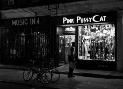
The first is of a candid street shot at night in the village that caught my eye.
![12000627773_5dddeba363_c.jpg]()
Original version.
![12001142656_9c2a1a3c9b_c.jpg]()
Removed some of the distractions on both the right and left side of the frame. I selectively darkened the window so it wasn't so blown out. I was initially happy with this version.
![12000686754_22b3241d32_c.jpg]()
Looking at it again, I felt that there were still too many distractions on both side. The subject is the store with the man outside looking in. I started thinking that elements on both sides were pulling the eyes away from the subject. Was I right on this?
The second photo was taken on a boat tour around Manhattan. This is looking northeastish. The sun was reflecting off the new Freedom Tower. Liked having the sailboat in the frame.
![12000684894_3d61ef055f_c.jpg]()
Somewhat underexposed because of the reflected light off the tower.
![12002272216_92294471ed_c.jpg]()
This is an early version of the photo which I think I may have posted in the POTD thread. Sky somewhat more dramatic than the original. The sailboat slightly more prominent than in the original but not the subject. I made this crop thinking that the light from the Freedom Tower was so bright that it should dominate the frame and be centered.
![12000627133_ff2cd94ed6_c.jpg]()
Did some fairly extensive adjustments in Silver Efex Pro 2. Made the sky more dramatic. Also selectively brightened the sailboat. Looking at the image after the above adjustments I started thinking that the sailboat is fairly prominent but is too far over on the right of the cropped frame.
![12000322535_580ebcb44f_c.jpg]()
So I tried this crop that moved the sailboat closer to the center. Not sure if there is now tension in the image from two competing subjects that are roughly balanced in the frame.
Would welcome any thoughts/opinions/advice for either of these. Trying to improve and could use some feedback")
I'm now trying to spend more time trying to get the most out of the photos I've taken in preparation for printing/framing some. For the first time really trying to learn the software to use it to its potential.
I have two photos that I would like help with regarding the best crop for them. For both, I'll include the original image and then two different crops. I'll include my own thoughts for both, but I'm not sure I trust myself and would welcome opinions. Both were taken on a trip to NYC last summer using a 35mm lens and rangefinder camera. Both were adjusted using Silver Efex Pro 2 and then cropped in LR5.
The first is of a candid street shot at night in the village that caught my eye.

Original version.

Removed some of the distractions on both the right and left side of the frame. I selectively darkened the window so it wasn't so blown out. I was initially happy with this version.

Looking at it again, I felt that there were still too many distractions on both side. The subject is the store with the man outside looking in. I started thinking that elements on both sides were pulling the eyes away from the subject. Was I right on this?
The second photo was taken on a boat tour around Manhattan. This is looking northeastish. The sun was reflecting off the new Freedom Tower. Liked having the sailboat in the frame.

Somewhat underexposed because of the reflected light off the tower.

This is an early version of the photo which I think I may have posted in the POTD thread. Sky somewhat more dramatic than the original. The sailboat slightly more prominent than in the original but not the subject. I made this crop thinking that the light from the Freedom Tower was so bright that it should dominate the frame and be centered.

Did some fairly extensive adjustments in Silver Efex Pro 2. Made the sky more dramatic. Also selectively brightened the sailboat. Looking at the image after the above adjustments I started thinking that the sailboat is fairly prominent but is too far over on the right of the cropped frame.

So I tried this crop that moved the sailboat closer to the center. Not sure if there is now tension in the image from two competing subjects that are roughly balanced in the frame.
Would welcome any thoughts/opinions/advice for either of these. Trying to improve and could use some feedback
Last edited: