A good OS 1.0 Redux would have been great yes! Black and white icons, vector driven (maybe use WWOF fonts for that ha!).
Got a tip for us?
Let us know
Become a MacRumors Supporter for $50/year with no ads, ability to filter front page stories, and private forums.
Yosemite looks terrible!
- Thread starter OldGuyTom
- Start date
- Sort by reaction score
You are using an out of date browser. It may not display this or other websites correctly.
You should upgrade or use an alternative browser.
You should upgrade or use an alternative browser.
- Status
- Not open for further replies.
Mind blown at the taste level of design some people have. Yosemite looks great.
But then again, you're "really really old" - probably think contemporary furnishing is modern and cool.

But then again, you're "really really old" - probably think contemporary furnishing is modern and cool.
Looks like the best place to chime in ---
but over all, I like the changes. I think the windows and menubar /window heads look great.
HOWEVER!
I was really looking foreword to Dark Mode ---- WHICH IS NOT DARK.
The only UI elements affected are the menu and dock --- something titled dark mode ought to affect the window surrounds, the spotlight search, all the primary user elements which make the screen bright.
Am I alone in thinking this? Maybe a few changes to come before the final GM?
----------
.. Beta 1 looked terrible. After beta 1, things improved a bit. Lines were thickened to make them visible --- but I've only been running 10.10 on my Air.
Overall things look cleaner, with a few UI icons still feeling some non-retina hate.
but over all, I like the changes. I think the windows and menubar /window heads look great.
HOWEVER!
I was really looking foreword to Dark Mode ---- WHICH IS NOT DARK.
The only UI elements affected are the menu and dock --- something titled dark mode ought to affect the window surrounds, the spotlight search, all the primary user elements which make the screen bright.
Am I alone in thinking this? Maybe a few changes to come before the final GM?
----------
I agree. Just updated to Beta 1 on a 2011 27" iMac and it does look terrible on non retina.
.. Beta 1 looked terrible. After beta 1, things improved a bit. Lines were thickened to make them visible --- but I've only been running 10.10 on my Air.
Overall things look cleaner, with a few UI icons still feeling some non-retina hate.
I thought it looked terrible too, when I installed DP3 in a VM. It was really crappy looking.
I just installed the public beta on a secondary HD and I'm liking it. It looks much better than on a VM. I won't go as far as saying I like it BETTER, because it's going to take some getting used to. I have both Mavericks 10.9.4 and Yosemite PB installed right now, so I'll have plenty of time to mess with both.
I just installed the public beta on a secondary HD and I'm liking it. It looks much better than on a VM. I won't go as far as saying I like it BETTER, because it's going to take some getting used to. I have both Mavericks 10.9.4 and Yosemite PB installed right now, so I'll have plenty of time to mess with both.
Looks like the best place to chime in ---
but over all, I like the changes. I think the windows and menubar /window heads look great.
HOWEVER!
I was really looking foreword to Dark Mode ---- WHICH IS NOT DARK.
The only UI elements affected are the menu and dock --- something titled dark mode ought to affect the window surrounds, the spotlight search, all the primary user elements which make the screen bright.
Am I alone in thinking this? Maybe a few changes to come before the final GM?
Yeah, Dark Mode is a nice function - guess the final version (this is still the beta though
) will look a bit like this screenshot... (I mean Spotify is already kind of dark-mode). Also when using the search field in the help tab - it's not quite finished yet (of course).I'm sorry I'm calling BS. As a UI designer it's my job to make software visually pleasing and useable. Most of everything I've seen in Yosemite so far is a huge improvement compared to Mavericks and miles ahead of the desktop UI in Windows 8.1. I understand 2013 is over so forgive me for even muttering this word but skeuomorphism in UI, the polar opposite of minimal design, is not the inevitable future of UI. Removing the gradients and 3D effects from the "X - +" buttons isn't a step back; it's a stylistic change. I want you to go back to the 80's and give me UI elements that looked like Yosemite's window controls because you don't know what you're talking about.
You're not allowed to go into an art museum and say your 3 year old daughter could have made a better Pollock painting. I'm not gonna stand here and let you say that Apple's hundreds of engineers are idiots. Sorry dude.
How can you call "BS" on someone's OPINION? You are allowed to go into an art museum and say whatever you like, art is subjective, somethings considered "masterpieces" by some would be considered garbage by others.
How can you call "BS" on someone's OPINION? You are allowed to go into an art museum and say whatever you like, art is subjective, somethings considered "masterpieces" by some would be considered garbage by others.
Exactly, and I for one don't like the new dock at all.
"Best product pipeline in 25 years"?
I haven't seen anything that impressed me, some good things but nothing amazing yet (e.g. iMac "update" was not fantastic, iPod Touch reissuance was lame, Yosemite is ok but nothing to get excited about, and the list goes on.
I haven't seen anything that impressed me, some good things but nothing amazing yet (e.g. iMac "update" was not fantastic, iPod Touch reissuance was lame, Yosemite is ok but nothing to get excited about, and the list goes on.
UI Design
Judging by this thread. You people seem to take good long time intervals staring at the fonts and icons in this OS. Personally as long as I know which button, app, switch, etc does what, I'm fine.
Judging by this thread. You people seem to take good long time intervals staring at the fonts and icons in this OS. Personally as long as I know which button, app, switch, etc does what, I'm fine.
I like Yosemite, I really , really like it ....
At first it was a bit shocking to look at it , it is familiar ,but at the same time is not... The "flat" kinda of childish look is at first a bit disconcerting, but , it grows as you use it more and more . As a beta , is very much functional and seems to work with most apps . The OS 7 and coming OS 8 influence seems very much palpable here . I would say is a departure from the glossy Aqua and post Aqua interface and certainly a step forward in functionality and features. The final version Im sure will be a great winner .
At first it was a bit shocking to look at it , it is familiar ,but at the same time is not... The "flat" kinda of childish look is at first a bit disconcerting, but , it grows as you use it more and more . As a beta , is very much functional and seems to work with most apps . The OS 7 and coming OS 8 influence seems very much palpable here . I would say is a departure from the glossy Aqua and post Aqua interface and certainly a step forward in functionality and features. The final version Im sure will be a great winner .
Last edited:
Quite easily. Not all opinions are equal. Some opinions are based on evidence and sound logic, others on the emotional rantings of three year olds. You have shown that yours is closer to the later than the former.How can you call "BS" on someone's OPINION? You are allowed to go into an art museum and say whatever you like, art is subjective, somethings considered "masterpieces" by some would be considered garbage by others.
Quite easily. Not all opinions are equal. Some opinions are based on evidence and sound logic, others on the emotional rantings of three year olds. You have shown that yours is closer to the later than the former.
Really? Opinions based on aesthetics are 100% subjective as they are generally based on emotions. Your logic is flawed and biased.
BTW, it's "latter."
I got to see Yosemite yesterday on a guy's machine while waiting at the airport. I don't know if it was a developers preview or a bootleg of one of the DP sets. I suppose it doesn't matter.
My conclusion was that some of the new features, once they get them working OK are good, in fact probably an asset.
....but then there are the changes to the user interface. Jonathon Ive said he was going to "pound it down" (the user interface, that is) and he did so...with a sledge hammer.
This is the worst looking version of MacOS I've ever seen in my life. The folder icons are an obnoxious deep turquoise. The Red, yellow, and green window control buttons have no 3D effects and look more like some cheap drawing. Most 3d effects are gone from the title bars of apps. They're all flat and unsophisticated looking. It reminded me of an early version of Linux or maybe something more like Windows 1.0. Many of the icons have been "simplified"...appaarently they were too complicated for us, so now they're being dumbed down with obnoxious, high contrast colors and simpleton diagrams.
THIS IS JUST PLAIN STUPID LOOKING!!!
I've been a loyal fan of Apple for years, but face the facts guys, Steve Jobs is gone and the new head of the company and his "designer" are pretty clueless. The "good 'ol days" of Apple, as in during the '80's are over, and now it's rebirth and re-incarnation of the company by Jobs in the 2000's are over. All the stuff Jobs liked, like the skeuomorphic design of the recently fired Scott Forstall, was what made the early versions of iOS and OS X look great, but Ive apparently got Forstall fired and has been "correcting" first iOS and now OS X.
FYI, CNET did a user rating of Ive's "greatly improved" iOS 7 and it got a 1.5 out 5 stars....all previous versions of iOS (from Jobs/Forstall) had ratings between 4.5 and 5. We obviously won't hear a bad word about Apple from anyone that stands to profit from advertising revenue but I'm afraid user rating tell the real story.
Unless they change Yosemite to appear more like its predecessors, I would give Yosemite a rating of 0.5 out of 5 stars. You really have to see it to get the feel for how butt-ugly and stupid looking it is.
I believe when my current generation of Apple hardware starts going south, the replacements will be non-Apple.
Any ideas for non-Windows alternates? I'm thinking Linux, FreeBSD, etc.
To me it looks different and appears to be more of a change than any previous OSX version I've used (though I only go back as far as Lion.) In my opinion it's more a matter of getting used to new things like the way you minimize/maximize full screen apps, etc. than anything being 'bad'.
- At least Apple MUST come with an option to disable ALL translucency. Not only for the menu bar.
Go to system preferences>accessibility and check off "reduce transparency"
- Ditch the default wallpaper please. Use the booting-grey. It'll do. As at least 50% of Mac users can't change wallpapers, please keep this annoying image from this world.
- Include the sRGB profile in all OS PNG's, not AdobeRGB. Now all colours seem over saturated and clipping to sRGB boundaries.
- Kill the Finder smiley icon. Come with a boring SSD chip or something like that. The Finder Smiley had always been debatable, this incarnation is too much. It's face is just like cheap Lego clone mini-figs.
The finder icon is iconic and friendly. If you want to change it, you can easily theme it.
In red above ^^^
Looks like the best place to chime in ---
but over all, I like the changes. I think the windows and menubar /window heads look great.
HOWEVER!
I was really looking foreword to Dark Mode ---- WHICH IS NOT DARK.
The only UI elements affected are the menu and dock --- something titled dark mode ought to affect the window surrounds, the spotlight search, all the primary user elements which make the screen bright.
I also lost my enthusiasm for Dark Mode the moment I launched an app.
I don't think there's an easy way to apply a dark theme to all apps from the OS level. You're bound to have custom controls and layouts that just won't look right. I was expecting at least the stock apps to have dark modes, however.
In red above ^^^
At first I thought it was overly friendly, but then the more I look at it it it's just flattened out and its pretty much the same.
On the other the happy mac on loading the MacOS was iconic but they got rid of that with OS X 10.3 for what is now the spinning wheel. So they're not averse to getting rid of icons and I still miss this.

Mind blown at the taste level of design some people have. Yosemite looks great.
Same. Can't believe there are still people who prefer iOS 6 to 7/8. iOS 6 and to a lesser extent 10.9 just look ancient now that the new OSes have come out.
Surprised here we are with b4 already and the fonts still look crappy. Maybe they look good on a retina screen, but on my 21.5" iMac and my Mac Pro with a 27" display they look really bad.
Can you please elaborate on what you mean when you say "crappy"? Are the fonts not legible? Are you having a difficult time navigating the system because you can't properly read the fonts?
This is the worst looking version of MacOS I've ever seen in my life.

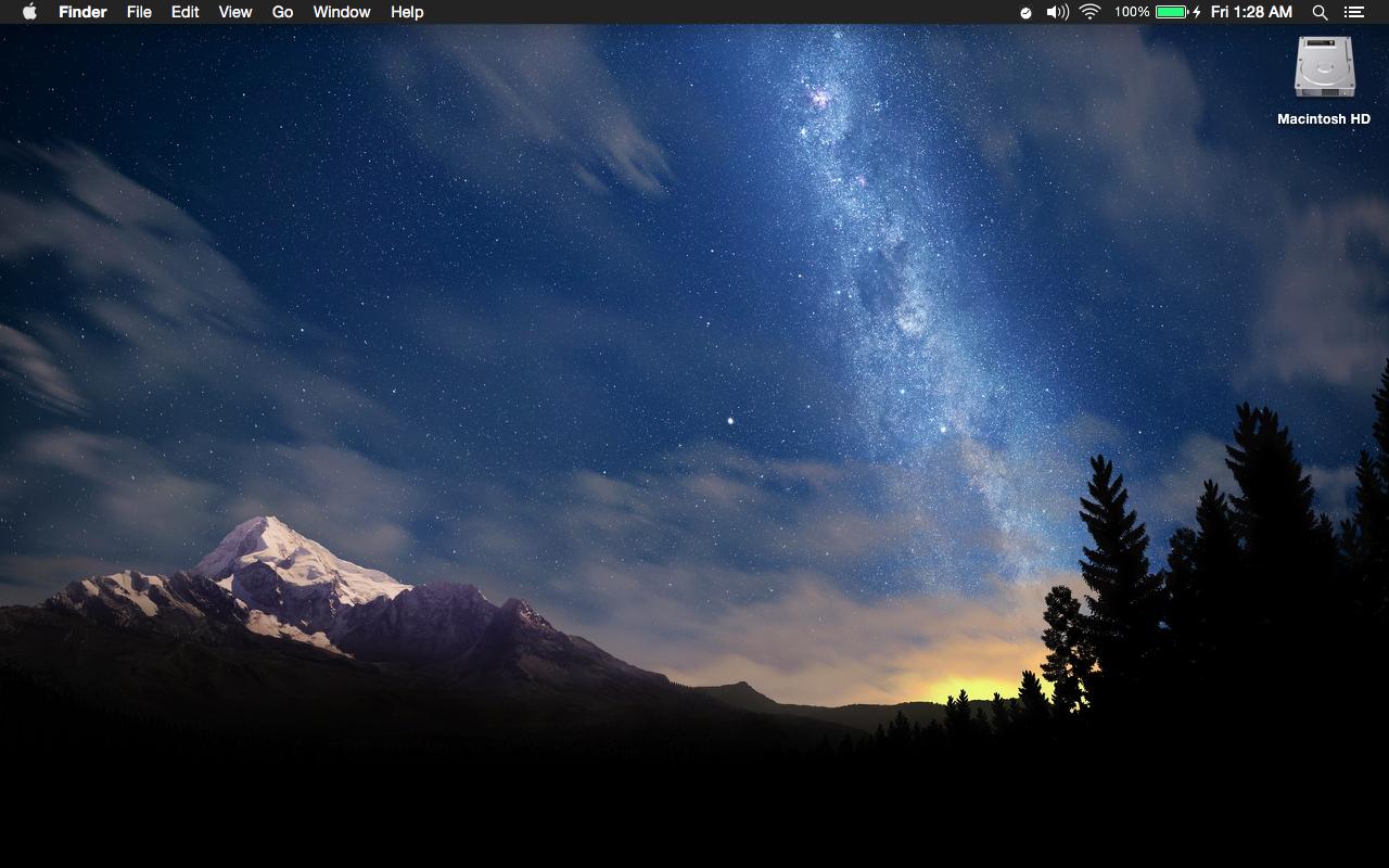
Can you link to that wallpaper?
- Status
- Not open for further replies.
Register on MacRumors! This sidebar will go away, and you'll see fewer ads.