Got a tip for us?
Let us know
Become a MacRumors Supporter for $50/year with no ads, ability to filter front page stories, and private forums.
Apple Releases OS X Yosemite Developer Preview 5
- Thread starter MacRumors
- Start date
- Sort by reaction score
You are using an out of date browser. It may not display this or other websites correctly.
You should upgrade or use an alternative browser.
You should upgrade or use an alternative browser.
At last...
Quite pleased with this one, as it appears it has resolved my Apple Mail crashing issue if accessing Exchange 2010.
Responsive, and so far after an hour, no sudden restart of the OS.
Microsoft Lync 2011 doesn't work (com.Apple.Geod process also seems to lock up regularly, which might be related?), but MS Communicator works, which is as good as Lync.
Woo-hoo! This was my biggest (non-functional) gripe with Yosemite!
Obfuscated URLs! What were they thinking???
Have they fixed the "bug" in which clearing "all time" history logs you out of accounts (ex. MacRumors), and conveniently forgets website notification settings every... single... time?
I don't know why Apple decided on different levels of history to clear; "last hour", "today", "today and yesterday", "all time". Wtf?! If I'm clearing history, I'm clearing it for a reason, privacy (don't always need private browsing), why would I need different times?
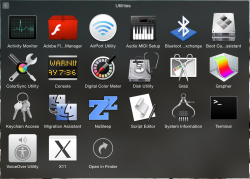
I don't know if it's new in this beta, but something about the 'increase contrast' option looks damn sexy. Colors are darkened, icons are blackened and there are really nice outlines around everything. Much better-looking than the 'button shapes' option on iOS8.
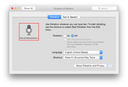
I would take more pics, but for some reason system preferences panels aren't screenshotting for me.


I would take more pics, but for some reason system preferences panels aren't screenshotting for me.
Safari - There's a new setting in Safari to show full website addresses.
Thank the heavens!!! The website path is the very essence of the web and a browser that hides this feels very dumbed down and like a kiosk browser.
I think every browser has this enabled by default. At least giving us the option to turn it on is sane.
The volume and brightness controls are hideous.
I don't get why they even changed those. They were already flat, only with a very slight drop shadow.
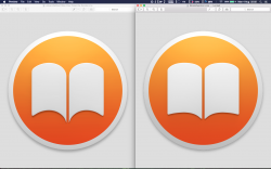
Looks like iBooks icon has changed a little. Personally I like the previous icon better (on the left it's DP1-4, on right it's DP5).
Nice catch. I just noticed the new icon and was surprised nobody had mentioned it yet.
I like the new one much better. In the old one, the arc on the top and bottom of the book was way too drastic.
Why doesn't everyone send them feedback to return swiping in the Finder??? The removal of gesture back/forward in the Finder was one of Apple's stupidest moves ever. What in the hell could possibly make them think removing that was a good idea? It literally slows down Finder navigation by a huge amount... Instead of swiping back with an instantaneous gesture, you have to curser over the tiny back or forward arrow, and click it.
Also, they should probably fix the hiccup that occurs in the animation for launch pad, when using the gesture. If you pinch quickly and pull your fingers in a lot, it will hiccup almost every time. If you pinch and hardly move your fingers at all, it will come up smooth. It's a bug that has been there since it's inception, are they that oblivious to simple problems?
As for the new volume/brightness/etc HUD... It looks hideous and dated, they always have. iOS 7 I thought would make it look a lot better, but it certainly didn't. This looks even worse. Why are they using the thick, filled in rectangles?! It would look a million times better if they were simply short lines or small flat ovals, without being outlined for some useless reason... It couldn't be more obtrusive either... Others are right when they say that it's ridiculous that it covers most of the screen on iOS, and it's nearly as ridiculous on OSX.
P.S. I love almost all of iOS 7, and Yosemite, so this isn't random anger over UI.
Why does the light bulb in the Energy Saver icon look like it's wearing a girdle?
Image
What type of light bulb is that supposed to be, anyway? What kind of light bulb glows yellow anymore? Come on, Apple! :/
It looks like an LED bulb http://www.iskonsoft.com/images/LED-Bulb.jpg
pac
Handoff stopped to work since OS X Yosemite DP 5 and iOS 8 Beta 5
I noticed this too. It was working great in DP4 and iOS 8 Beta 4
Looks like iBooks icon has changed a little. Personally I like the previous icon better (on the left it's DP1-4, on right it's DP5).
Good find, Im surprised so many people missed it. I like the new one, it looks more like a book.
I don't get why they even changed those. They were already flat, only with a very slight drop shadow.
Makes it consistent with iOS.
IMO, they should've made iOS' look like OS X's.
Why doesn't everyone send them feedback to return swiping in the Finder??? The removal of gesture back/forward in the Finder was one of Apple's stupidest moves ever. What in the hell could possibly make them think removing that was a good idea? It literally slows down Finder navigation by a huge amount... Instead of swiping back with an instantaneous gesture, you have to curser over the tiny back or forward arrow, and click it.
No you don't. You can do it even faster than swiping by keeping your hands on the keyboard and hitting command-[ or command-].
Why doesn't everyone send them feedback to return swiping in the Finder??? The removal of gesture back/forward in the Finder was one of Apple's stupidest moves ever. What in the hell could possibly make them think removing that was a good idea? It literally slows down Finder navigation by a huge amount... Instead of swiping back with an instantaneous gesture, you have to curser over the tiny back or forward arrow, and click it.
Also, they should probably fix the hiccup that occurs in the animation for launch pad, when using the gesture. If you pinch quickly and pull your fingers in a lot, it will hiccup almost every time. If you pinch and hardly move your fingers at all, it will come up smooth. It's a bug that has been there since it's inception, are they that oblivious to simple problems?
As for the new volume/brightness/etc HUD... It looks hideous and dated, they always have. iOS 7 I thought would make it look a lot better, but it certainly didn't. This looks even worse. Why are they using the thick, filled in rectangles?! It would look a million times better if they were simply short lines or small flat ovals, without being outlined for some useless reason... It couldn't be more obtrusive either... Others are right when they say that it's ridiculous that it covers most of the screen on iOS, and it's nearly as ridiculous on OSX.
P.S. I love almost all of iOS 7, and Yosemite, so this isn't random anger over UI.
Apple removed Multitouch from iWork also which SUCKS. I don't understand this at all.
New volume up and down sounds
Volume up and down sounds aren't enabled by default, and when you turn them on, you get a different noise
https://www.youtube.com/watch?v=0tyQSY2JtoA
pac
Volume up and down sounds aren't enabled by default, and when you turn them on, you get a different noise
https://www.youtube.com/watch?v=0tyQSY2JtoA
pac
No you don't. You can do it even faster than swiping by keeping your hands on the keyboard and hitting command-[ or command-].
Okay I understand that, but personally I use as few keyboard commands as I can, because frankly gestures on the trackpad are about a trillion times better than a keyboard command would be. Also, the vast majority of users are unaware of 98% of keyboard commands, and don't use them. However, gestures on the trackpad are very easy to use, and remember. Especially back and forward navigation, which by the way, hasn't really worked since snowleopard. I swear each new iteration of OSX has different places swiping back and forward works, and they just randomly removed three finger swiping too. Like in iTunes in snowleopard you could swipe between anything using three fingers, I forget about two, but definitely three. Now, it's just like iTunes navigation, and it randomly works and doesn't, and absolutely only two fingers works. It's a true embarrassment to Apple's OSX.
Okay I understand that, but personally I use as few keyboard commands as I can, because frankly gestures on the trackpad are about a trillion times better than a keyboard command would be.
That's sort of an unproven allegation. For many people keyboard commands are far better than taking their hands off the keyboard to use a mouse or trackpad.
No you don't. You can do it even faster than swiping by keeping your hands on the keyboard and hitting command-[ or command-].
Wow... thanx! Didn't know that shortcut.
The only thing I missed in Finder was the BS key functionality in Windows Exploder.
That's sort of an unproven allegation. For many people keyboard commands are far better than taking their hands off the keyboard to use a mouse or trackpad.
You're right, but the same is true of removing a hand from the trackpad to complete a keyboard command, many of which require two hands I believe. That's why it should be able to be preformed through both a keyboard command, and a gesture (back and forward navigation that is).
Register on MacRumors! This sidebar will go away, and you'll see fewer ads.


