Become a MacRumors Supporter for $50/year with no ads, ability to filter front page stories, and private forums.

Kardashian

macrumors 68020
Original poster
Sep 4, 2005
2,083
2
Britain.
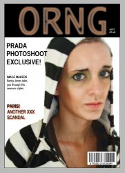
Basically, for my A-Level, I'm making my own magazine.

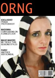
Me and my friends are writing articles, and I'm doing all the photography and Photoshop work, putting it together, layout, design etc.

I have a few questions:

1. Whats the best app. to use to 'create' the magazine? At the moment, I'm using Photoshop for everything, and its really good - however I'm a little worried for printing etc, I don't know how to do double pages etc.

Also, how do I make Photoshop act like Word/Pages in respect to inserting a text - not letting it run off the page, and having it re-arrange itself when an image is inserted etc, or is that not possible as its a design app?

2. Where can I get it bound/printed, in the UK?

3. How do I 'layout' pages?

At the moment I'm doing one A4 page at a time and saving it as 'Page 1' etc, although, I need to know how to do double-page spreads (Like Mags and Newspapers), and double-sided.

(If its bound, I'm guessing I'll just do double-sided A4's then send them to a company to be bound, but if I can't get it bound and it has to be stapelled, I'll have to do a print layout the same as newspapers use, not sure what its called. Where you print out double page, double sided A4's joined together [so is that A3?] - then lay them on top of each other? CONFUSED :confused: )

Anyway, I'm very confused as to how I should be laying it out, and getting it bound.

I have no idea how to do a double page spread, a double sided page, or whether I should save them as seperate pages for the time being (as I'm doing) and insert them onto one giant-sized canvas, and drag both pages onto that - making a double page.

Also, binding it is an issue.

(Sorry to go on, wanted to simplify my post as it got a bit confusing) :eek:
 

Blue Velvet

Moderator emeritus
Jul 4, 2004
21,929
265
Stop using Photoshop for layout, right now. If you've got the Creative Suite use InDesign. That will do all the things you're having problems with.

And there are tons of printing companies in the UK... we use printers in Wales for certain things where price is not an issue and time is not of the essence. Yell.com is your best bet but very few printers will want to touch anything with a run of less than 300 or so, unless it's a digital run and even then you'll find it costly.
 

Kardashian

macrumors 68020
Original poster
Sep 4, 2005
2,083
2
Britain.
Blue Velvet said:
Stop using Photoshop for layout, right now. If you've got the Creative Suite use InDesign. That will do all the things you're having problems with.

And there are tons of printing companies in the UK... we use printers in Wales for certain things where price is not an issue and time is not of the essence. Yell.com is your best bet but very few printers will want to touch anything with a run of less than 300 or so, unless it's a digital run and even then you'll find it costly.

Thanks Little Miss Know How :)

Yes, I have InDesign.

What do I do to get all my work over to there, I've saved 2 copies of everything - .jpeg for my portfolio, and .psd for Photoshop editing. How do I do that double page thingy?

Yeah, Dads friend runs the local paper, so we got a few contacts from them, but no one will touch under 500 copies, I found a company in Cardiff who wants in the region of £120 for 5 copies, 55 pages each, printed and bound - which is a tad expensive for me.

Edit: I have ImageReady and Photoshop. No InDesign. How do I get it?
 

Blue Velvet

Moderator emeritus
Jul 4, 2004
21,929
265
josh.thomas said:
Thanks Little Miss Know How :)


Not the way to respond to a designer with almost 25 years' experience who was about to give you a detailed reply to all of your questions, taking time out from the project in front of her to help you out.

Later.
 

Kardashian

macrumors 68020
Original poster
Sep 4, 2005
2,083
2
Britain.
Blue Velvet said:
Not the way to respond to a designer with almost 25 years' experience who was about to give you a detailed reply to all of your questions, taking time out from the project in front of her to help you out.

Later.

It wasn't meant nastily.

It was meant playfully, as I know from talking to you in the past you run (I think) a design company.

I was grateful for your reply, and I didn't mean it sarcastically at all.

Anyway, sorry if I disturbed you from your project, and it wasn't meant to cause offense, hence the smiley. :)
 

dornoforpyros

macrumors 68040
Oct 19, 2004
3,070
4
Calgary, AB
Blue Velvet said:
Not the way to respond to a designer with almost 25 years' experience who was about to give you a detailed reply to all of your questions, taking time out from the project in front of her to help you out.

Later.


haha blue velvet, you rule. Kudos

I hope after 25 years I still have that kind of passion for this work.
 

Kardashian

macrumors 68020
Original poster
Sep 4, 2005
2,083
2
Britain.
20rogersc said:
But surely if you're doing A Levels, you'll have access to the Adobe suite at your college!?
Because we do :p

You'd think that, wouldn't you? :p

Its all Windows and grey boxes, with no Adobe programs, other than Acrobat.

Useless. :(
 

20rogersc

macrumors 65816
Jun 28, 2005
1,144
0
Brighton, UK
What subjects you doing then for this!?
We have grey boxes, but with both the Adobe and Macromedia suites.
That's Graphics A2 by the way.

::20ROGERSC::
 

Kardashian

macrumors 68020
Original poster
Sep 4, 2005
2,083
2
Britain.
20rogersc said:
What subjects you doing then for this!?
We have grey boxes, but with both the Adobe and Macromedia suites.
That's Graphics A2 by the way.

::20ROGERSC::

Art, Photography, and moving to I.T from Psychology.

I'm doing A2 now, just started in September.
 

vectormasked

macrumors member
Sep 3, 2006
77
0
Somewhere in Canada
Use InDesign or QuarkXPress for the layout. These two programs are used for laying out magazines, newspapers and well pretty much everything.

Photoshop and Illustrator are only used for graphics, that's why in InDesign and QuarkXpress you can have multiple pages and not in PS or Illy.

In InDesign you can set the number of pages you want when creating a new doc and you can add or delete pages any time. There's something called "Master Pages" that you will find at the top of the "Pages" palette that you will have to use for elements in the layout that will be used several times such as "page numbering" and stuff.
If you plan to add images or graphics into the layout use PSDs, TIFFs or AIs. Stay away from using jpgs or any other image format since jpgs and a lot of formats are not meant to be used for print.

Hope this info helps.
 

Kardashian

macrumors 68020
Original poster
Sep 4, 2005
2,083
2
Britain.
Thanks a lot.

I've downloaded the Try Out of InDesign, as there's no way I can afford it.

How do I get what I've done so far, into InDesign?

I have everything saved in .PSD.

Thanks :)
 

20rogersc

macrumors 65816
Jun 28, 2005
1,144
0
Brighton, UK
Just drag and drop! Get the .psd files from Finder, and drag them into inDesign wherever you need them! You can also create a frame, and when it's selected, do Command-D, and then select your file. to place something in it.

Hope this helps.

::20ROGERSC::
 

Kardashian

macrumors 68020
Original poster
Sep 4, 2005
2,083
2
Britain.
20rogersc said:
Just drag and drop! Get the .psd files from Finder, and drag them into inDesign wherever you need them! You can also create a frame, and when it's selected, do Command-D, and then select your file. to place something in it.

Hope this helps.

::20ROGERSC::

I got up early this morning and totally messed around with it - sorta figured out how now, but thank you.

How can I post my front cover? Want your opinions.. remember, I'm a total utter n00b at this!
 

Kardashian

macrumors 68020
Original poster
Sep 4, 2005
2,083
2
Britain.
Don't laugh.. urm, please. :eek:

But do criticise, and tell me what I can do better! :)
 

Attachments

  • Picture 1.jpg
    Picture 1.jpg
    87.6 KB · Views: 97

macdon401

macrumors 6502
Jul 9, 2005
261
0
You asked for it!

i know you are new to this, so i will be gentle...
1. your Header for the cover should never be a "soft focus' typeface, it looks like a mistake and it's rather ugly too, centre it or flush left will help, but change the face.
2. Your subheads have way too much leading in them (the space between the lines) it makes the mag look very amatuerish.
3.The space between your subs should be much smaller as well.
4. The photo also looks out of focus, make sure it is 300 DPI for the best quality.
%. Red drop shadows are very lame ...try using some color in the subheads, it may help overall.

I hope this helps you out a bit
R
 

vectormasked

macrumors member
Sep 3, 2006
77
0
Somewhere in Canada
Get some typefaces!

The cover looks kinda amateurish because of the image you used and the way the edges look. The typefaces you used are kinda boring, plain and aren't very profesional looking because you are just using what came preinstalled with the computer, or in other words.....free fonts.
If you can pay a little for 2 quality typefaces, do it, otherwise you're never gonna get proffesional looking results.

The header doesn't look very good. That glow or blur on the ORNG just looks ugly, and so does that typeface. Try not to use any effects in here. Rather try to use one or two solid colours (1 is best) and modify the typeface used on the header or something. And...left align it please.

Stay away from using drop shadows and glows. They are pretty much only useful when you have a very busy background that makes text be unreadable. In this case you have no background, so don't use the orange dropshadow. Besides drop shadows and glows are used in "cheap-looking designs or products. They are considered a crime in design, and I could almost be beaten to death by my coworkers at the design agency I work for if I use dropshadows or glows. :(

Play a bit with the different weights of each typeface (normal, demi, bold, black, etc...) to make certain information be more eyecatching.

Hope this critic is not to harsh. we're just here to help ;)
 

20rogersc

macrumors 65816
Jun 28, 2005
1,144
0
Brighton, UK
Just a few quick things that I would play around with . . .

Change the header, or atleast get rid of the glow.
Play around with the subheadings - size/colour/typeface/placement.
Maybe give that picture a background?
Put the head of the person over the header.
Change the size/colour/typeface/placement of the issue and price.

::20ROGERSC::
 

Kardashian

macrumors 68020
Original poster
Sep 4, 2005
2,083
2
Britain.
Thanks every.. tell me if I'm that bad, I'll pick another final project (I have until Xmas).

OK, here's what I've changed:

1. The glow on the title has gone
2. The size and font of the title has been changed
3. Its been moved to the left
4. I have changed the font, and weight of the subheads.
5. Moved the price and issue, next to the barcode.

I can't move the top of the models head over the black bar, as in the picture, the top of her head is missing. It looks better having a black bar under the title, than an empty chunk missing. I just really love the photo.

Any more suggestions? As for the font idea, I have no money until the end of the month, and from what I've seen - fonts and icons are pretty darn expensive, so I can't go running around buying fonts, although if you can suggest some free ones, or under a fiver, I would gladly use/try out.

Any more ideas, I'd be really grateful.

(Sorry if I'm taking everyones time)
 

Attachments

  • Picture 1.jpg
    Picture 1.jpg
    83.9 KB · Views: 106

vectormasked

macrumors member
Sep 3, 2006
77
0
Somewhere in Canada
that is a little better, but there's still tons of work lef to do to improve it.

Choose another typeface for the header. "ORNG" looks very weak and fragile and because of this people are gonna forget about the magazine as soon as their eyes look away from it. Choose something bolder, with more power.

As for the articles, don't make all of them the same size. make the most important one bigger. and reduce a little bit the size of the other ones.

I'd suggest you to print the cover in its real size and compare it to other magazines and you will see why magazines do certain things look in a certain way. You'll also be able to compare the typefaces used, as well as their point sizes, and well pretty much everything.
 

20rogersc

macrumors 65816
Jun 28, 2005
1,144
0
Brighton, UK
josh.thomas said:
Any more suggestions? As for the font idea, I have no money until the end of the month, and from what I've seen - fonts and icons are pretty darn expensive, so I can't go running around buying fonts, although if you can suggest some free ones, or under a fiver, I would gladly use/try out.
DaFont is a good place to start.

::20ROGERSC::
 

Applespider

macrumors G4
This is supposed to be a fashion/women's mag? Well, it's nothing to do with the design itself but there's no way I'd pick that magazine up in a store with that cover.

Most fashion mags are aspirational and their covers reflect that (rightly or wrongly) with beautiful, glowing women - unless they're really trying to make a point. 'Your' model looks ill - and while it might work as part of a bigger series of shots, as a standalone on the front cover, it doesn't. Imagine that sitting on a shelf with lots of other similar mags... appealing? No. Unless of course, you're going for the shock factor with a lead article on eating disorders.
 
Register on MacRumors! This sidebar will go away, and you'll see fewer ads.